Your logo encapsulate your organization’s identity, and it’s what identifies you to the general public. Colors, fonts, shapes, and visual graphics should combine to be both eye-catching and memorable. A successful logo is simple in form, yet effectively illustrates a concept. Your logo should be practical yet original, and easily adaptable across a variety of platforms. In short, a logo should have a great concept and exceptional execution. Seems easy, right? However, creating a logo can be deceivingly hard to get right. Here at Elevation, we’ve put together a list of 6 fundamental tips to help guide you through the logo design process.
1. What are your nonprofit’s unique elements?
When describing your nonprofit, be specific. Even if the cause you support is something broad like education, the environment, or hunger, it’s important to show how your nonprofit adds a unique element to an important cause. Then, try and cut that description down to two words. Choose the two most accurate and powerful words that reflect your organization. Examples could be: youth empowerment or earthquake relief. The purpose of making a two-word description is so that when you start throwing around logo ideas, you will be thinking about the most important part of your nonprofit that you want to showcase. Graphic images, color palettes, and typography will follow after you’ve narrowed down the focus of your organization.
2. Can your logo be remembered 10 seconds later?
Entrepreneur Magazine’s top branding expert, John Williams, thinks he has the answer to testing whether a nonprofit’s logo is memorable enough. He writes, “If you can’t look at a logo for fewer than 10 seconds and re-draw it with decent accuracy, it’s probably too complex to be easily remembered.” Think about some of the most iconic nonprofits in the world such as WWF and charity:water. Could you apply Williams’ test to these? Probably. These logo designs employ a balance between originality and simplicity.
3. How to use color in your nonprofit logo
Before delving into color choice, first ask yourself what the most important qualities of your nonprofit are. Do you focus on improving education standards in high risk neighborhoods, providing immediate relief to communities suffering from natural disasters, or supporting minority populations in your community? It’s a well-known marketing strategy that colors spark emotions and associations inside our brain, and depending on the purpose of your nonprofit, your color palette should reflect that. For example, look at the logo below:
Putting aside whether or not you recognize the organization associated with this logo, what can you immediately infer from the color choice? With muted and soothing tones, your initial assumption could be that this a policy or healing organization with a more formal style. You might also think this organization focuses on the environment since they use earth colors. Green is often associated with fresh energy and nature, while blue is connected to innovation, water and the sky. The above logo is used by Conservation International, whose main objective is to protect and conserve the environment, and graphic designers strategically used green and blue to reflect that. If you haven’t read it yet, check out our blog post about color choice to have a full rundown of the different emotions colors evoke.
4. What will your logo look like in 5 years?
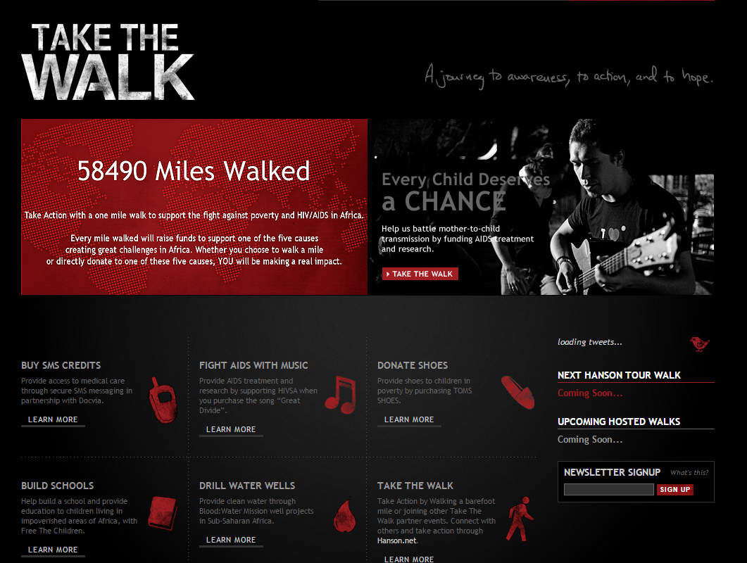
What about 10 years? Or even 20 years? Trends come and go and while it’s important for an organization to employ fresh and up-to-date tactics to engage their audience, when considering a logo, longevity is key. For instance, have you heard about the new flat design trend? Flat design focuses on minimalist principles in a two dimensional form. Check out Take The Walk’s website. The use of a bright, yet muted color palette, along with basic shapes is simple, clear, and visually appealing. While flat design is considered a trend, web designers alike think that it will maintain its popularity in the future. What do you think?
5. What will your logo look like on different platforms?
Creating a logo that can be transferred across a variety of platforms can be very difficult to achieve. Graphic designers must consider how the logo is going to look online versus printed, dark versus light backgrounds, next to a tagline, on something as small as a postage stamp to as large as a billboard, and whether color choice could affect connotations associated with the brand. A popular logo we see on a range of platforms is the American Red Cross’ logo. It can be seen as easily on their webpage as on the side of trucks, blankets, t-shirts, and a multitude of other places.
6. Can your logo be simplified?
Simplicity is the ultimate guiding principle of logo design. Clear lines, minimal detail, limited colors, and consistent typography should help your audience understand your nonprofit, not confuse them. Furthermore, you may think every detail of your nonprofit should be included in the design, but the best nonprofit logos in the world are simple at heart. This may seem counter-intuitive in our increasingly competitive world, but in order to create a great logo, simplicity is key.
Conclusion
Designing a logo takes time and consideration. It should make a great first impression, engage your audience, and capture the essence of your cause. If you are interested in logo design for your nonprofit, check out some of Elevation’s logo designs and reach out to see how our experts can assist you today. What do you think are important tips for logo design? Share your thoughts!
This post updates the original article published in 2015.


