The internet is designed to be accessible for all persons with all soft/hardware, languages, locations, and abilities. Though your website’s accessibility may seem like an idealistic standard, it is actually a legal necessity. According to UsableNet research, accessibility lawsuits increased 181% between 2017-2018 and have shown no signs of slowing. Thus, it the website designer’s responsibility to ensure that their website includes all types of users. By understanding the various dimensions of accessibility, you can work to make your nonprofit website accessible for all.

What Is Accessibility?
Website accessibility, though at times a legal nightmare, benefits everyone. As it relates to those with special needs, web designers must consider those with auditory, cognitive, neurological, physical, speech, and visual differences when constructing all elements of the website. Web designers also must be cognizant of those with old age, temporary/situational disabilities, slow internet, and such. Once all these populations have been considered, your nonprofit website will reach and influence diverse groups. Here are ways websites can be more accessible as it relates to text, colors, and general design elements.
Accessibility in Text
The main component of website content involves the text, so keeping it accessible is key.
- First, make sure the text is at least at size 16. This easy fix will help those who are hard of sight.
- Next, provide alternative text for non-text content. In other words, write a short descriptive sketch with keywords to accompany all images. This is called your alt-text.
- And for videos, include closed captions or a manuscript so those hard of hearing will be accommodated.
- Finally, make all links text-descriptive. This means eliminating “click here to read more” anchor text and similarly worded CTAs.
By checking your website’s text accessibility, you are eliminating legal hassles while reaching diverse groups across the globe.
Accessibility in Color
To assist those who are colorblind, visually impaired, or even epileptic, it’s important to assess color schemes on your website.
First, check your color contrast. According to WCAG (Web Content Accessibility Guidelines) the contrast ratio for images and smaller text should be at least 4.5:1. For large text, the contrast should be at least 3:1, whereas incidental text/images and logotypes do not have any contrast requirements. For an easy and free way to confirm the accessibility of your color contrast, check out Material Design’s color tool.
Further, the color of content should never be the only indication of meaning. For example, if you are using red font to indicate error text or required fields on a form, you must also clearly explain using text what the error is if the form can’t be submitted.
Accessibility in Navigation

For example, if there is an error of some sort, the error’s message should be put concisely explained in text. If errors are only communicated through a singular mode (i.e. a warning icon), underserved demographics may remain confused as to how the error occurred and how to best resolve it.
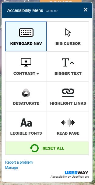
As it relates to tab navigation, an accessible website will allow users to navigate the entire website via the keyboard. That way, those with and without mouse pads can travel through the website with ease. For our websites, we use the wordpress plugin from userway.org.
And if your website has time limits in any capacity, (i.e. membership login resets), ensure that the time limit is flexible. Otherwise, users with slow internet, mental/physical disabilities, or old age will not be aptly accommodated. One way to maintain time limits while catering to these demographics would be to insert time warnings so users will remain alert and attune to whatever limits you’ve set.
Accessibility Software Help
If you feel solid in your website’s accessibility or you have some concerns, consider utilizing accessibility software to help identify and resolve potential issues.
- Userway.org
- Wave.webaim.org
- Google Lighthouse
- WordPress accessibility tools and alt text finder identifies missing alt tags, adds a contrast ratio checker, a WCAG interactive checkout list, and more!
Watch our on-demand webinar on learn more
Checking and maintaining an accessible website overlaps with best practices for website maintenance and user experience. Additionally, it will save you legal battles and reactive burdens. Although it is quite cumbersome to routinely assess, it will help you better serve your constituents and your nonprofit population. To learn more about how to begin your web accessibility journey, check out our on-demand webinar, “Getting Accessibility Right.”


