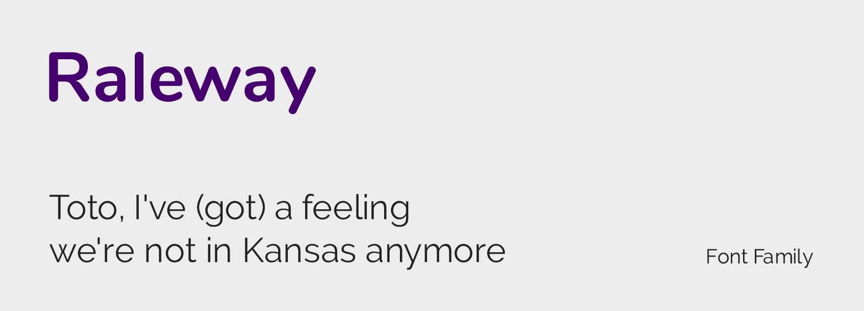
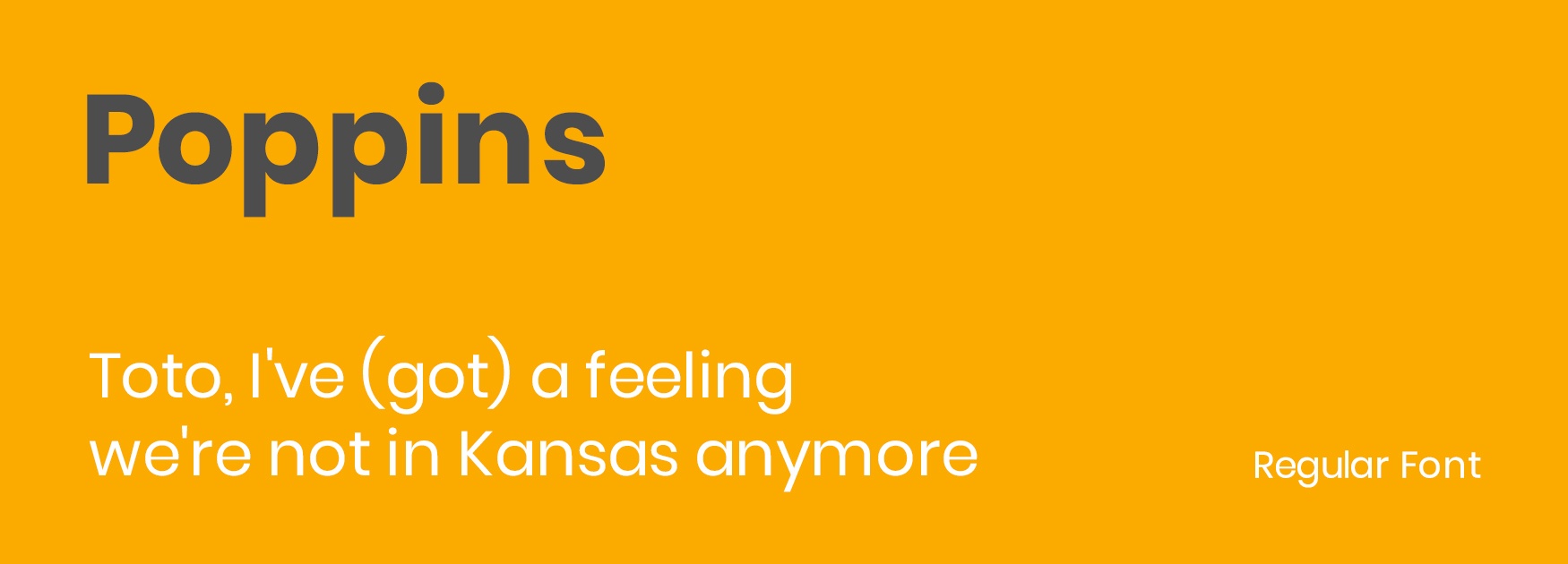
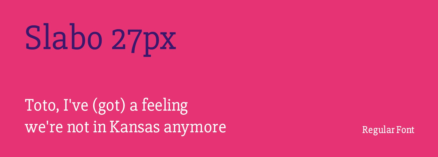
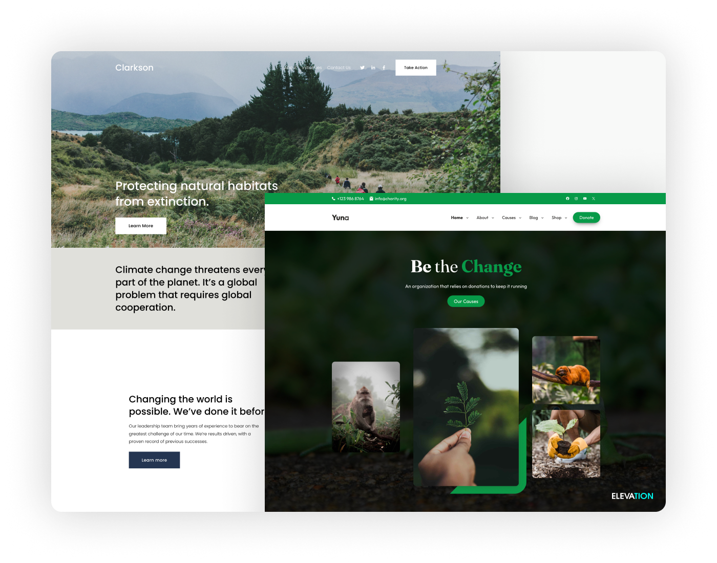
We are here to make an argument, an argument about font. When font only existed in print, it was easy. Designers knew that the design they created was going to appear as they wanted it to. Enter the modern era, the era of web design where type renders differently on a screen. There are a ton of different things that affect how text will show up from device type to whether that font is even available on the user’s device.
To manage this problem, designers came up with “web fonts” that are optimized for screen viewing. These fonts existed out on the web and didn’t need to be downloaded but came with a set of issues. One, when they first started, not that many existed leading to some pretty limited options for the creative among us. In addition, they came (and come) at a pretty penny and with a set of licensing concerns. So, enter “Google fonts”. I mean, Google will deliver quality in everything it does, so why would fonts be an exception? Google’s library of fonts is free and open source for all web designers. Why should you use these fonts? Luckily for me I have a team of awesome designers here at Elevation whose knowledge is unparalleled and they gave me all the deets.
Here’s Why:
1) It’s free.
I don’t mean kind of free, I mean free free. When you buy the licensing for a font, you think you just pay that initial fee and you’re ready to go. Oh, mon cheri, no. You have to pay additional fees for mobile or print or if your site is super popular. Do you want the bolded version, what about the italic or thin? Each of these font family variations adds a little more to the bill. I think you’ve got the point that Google fonts circumvents all of this. They are all also open source meaning you aren’t going to run into any trouble with how you use them.
2) Browser equitability.
Google fonts doesn’t discriminate, it renders exactly the same on each and every one. Mozilla Firefox? Check. Internet Explorer? Duh. Google Chrome? I won’t even answer that one.
3) Consistency.
It doesn’t need to be pre installed. Website browsers will see what you intended them to see. You don’t have to worry about your nonprofit’s website looking weird because you picked a rare custom font that no one’s technological device recognizes.
4) Page speed.
Using google fonts will actually speed up your page’s load time! They are stored in your user’s cache so your pages will be lightening fast.
5) Font families.
These fonts all pretty much have giant font families meaning there are ton of options to choose from. Font families refer to the slight variations of the same font. Meaning style (regular vs italic) or the weight (thickness) of the font. Extensive font families mean that your designers can be more creative with their designs and use variations for headers and subheaders on your pages.
6) Quality design.
Google is good at what they do and fonts are no exception. While the fonts are submitted by font designers (yes there are people who specialize in fonts) Google has to okay them. Google is selective about the fonts they accept, so you know that you have high quality options.
7) Choice.
The Google font library is kind of like the NYC public library, in that there are a ton of options. So don’t worry if you thought you were going to be limited by sticking with Google: that couldn’t be further from the truth.
More than these Google font tips, we have another little surprise up your sleeves for you today. Our designers have put their heads together and compiled a list of their all time favorite Google fonts to use in their designs, though I do take credit for the movie quote.
Here’s the executive summary. If you want your site to look as it was intended to, Google Fonts is your best bet. It offers a ton of high quality options, speeds up your page loading time, and is (truly) free. If you have any questions about font or web design in general please reach out. We love to hear from you!


