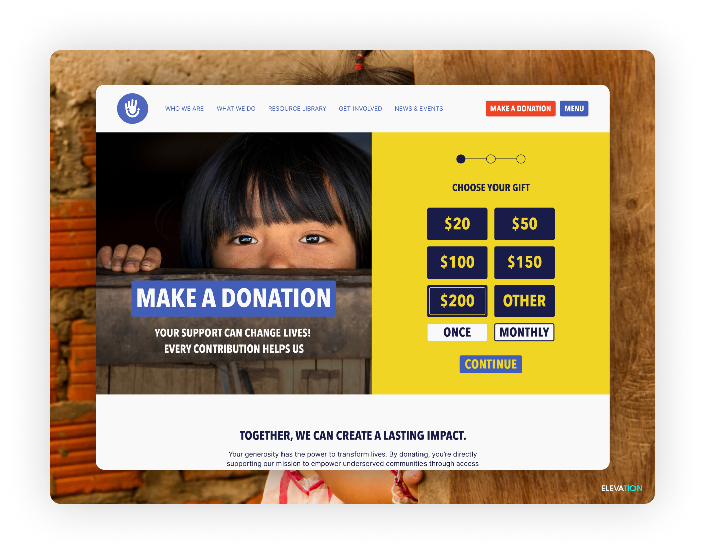
As a nonprofit, your focus should not only be on directing possible donors to your donation page but also providing them with a clear, simple, and exciting donating experience. Your goal as an organization is to have all those who have reached your donation page follow through and complete the action, right?
After all, your donate page is the medium that funnels you the means to operate your organization and spread good in the world! We at Elevation want you give your visitors the best experience possible when donating to your cause, so by following the 6 steps outlined in the infographic below, you can be sure to create a great user experience for your donors!

We hope you enjoy the infographic and will share it with your community! As always, if you would like share your own personal experiences regarding donation usability, please feel free to comment below or reach out to us at Elevation. We’d love to hear from you!


