Nonprofits have to meet a lot of rules and regulations, but having a boring website isn’t one of them. If it’s time to hit the refresh button on your website and make some updates then look no further. Elevation is here to take your site out of the historic era and give it some modern-day flair.
Here are some steps your nonprofit can take to give your website a simple but effective face-lift:
1. Update your logo
We’ve already been over what makes a great nonprofit logo. It’s 2016 and as important as ever to reflect that. An outdated logo will bring down the otherwise most modern of websites. If your nonprofit board is resistant to updates, propose a compromise. Simple touches like increasing resolution or creating alternate logos for different backgrounds and contexts will make a huge difference. Your logo is your brand; take the time to make sure it isn’t stuck in 2000 and late.
2. Add a slideshow
We’re not talking about a Powerpoint presentation. A slideshow on your nonprofit website is a rotating collection of photos that stretch across on the top of the page. These add a modern twist and break up mundane blocks of color and text. Use images that reflect your nonprofit’s mission and brand, and that add some interest factor to your homepage. Don’t fret if you’re not a graphic designer — simply use high-quality “hero” images and transform your slideshow into a powerful tool for empathy. You can also use this opportunity as free advertising for upcoming events, calls-to-action, etc. by including links to other pages in your slides.
3. Put social share buttons front and center
Now that your website is the best, you want everyone to see it! We all know the power of social media for raising brand awareness and putting your organization on the map. Make sharing as easy as possible by having big, visible social media share buttons. (Pro tip: use sticky social share buttons that follow you down the page so your viewers can share at any point). Include all the key players such as Twitter, Facebook, Google + (great for SEO!), Instagram, LinkedIn, and email.
4. Switch up your fonts
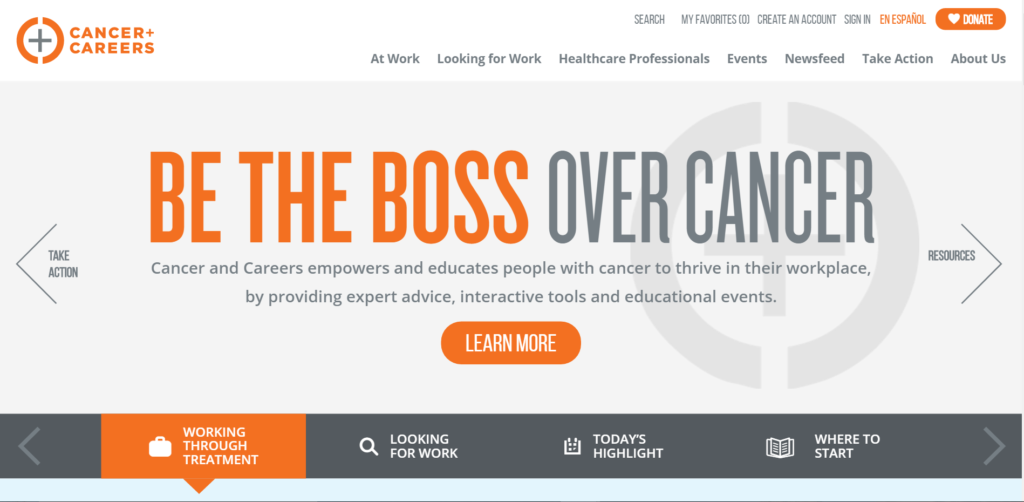
Quickly catch up with the times by getting rid of the Times. While great for those double-spaced, 1-inch margin college essays, Times New Roman on your nonprofit website can appear drab and outdated. Stick to simple and modern fonts for a sleek-but-still-legible-and-totally-with-it feel.
Cancer+Careers is crushing the font game.
5. Make online donation and registration as easy as possible
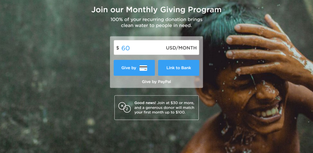
When it comes to online donations and volunteer registration, you want to take out all the guesswork. Convert visitors to donors and volunteers by making these processes as straightforward as possible. Use programs like Stripe and PayPal to make donating a simple as entering a value and clicking a button. And with services like SignUpGenius and 123Signup, volunteer registration can be a breeze as well.
Check out Charity:Water’s homepage donation feature.
If you’re needing something besides these few quick fixes, contact us at Elevation. With leading expertise in nonprofit website design, we can help your organization move into 2017 with professionalism and style.


