Building nonprofit websites with a responsive design can be a challenge these days. Not only do you have to make it appealing for donors and volunteers, but you also have to make sure that you educate your visitors about your organization and what your purpose is. You want to make sure you catch and hold their attention with an informative, user-friendly design.
These 5 nonprofit websites listed below have achieved engaging their audience, have a clear call to action, and a strong mission statement. All these are important factors in building a strong and effective website for your nonprofit organization. Check out some pointers from the websites listed below.
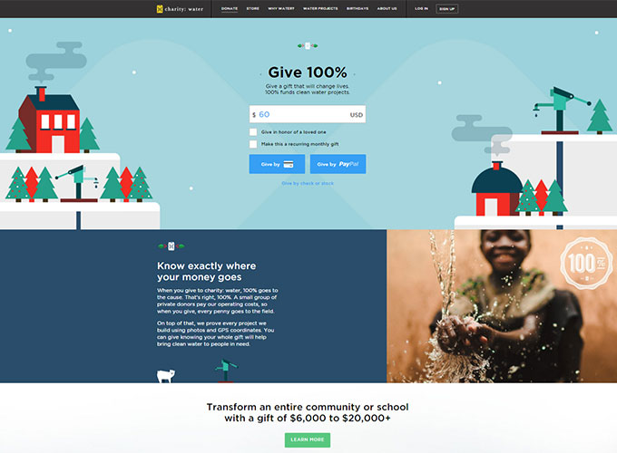
1) Charity:Water
- Tell you exactly how and where your donation goes and how it is used on the first page
- Attention grabbing facts are present, CTA is clear, they make sure that you know that everything that you donate goes 100% to charity
- Provide statistics that make their goals even clearer
- They definitely have their audience and what they want their audience to know in mind
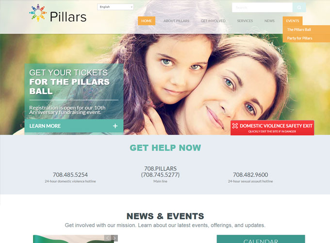
2) Pillars
- Very readable, white background draws direct attention the the organization’s CTA
- Easy to navigate, makes it easier to find the crucial information needed
- Numbers to hotlines are on the front-line
- Use of colors is very clean and responsive
- The safety exit is visible and easy to find
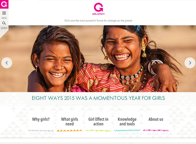
3) Girl Effect
- Information is very user friendly and easy to access, draws you in as soon as you enter the website
- They provide powerful statistics that really get you in tune with their cause and why it is important, helps encourage viewers support and donations
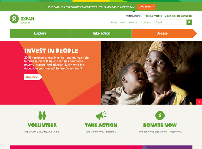
4) Oxfam America
- Have a clear “how you’re helping” piece where you can visually put in perspective how your donations help.
- Donation form is easily accessible
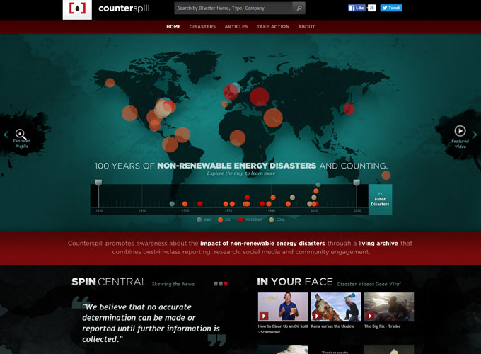
5) Counterspill
- Interactive map showing the nonrenewable energy disasters over the last years
keeps the audience drawn into the site, definitely keeps their attention for quite some time because of the powerful graphics that are provided. - Each disaster takes one to link giving the history of what happened summarized in striking and compelling statistics
Conclusion:
All of these nonprofit websites have one important characteristic in common: they provide powerful statistics to really draw their audience in and hold their attention. This strategy has become increasingly popular over the years to show impact and to show in detail how your donations are helping. These top 5 websites listed accomplish the most important goal of effective nonprofit web design, that after you leave their page, you will have a more than thorough understanding of what the organization does and how you can help.
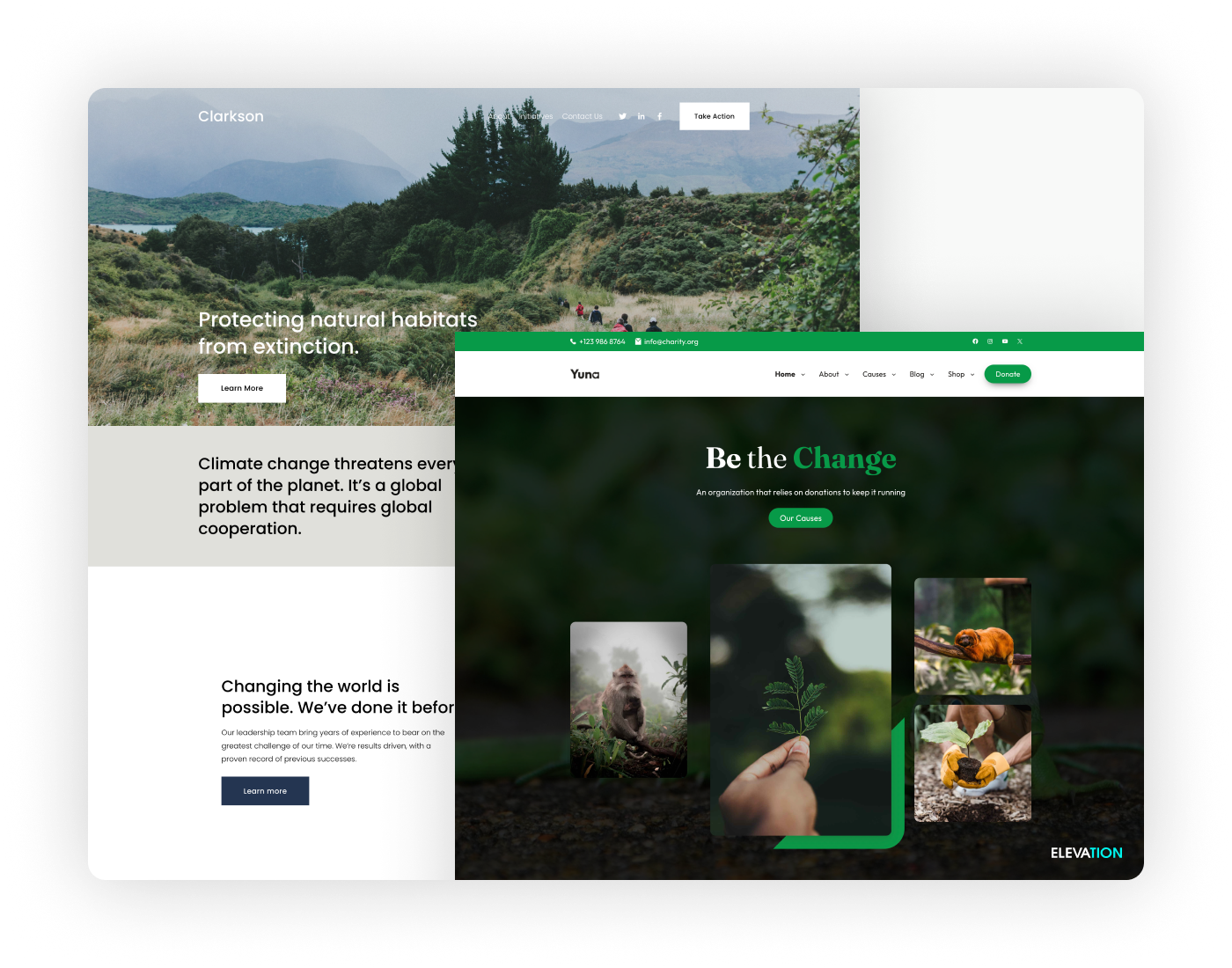
Do you have any other nonprofit websites to add to the list? There are so many more websites that can be added to the list, but these just really stood out. Some of the above were even designed by our team here at Elevation. Be sure to get to check out our portfolio of our work, and if you’re interesting in designing an effective nonprofit website for your organization, get in contact with us today!

