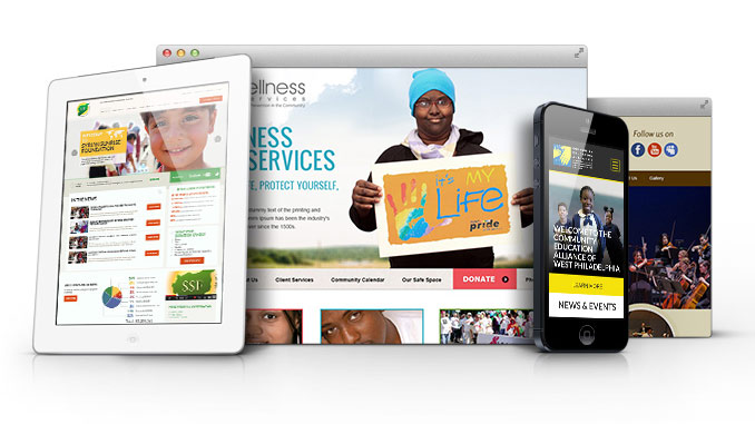
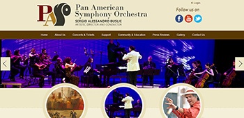
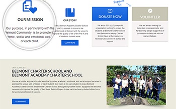
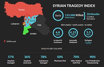
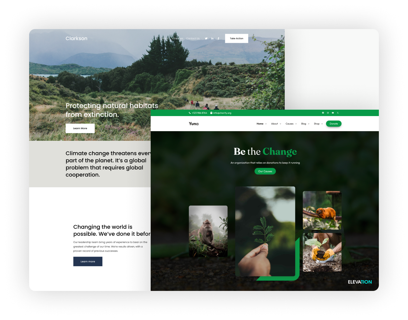
Nonprofit websites share many of the same traits as other websites, but the best ones typically have a little something that makes them extra special. They need to be attractive, user-friendly and informative, like corporate websites – but they also need to inspire people to come back again and again, and to decide to donate.
With strong competition from other nonprofit websites, it is essential that any new nonprofit website draws people in immediately, and is unique enough to be remembered. Below are some tips for creating a nonprofit web design that stands out, inspires and is practically useful:
1. Play to your audience
First and foremost, a nonprofit website must be targeted at the right audience. Work out who you are trying to attract to the website, and design it accordingly. The last thing you want to do is deter certain individuals who could become loyal donors or supporters. You also need to ensure that your website design is consistent with the style and format of all your other promotional materials. The logo needs to be the same as for your promotional materials, to ensure trust in, and recognition of, the organization.
It’s important to determine early on who you are trying to attract, and make this clear in the content and style of the site. This means that any photos need to be scrutinized to make sure they fit with your overall mission statement, and that any messages are clearly-targeted at the right cross-sections of society. Also consider whether the website will have national or international audiences, as this will have a significant bearing on its style and content.
2. Make sure the mission statement is clear
Once you have decided who your key audience will be, ensure that the organization’s mission statement is completely clear. Compare the mission statement of similar organizations in your area, and analyse whether their statement works in a web context. Maybe it is too long for a website? Perhaps it does not get to the point quickly enough? Remember that people tend to have a much shorter attention span online, than for traditional reading methods.
Also ensure that the purpose of the website is clear: is it to attract new donors, or is it to inform current donors? If the website has several aims, make sure you take them into account in the initial design process, to save time and money later. The content will also need to be consistent. Don’t forget to proofread all your website copy for grammatical errors, so it looks as professional as possible.
3. Keep content fresh and dynamic
One of the best ways to keep people coming back to a website is to ensure a regular flow of interesting, targeted content. Explore different types of content that your organization could use, including news, features, blogs, case studies, press releases and videos.Regularly-updated content will also keep improve your search engine visibility. Also ensure that you use all the latest social media sites, including Facebook, Instagram and Twitter, to keep your supporters up-to-date with all your latest news and events. If used wisely, social media will draw supporters back to the website.Also one of the best ways of drumming up interaction with the public is to use social media buttons on your site. Make sure these are visible on your site, not just in the head and footer. Create content that will be easy for people to Tweet, or post to their Facebook page, for example.
You might consider creating a donors-only area with exclusive content, and you could even get donors involved themselves by encouraging them to create blog entries and other types of content that will forge a sense of community around your organization.Blogs and news stories can also be quoted by other blogs, which could boost traffic to your site. Try and build up relationships with blogs and news providers that may be interested in quoting or linking to your content. Content creation is one of the easiest and most effective ways of giving your website an identity.
4. Reach wider audiences with a media section
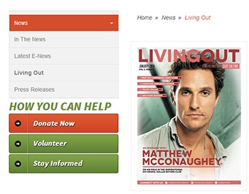
It may sound tricky, but one of the best ways of promoting your organization to new and current supporters will be through getting press attention. Create a media-friendly press section on your website that will inform and inspire any journalists that come to your website. Make it clear that journalists can use any information or photos from your website without prior consent.
Also ensure that your organization’s media contacts and media contact information are clear and up-to-date. Include professional photos of any press contacts at the organization, to encourage people to get in touch. Also include mini-biographies and contact information for your founders, board of directors and key members of staff. Ensure that there is an archive of press releases, for anyone interested in background information on the organization.
For larger or especially media-focused organizations, you might consider creating white papers or case studies that position your organization as an expert in a particular field. All nonprofits would benefit from offering a downloadable media kit, and a collection of downloadable images that journalists and bloggers can quickly and easily access.
5. Make donations easy
Once someone has got to the stage of wanting to donate, you have to ensure the donation process is simple and straightforward, otherwise you may lose their support. It may sound obvious, but first of all ensure that the donations section is easily visible on the site, from the homepage. You will probably also want to include several links to the donation section of the site, to enable visitors to access it from different pages.
Once your visitors are through to the donations area, keep it as stress-free as possible. Don’t ask visitors to set up an account before they donate. Keep it simple with a basic form and credit card section. Only ask for the minimal information required, i.e. basic personal information and credit card details. Try to keep the donations form as just one single page, plus a confirmation page. As well as keeping the giving process simple, this also avoids any problems presented by browsers timing out and other similar internet connectivity issues.
Conclusion
Designing a website for non profit doesn’t have to be hard, so long as you concentrate on some key concepts: original content, clear messaging, media friendliness, to name just a few. Unlike your typical corporate website, a non profit has to appeal in its own unique, personalized way. Give your website that little something extra which will appeal to people’s hearts and minds, and keep them coming back.

