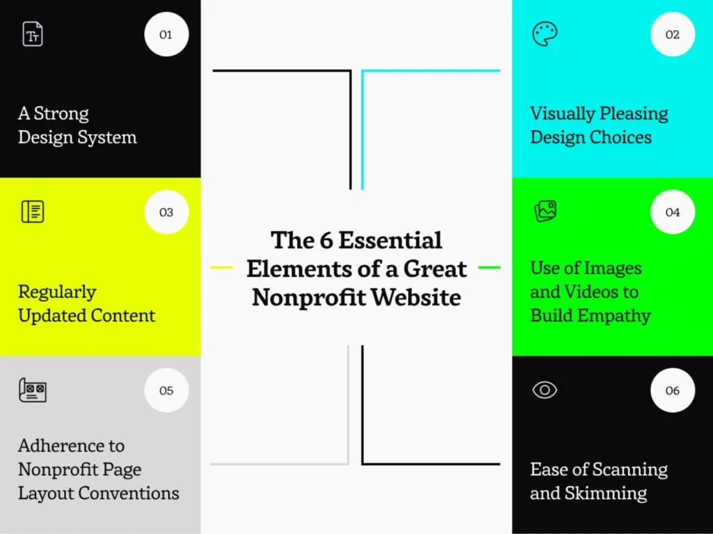
The 6 Essential Elements of a Great Nonprofit Website
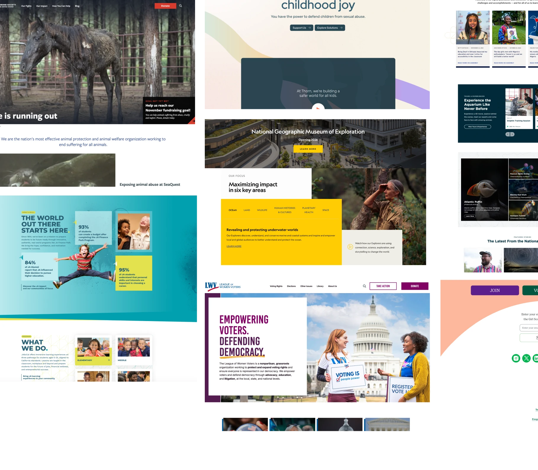
Creating a nonprofit website that resonates with your audience requires a thoughtful, strategic approach. From a strong design foundation to accessible features, the following six elements are essential for a nonprofit website that effectively serves its purpose.
1. A Strong Design System
A well-executed nonprofit website operates from a clear design system. This means using a predefined color palette, 2-3 complementary fonts, and a standard icon set to group information consistently across pages.
Just like interior design, where a well-designed room follows a clear strategy to create a harmonious space, a successful website follows design principles that help visitors navigate content effortlessly and find what they need quickly.
A cohesive design system not only enhances the visual appeal of the website but also establishes a professional identity for your organization, instilling trust and reliability in your visitors.
2. Visually Pleasing Design Choices
The visual design of your nonprofit website should be both aesthetically pleasing and functionally clear. A thoughtful color palette can evoke the right emotional response from your audience, which is essential for creating a connection. For example, blue often communicates trust and stability, while green represents growth and sustainability (source).
Your fonts should be highly readable, with a focus on simplicity and accessibility. Avoid overly ornate fonts that might hinder readability, especially for users with cognitive impairments.
Websites should also have plenty of whitespace, allowing the eyes to rest and making it easier for people with limited mobility to target clickable elements.
Finally, adhering to the Gestalt principles of design helps establish clear relationships between informational and design elements, enhancing the website’s usability and overall user experience.
3. Regularly Updated Content
Great nonprofit websites are never static. They are continuously updated with fresh content that keeps visitors informed and engaged.
A dynamic homepage banner featuring the latest event or news gives visitors a clear indication of what’s happening right now. Carousels, on the other hand, are to be avoided, as studies show that visitors rarely engage with more than the first slide.
Incorporating a blog, event calendar, or news feed on your website allows you to share updates and showcases that your organization is active, relevant, and transparent.
Additionally, nonprofits should regularly update their financial information and annual impact reports to demonstrate transparency and build donor trust. The most successful nonprofit websites show potential donors exactly where their contributions are going, and they keep their impact statistics up-to-date to build confidence and long-term relationships with their donors.
4. Use of Images and Videos to Build Empathy
Your nonprofit website should prioritize storytelling, and there’s no better way to do this than through authentic, organization-specific images and videos. Rather than relying on stock photos, use images that showcase the real people your nonprofit serves, the staff behind the scenes, and the community you’re helping. This builds emotional connections with your audience and puts a face to your mission.
Remember that images should be optimized for the web. Ideally, no image should be larger than 300kB to ensure quick page load times and a seamless user experience.
Video content can also be a powerful tool for storytelling and engagement. To remain fully accessible to those with motion sensitivities, videos should never be auto-played but rather consumed on the user’s terms.
Featuring video success stories can inspire greater involvement, and embedding videos alongside impactful text and images will create a richer, more immersive user experience.
5. Adherence to Nonprofit Page Layout Conventions
Users have certain expectations when navigating a nonprofit website. Keeping these expectations in mind ensures a smoother user experience and reduces confusion.
For instance, the logo should always appear at the top left of the page, with the main navigation menu placed at the top right. The donation button should be visually distinct from the rest of the navigation menu and prominently placed in the upper right corner for easy access.
Critical information such as your mission statement, impact statistics, and a call-to-action (such as donating, volunteering, or subscribing) should be immediately accessible from the homepage.
Finally, integrating dynamic content—an events feed, blog roll, or social media widget—adds an element of interactivity and shows that your organization is constantly evolving.
Complete the page with a donation callout panel toward the bottom rather than relying on annoying (and inaccessible) popups that ask for contributions before users have a chance to learn about who you are and what you do.
6. Ease of Scanning and Skimming
Nonprofit websites should be easy to navigate, with information presented in a way that allows users to quickly find what they’re looking for. Most visitors don’t read every word on a webpage; instead, they scan it for key information.
Mission-driven folks often forget this and drive visitors away with lengthy descriptions right out of the gate of the incredible work they’re doing for their communities. Admirable as your work may be, users must be allowed to choose what to delve into and what to skip over.
The homepage, therefore, should be the most concise page on the site. So-called “interior pages”— all those beyond the homepage— should be reserved for deeper dives into specific topics, offering more detailed content for users who choose to explore further.
Ample use of bullet points, headings, and short paragraphs facilitate ease for readers to find and absorb key information.
Conclusion: Building a Nonprofit Website that Delivers Results
In the competitive nonprofit space, a great website is no longer a luxury—it’s an essential tool for connecting with your audience and achieving your organization’s goals.
By focusing on a strong design system, visually appealing and functional design choices, regular updates, and intuitive layouts, your nonprofit can build a website that engages visitors, fosters trust, and drives action.
If you’re ready to get started on designing a nonprofit website that makes a lasting impact, I invite you to explore below our Top 50 Nonprofit Websites for Inspiration and 7 Essential Resources for Website Building, which can help you through every step of the process.
Top 50 Nonprofit Websites for Inspiration
We invite you to peruse our favorite nonprofit websites of 2024, grouped by service area. All of these websites adhere to most, if not all, of the guidelines presented above. Enjoy, and be inspired!
Education/Schools
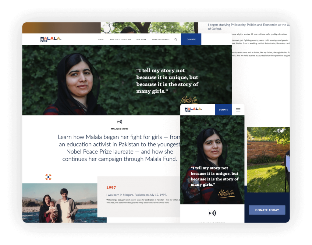
The Malala Fund website is a prime example of effective nonprofit web design, emphasizing ease of use and strategic communication. Navigation is streamlined and intuitive, allowing users to effortlessly find information about the organization’s mission, ongoing projects, and how to get involved.
Highlights: A standout aspect of the website is its clear ‘Donate’ call to action, which is prominently displayed and easy to locate from any page, encouraging visitors to contribute with minimal effort. The homepage features real video content to engage visitors, showcasing the real stories and successes of girls empowered through education. These elements combine to create a compelling online presence that drives the Malala Fund’s mission forward.
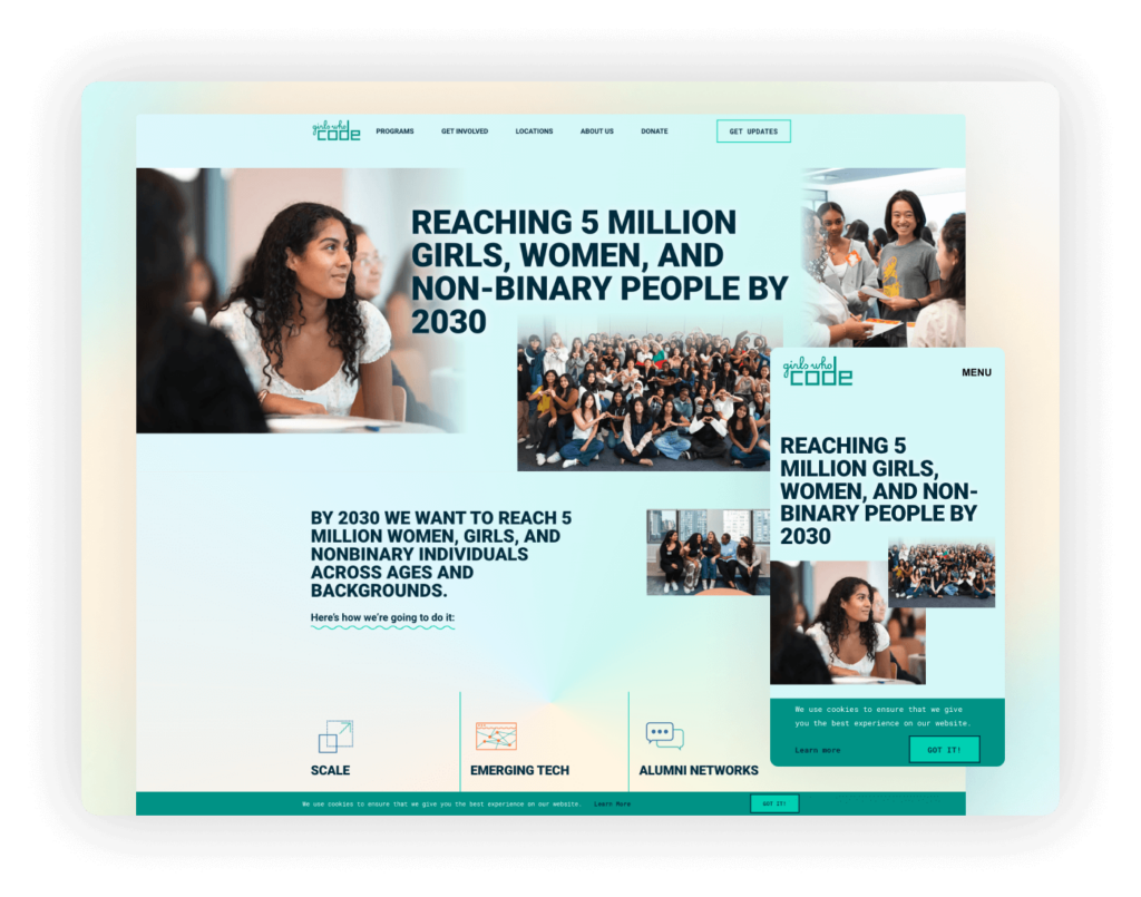
The Girls Who Code website features a vibrant color palette and modern typography that reflect its mission of innovation and inclusivity in tech. The design is not only visually pleasing but also ensures easy navigation, guiding users through educational programs and opportunities to engage.
Highlights: The strategic use of color and font highlights the organization’s dynamic approach to tech inclusivity. A clear cookie policy adds a layer of transparency, informing users about data usage and building trust. Together, these elements create a functional and engaging digital platform that inspires and connects its community.
Phillips University Legacy Foundation
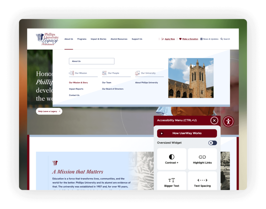
PULF’s website projects a professional and educational aura, perfectly aligning with its mission to enhance public understanding of land forces. The site’s design utilizes a sophisticated color palette that complements this professional image, aiding in the clear presentation of content and enhancing the overall user experience.
Highlights: The navigation menu is notably well-organized, making it easy for users to find information quickly and efficiently. This is crucial for a site that aims to educate and inform. Additionally, the integration of UserWay for accessibility ensures that the website is usable by a wide audience, including those with disabilities.
Human Services
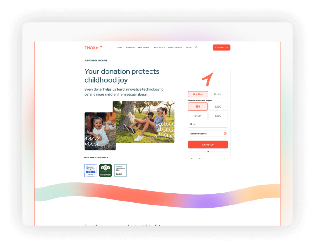
Thorn’s website delivers a modern user experience through the use of bold colors and a streamlined design, effectively embodying the organization’s forward-thinking approach to combating child exploitation.
Highlights: The donation page: Beautifully crafted with comprehensive elements that enhance donor trust and engagement. It includes vivid photos, an intuitive donation form, detailed explanations of how contributions are used, and visible transparency credentials. This combination not only facilitates an easy giving process but also thoroughly informs donors about the impact of their support, reinforcing the organization’s commitment to transparency and accountability.
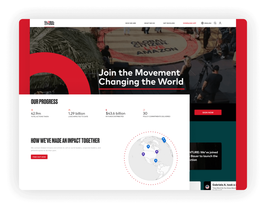
Global Citizen’s nonprofit website captivates visitors from the start with an engaging video banner on the homepage that highlights the energy and scope of their global advocacy campaigns. The site is enriched with sleek animations that provide a visually appealing and smooth interactive experience, emphasizing important nonprofit initiatives.
Highlights: Notably, the website features an interactive map that illustrates Global Citizen’s extensive nonprofit impact across the globe. This engaging tool effectively communicates the reach and results of their efforts, making the nonprofit’s mission clear and inviting visitor participation and support.
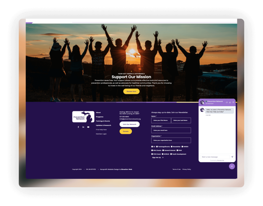
Crafted by Elevation, the Prevention Network website is a stellar example of nonprofit web design, featuring a powerful color palette that vividly represents the organization’s mission. The site is strategically designed with clear, prominent calls to action (CTAs) in its navigation, ensuring visitors can easily access vital resources and support.
Highlights: A key feature of this nonprofit website is the integration of an AI assistant chat, which significantly enhances user interaction by providing instant support and information. The robust and professional footer adds another layer of functionality, offering comprehensive links and contact details that boost accessibility and trust. Collectively, these design elements create an engaging and effective online presence for the nonprofit.
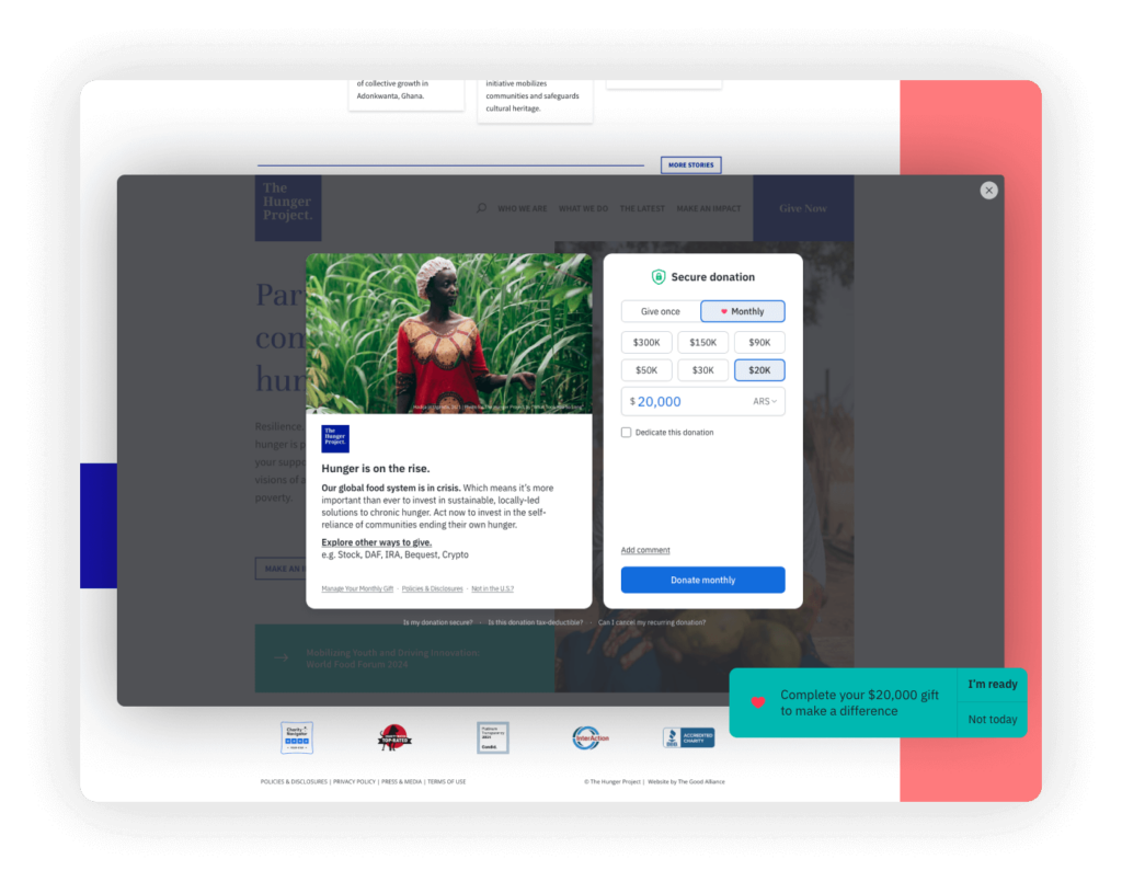
The Hunger Project’s website leverages traditional nonprofit web design with clean white space for enhanced readability and fast load times. This streamlined approach allows for efficient navigation and focuses on the organization’s key initiatives.
Highlights: An effective donation platform powered by Fundraise Up offers a simple popup interface for quick, secure contributions. The site also displays transparency credentials from GuideStar and Charity Navigator prominently, reinforcing credibility and the nonprofit’s commitment to transparency.
Ronald McDonald House Charities (RMHC)
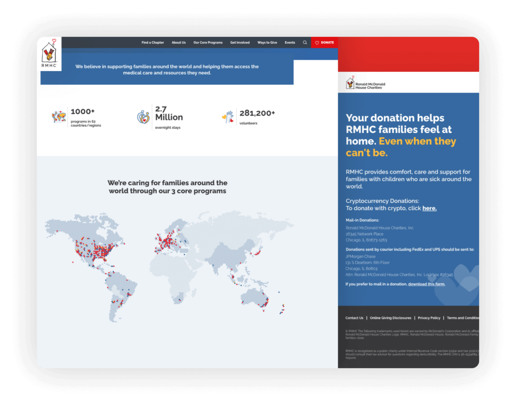
RMHC’s website recognizes the critical importance of privacy and cookie policies, especially given its global reach and the sensitive nature of the information shared by its diverse audience. This commitment to data protection is essential for maintaining trust and transparency with visitors from around the world.
Highlights: The website features an interactive map that visually represents the global impact of RMHC, showing where they provide support to families in need. This map not only illustrates the breadth of their operations but also helps to contextualize their mission and the real-world implications of their work. Additionally, the donation page is effectively designed to be concise and informative, summarizing key information above the fold to ensure that potential donors can quickly grasp how their contributions will be used.
Second Harvest Foodbank of Southern Wisconsin
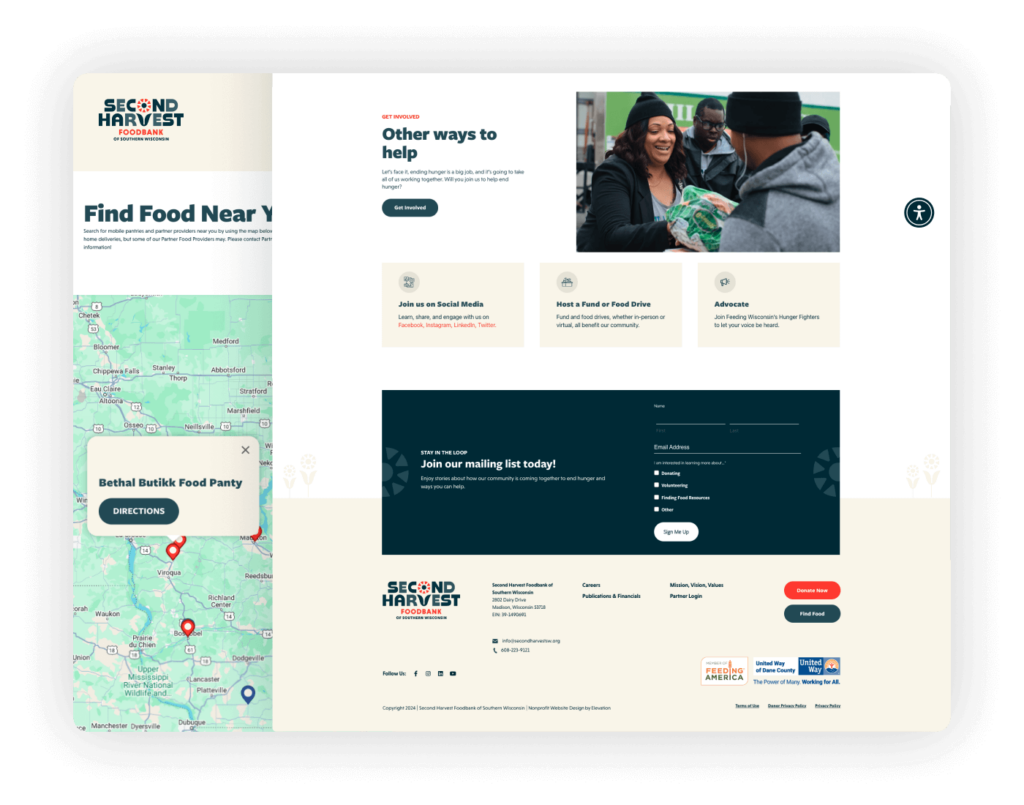
Second Harvest Foodbank’s website utilizes real photos to tell the impactful stories of individuals and communities they support, enhancing the site’s authenticity and emotional engagement. The beautiful color palette complements these stories with warm and inviting tones, encouraging further exploration and connection.
Highlights: The site includes a prominently placed newsletter sign-up box, making it easy for visitors to stay informed about ongoing efforts and how they can help. Additionally, a user-friendly directory map allows users to easily locate food distribution points nearby, making vital resources accessible. These features combine to create a highly functional and visually appealing nonprofit website.
International/Foreign Affairs
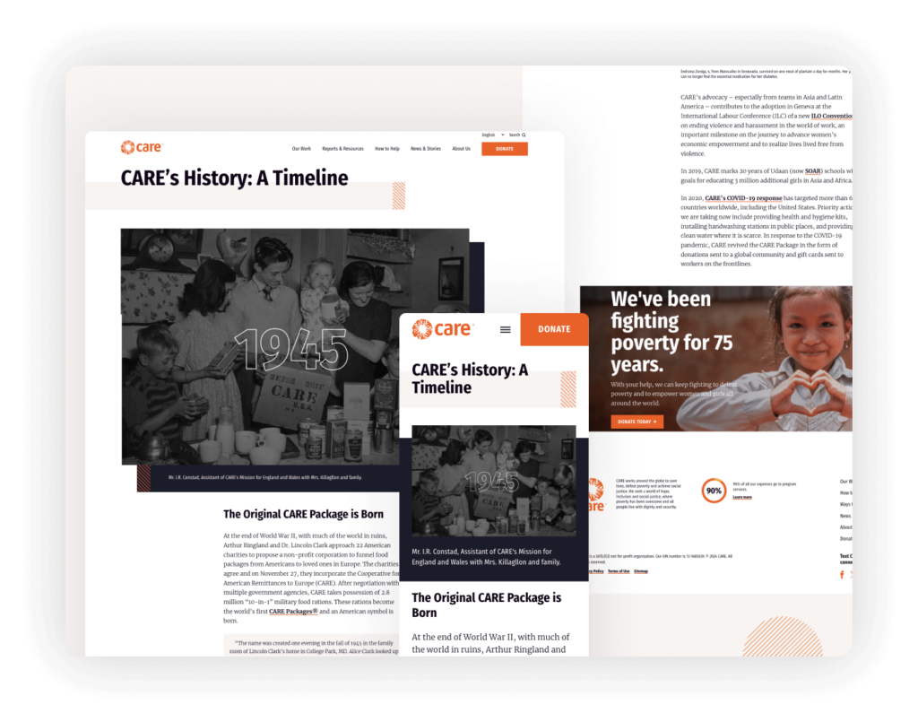
CARE’s website utilizes a bold design that effectively captures the attention of visitors, employing vibrant colors and compelling backgrounds that reflect the organization’s dynamic approach to global humanitarian efforts. The design not only enhances visual appeal but also helps to convey the urgency and scope of their work in a visually impactful manner.
Highlights: A standout feature on the site is the history section, which includes a beautifully crafted timeline. This timeline artfully narrates CARE’s long-standing commitment to fighting global poverty and aiding in emergencies. The use of chronological visuals and succinct text in this timeline allows visitors to easily understand and appreciate the organization’s evolution and major milestones.
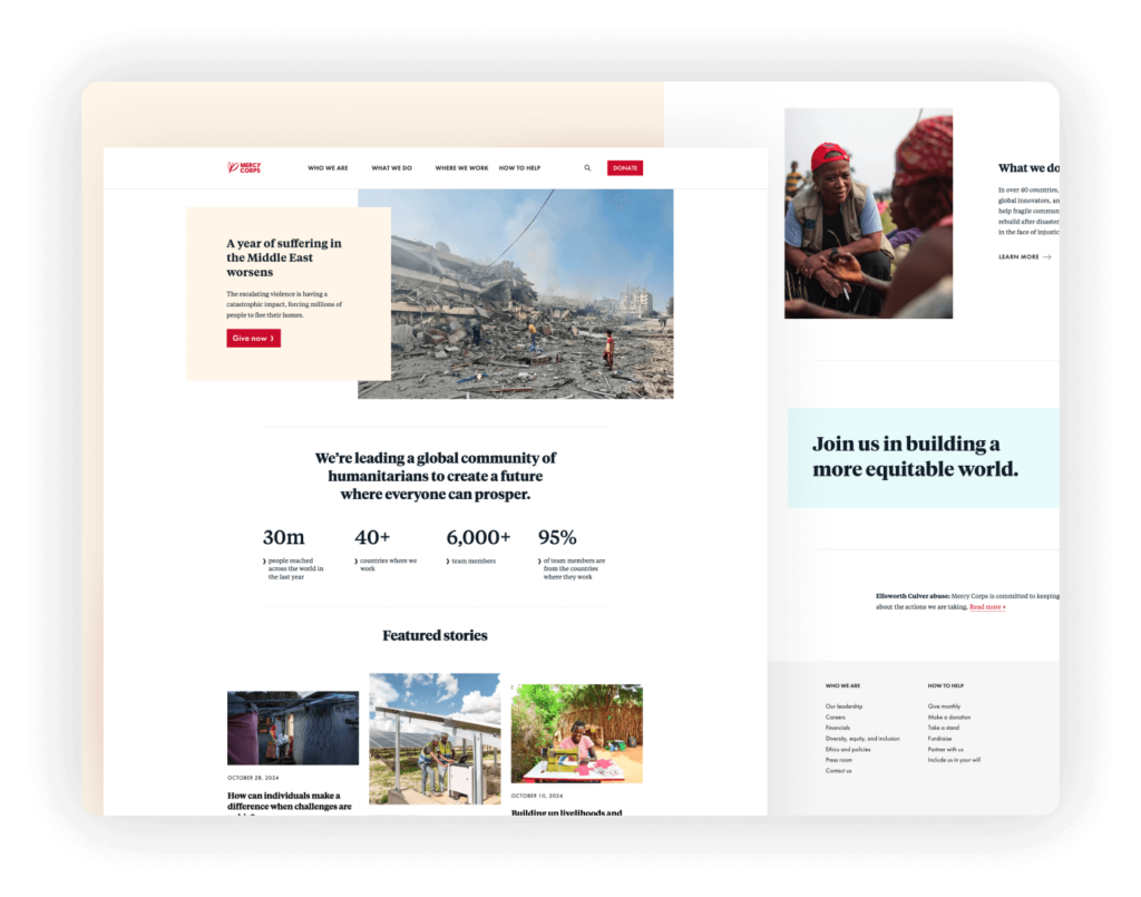
Mercy Corps’ website is a model of nonprofit web design, featuring a well-balanced color scheme that supports the organization’s message of hope and urgent action. The thoughtful use of white space gives users visual breaks, enhancing readability and focus while navigating through the site’s content.
Highlights: The website’s responsiveness is finely tuned for an optimal mobile experience, ensuring that users have access to information and can engage with the content effectively on any device. The use of outstanding photography captures the essence of Mercy Corps’ work, vividly portraying the impact of their global initiatives.
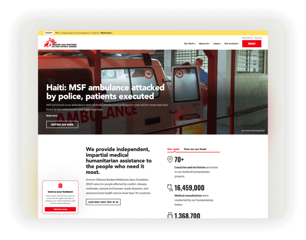
The Doctors Without Borders website integrates images seamlessly into its design, enhancing the visual storytelling that is central to conveying the urgency and impact of their medical humanitarian work. These images are not merely decorative but are integral to the structure and experience of the website, amplifying the message and emotional connection with visitors.
Highlights: The donation page stands out for its simplicity and effectiveness, featuring a prominent design that temporarily eliminates navigation to focus users solely on the donation process. Additionally, a thoughtfully designed survey popup on the homepage engages visitors immediately, gathering valuable feedback to improve user experience and service delivery.
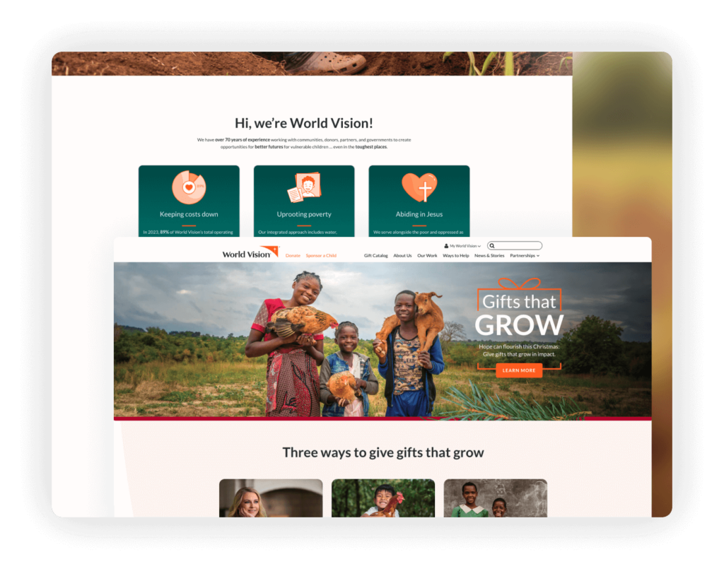
World Vision’s website excels at creating a sense of urgency, prominently displaying a donation appeal at the top of the homepage to immediately draw visitors’ attention to the need for support. The use of compelling, high-quality photos engages users emotionally, highlighting the direct impact of the organization’s work across the globe.
Highlights: The website skillfully incorporates illustrations that complement the photographic content, enriching the storytelling and visual appeal. Notably, it emphasizes that the majority of donations go directly to its programs, reinforcing the organization’s commitment to using funds effectively. Transparency credentials are clearly displayed in the footer, enhancing trust and accountability.
Youth
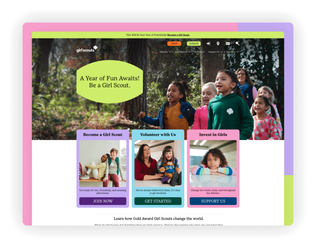
The Girl Scouts website stands out with its beautifully designed mega menu, which not only simplifies navigation but also visually engages visitors by showcasing the breadth of the organization’s programs and resources. The website uses a colorful and vibrant theme that reflects the energy and diversity of the Girl Scouts community.
Highlights: Prominent calls to action for the shop and donate functions are strategically placed, making it easy for visitors to support the organization financially or by purchasing merchandise.
HerStart by Youth Challenge International
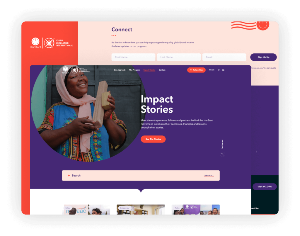
The HerStart website by Youth Challenge International captivates with a bold and engaging design that leverages large, impactful photos and a contrasting color scheme to draw attention to key elements. This design strategy effectively highlights the site’s calls to action, guiding visitors towards engagement opportunities and program participation.
Highlights: A beautifully integrated email signup box is strategically positioned to catch the eye of visitors, encouraging them to stay connected and informed. The highlight of the website is the ‘Impact Stories’ section, which showcases the profound effects of the program through compelling narratives and visuals. This section not only celebrates successes but also serves to inspire and motivate further support and involvement.
Junior Achievement of Southern California
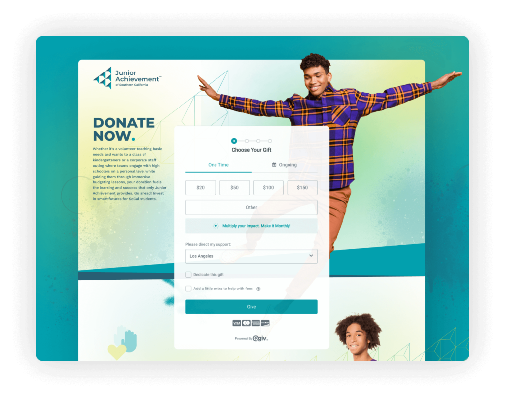
The new website for Junior Achievement of Southern California, crafted by Elevation, masterfully represents the organization’s vibrant brand and mission. Elevation’s design prioritizes accessibility, ensuring that all users can easily navigate and interact with the site. The engaging user interface is complemented by smooth animations and customized banners for each program, which enhance the visual appeal and clearly delineate the diverse offerings of JA.
Highlights: The website also features seamless integration with Qgiv for donation processing, simplifying the giving process and ensuring a smooth user experience. This integration, along with the tailored and dynamic design elements, effectively supports the organization’s fundraising efforts while providing a compelling online presence that truly embodies the spirit and objectives of Junior Achievement of Southern California.
Student Conservation Association (SCA)
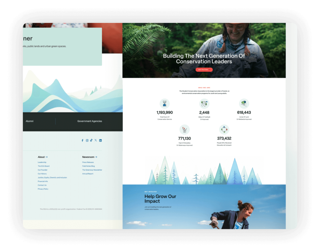
The SCA website features a modern, sleek design that not only looks great but also boasts excellent loading performance, ensuring a seamless user experience. The integration of beautiful images with the overall design enhances the visual appeal and effectively communicates the spirit of conservation and engagement that the organization promotes.
Highlights: The site also makes good use of nice illustrations that add a playful yet informative tone, helping to explain complex conservation concepts in a more digestible way. This thoughtful combination of images and illustrations ensures that the website is not only functional but also engaging and educational for its visitors.
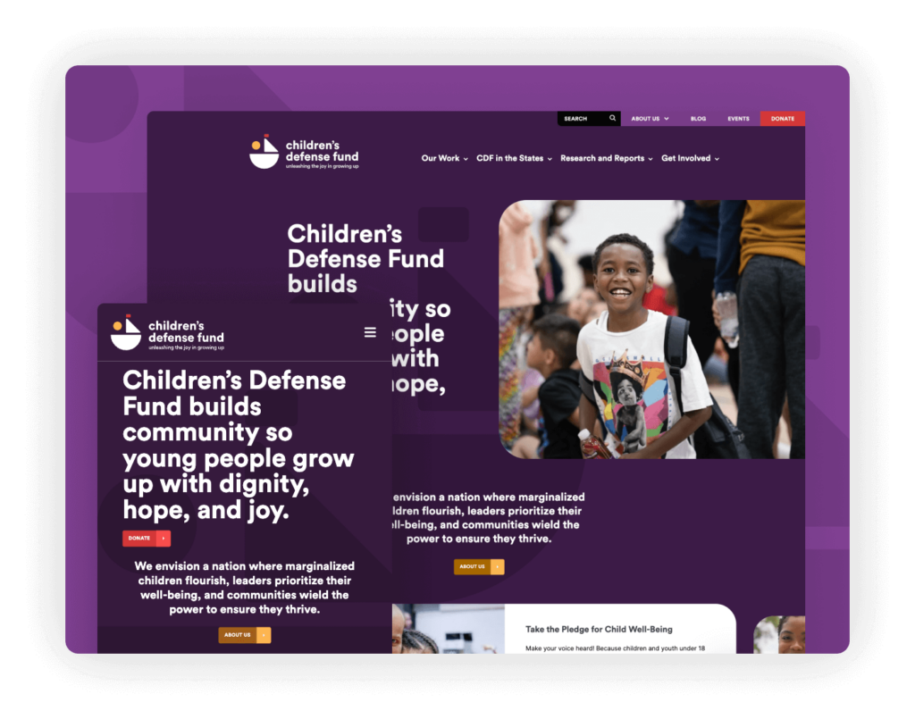
The Children’s Defense Fund website is a standout example of nonprofit web design, integrating the organization’s logo seamlessly within the site’s elements. The color palette is carefully chosen to maintain visual balance and harmony throughout the site, enhancing readability and aesthetic appeal. The contrast within the homepage sections is optimally tuned to ensure ease of reading, facilitating visitor engagement right from the first click.
Highlights: The footer of the website is particularly notable, generating trust through the inclusion of the organization’s EIN and transparency credentials like logos from accrediting bodies. Additionally, there’s a beautifully designed email signup feature that not only fits well within the overall design but also invites ongoing engagement by encouraging visitors to subscribe for updates.
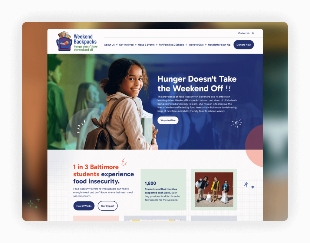
The Weekend Backpacks website boasts a playful design that effectively incorporates elements reflective of the organization’s mission to combat child hunger.
Highlights: The donation page is seamlessly integrated with Bonterra, enhancing the ease of the donation process. This integration ensures a smooth, user-friendly experience for donors, encouraging more frequent and generous contributions by minimizing hassle and maximizing convenience.

Playworks’ website is distinguished by its excellent navigation, making it easy for visitors to explore the wide range of programs and services offered. The layout is user-friendly and designed to ensure that information is accessible within a few clicks, enhancing the overall user experience.
Highlights: One of the standout features of the website is an interactive map that allows users to locate Playworks programs in their vicinity. This tool is not only functional but also engages visitors by connecting them with local resources directly. Additionally, the strategic display of partners and sponsors’ logos on the site underscores the collaborative nature of Playworks’ mission and emphasizes the breadth of their support network.
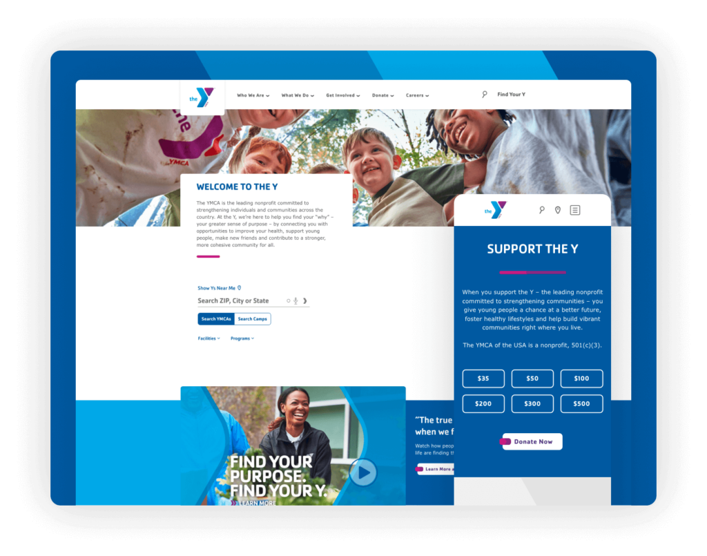
The YMCA website strikes a perfect balance between a vibrant, colorful brand presence and a clean, professional design. This effective design approach makes the site one of the standout examples in nonprofit web aesthetics, catering to a diverse audience while maintaining a unified and compelling visual identity.
Highlights: From the homepage, the site offers a straightforward and accessible way to support the organization, featuring preset donation amounts to streamline the giving process. Additionally, the YMCA website includes a critical directory/search feature, allowing users to easily find their local YMCA chapter. This functionality is essential for a community-based organization, as it directly connects users with local facilities, programs, and services, enhancing user engagement and fostering community involvement.
Animals/Wildlife
The Humane Society of the United States
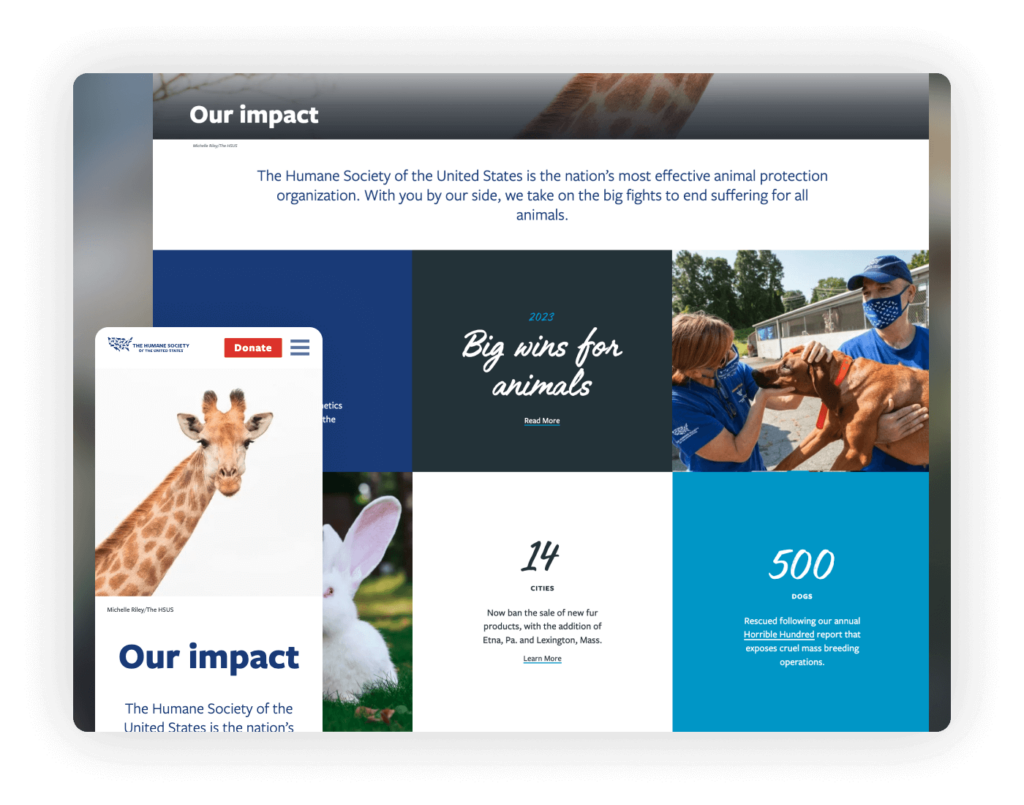
The Humane Society’s website sets a high standard for nonprofit online presence, particularly through its exceptional use of high-quality photography. Recognized as a leader in website design trends, the site showcases how powerful visual storytelling can significantly enhance user engagement and emotional connection.
Highlights: The impact section of the website is especially compelling. It features stunning, engaging photos combined with handwritten fonts that add a personal touch to the narratives of animal rescue and care. This section not only draws visitors in but also powerfully communicates the tangible effects of the organization’s work, making it a highlight for both new visitors and long-time supporters.
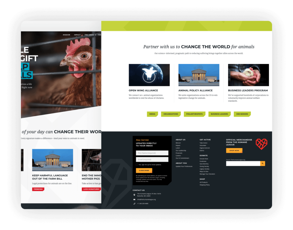
The Humane League’s website is a testament to modern nonprofit web design, prioritizing functionality and user engagement right from the start. The design smartly places accreditation and credentials above the fold, immediately establishing credibility and trust with visitors. Additionally, the inclusion of a straightforward and easily accessible donation box at the top of the page encourages immediate action without overwhelming the user.
Highlights: The site features one of the best designs in the nonprofit sector, characterized by a clean, contemporary aesthetic that appeals to a wide audience. A notable design feature is the sticky footer, which remains visible as users scroll through the site, consistently offering options to take action.
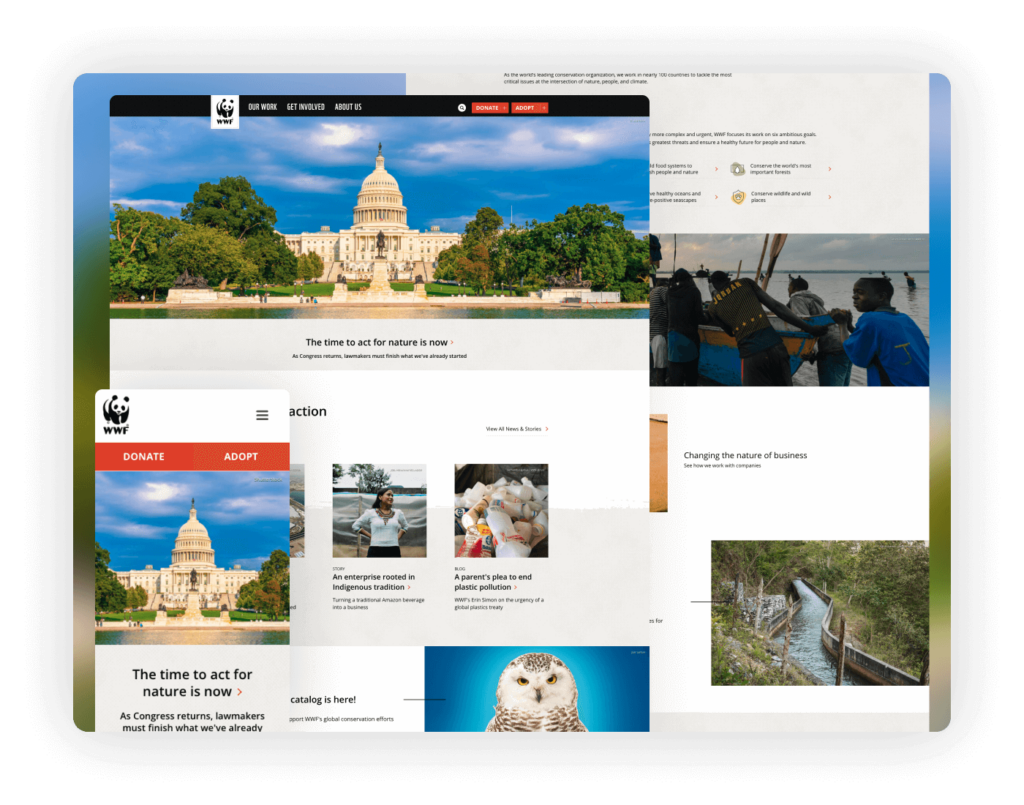
WWF’s website stands as a hallmark of nonprofit web design, prominently featuring one of the most recognizable logos in the nonprofit world. The site expertly balances stunning photography and illustrations with just the right amount of text to inform without overwhelming, creating a harmonious visual and informational experience.
Highlights: The navigation is elegantly simple, designed to guide users effortlessly through the site’s rich content and resources. It features two clear calls to action that are strategically placed to encourage donations and further engagement without detracting from the user’s experience.
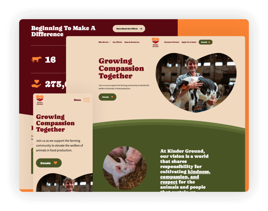
KinderGround’s website adopts a fresh, modern design by centering the logo within the header, effectively balancing the navigation links on the left with a clear call to action on the right. This layout not only enhances the visual appeal but also facilitates user navigation, making the site exceptionally user-friendly.
Highlights: The website’s color palette is beautifully curated, adding vibrancy and enhancing the overall user experience. Built on WordPress, KinderGround benefits from an easily updatable platform, ensuring that the site can remain current with the latest content and features.
Arts/Culture/Humanities
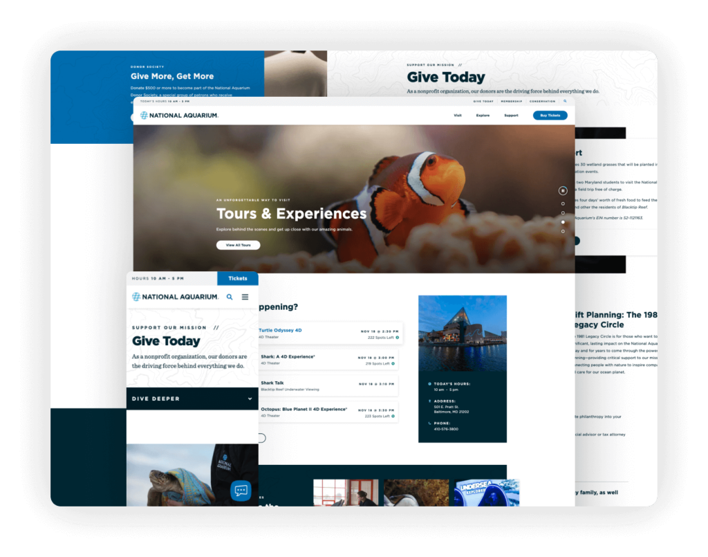
The National Aquarium’s website is thoughtfully designed with a focus on user engagement and functionality, prominently featuring a dynamic display of their schedule integrated with a real-time ticketing system. This setup not only shows current availability but also streamlines the ticket purchase process, making it central to the site’s design.
Highlights: While the website is centered around selling tickets, it also effectively emphasizes various support options, catering to different levels of involvement and contribution. The site’s design balances commercial needs with nonprofit goals, encouraging visitors not only to visit but also to support the aquarium in diverse ways.
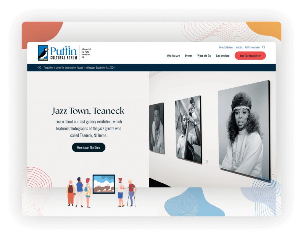
The Puffin Cultural Forum’s website showcases the prevalent trend of WordPress adoption within the nonprofit sector, demonstrating its cost-effectiveness and ease of maintenance. By using WordPress, Puffin avoids expensive software subscriptions while ensuring the website remains current and functional, a significant advantage for nonprofits looking to maximize their resources.
Highlights: The website features vibrant illustrations that effectively capture and convey the essence of Puffin’s mission, enhancing the cultural and artistic focus of the forum. The design prioritizes information dissemination over direct fundraising, catering to visitors interested in learning about and participating in the forum’s events and offerings.

Poet Lore’s website serves as an excellent example of how design can mirror mission, with a user interface that reflects the literary essence of America’s oldest poetry magazine. The careful use of typography and balanced imagery creates a clean and inviting online space that appeals directly to readers and writers alike.
Highlights: The design emphasizes clarity and simplicity, directing visitors towards a clear call to action: to subscribe. This focused approach ensures that users are not distracted by extraneous elements but are guided towards engaging more deeply with the publication through subscription.
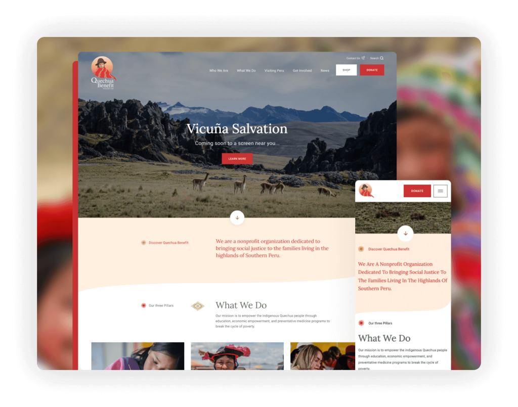
Designed by Elevation, the Quechua Benefit website features a calm and earthy color palette that beautifully reflects the organization’s mission to improve the lives of Peru’s Quechua people. This design choice not only complements the cultural essence of their mission but also creates a soothing visual experience for visitors.
Highlights: Immediately below the banner, the site presents a clear and concise statement of its mission, effectively communicating its goals at a glance. The use of authentic images throughout the site tells the story of the community and the organization’s impact with great clarity. The website also focuses on essential calls to action, such as ‘Shop’ and ‘Donate,’ with clean navigation that prioritizes these options. Additionally, the site is optimized for mobile devices, ensuring that it delivers a stunning and functional experience across all platforms, which is essential for reaching a broader audience and facilitating engagement and support.
Conservation/Environment
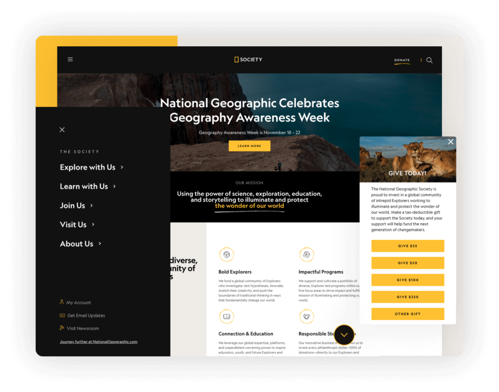
The National Geographic Society’s website is instantly recognizable with its iconic black and yellow branding, a nod to its long-standing heritage in exploration and storytelling. The site adopts a mobile-first design philosophy, prioritizing the user experience on smaller screens to ensure accessibility and engagement across all devices.
Highlights: The website features a well-implemented hamburger menu that streamlines navigation while keeping the design clean and focused. Notably, the ‘Donate’ button is isolated within this menu, making it stand out and effectively calling users to action. Additionally, the inclusion of a ‘Give Today’ slide box on mobile and desktop versions simplifies the donation process, enhancing the user experience by making it easy and quick to support the organization’s missions.
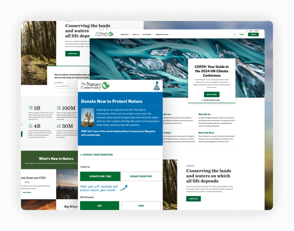
The Nature Conservancy’s website stands out as a leader in web design trends for nonprofits, skillfully balancing a simple color palette with creative elements to captivate and educate its audience. The design utilizes these subdued tones not just for aesthetic harmony but also to enhance the impact of its visual storytelling.
Highlights: The homepage is particularly striking, featuring stunning photography that powerfully illustrates the organization’s conservation efforts and the natural beauty they strive to protect. These images play a crucial role in drawing visitors deeper into the site. The donation page itself is remarkably well-crafted, resembling a piece of art that gracefully guides potential donors through the giving process.
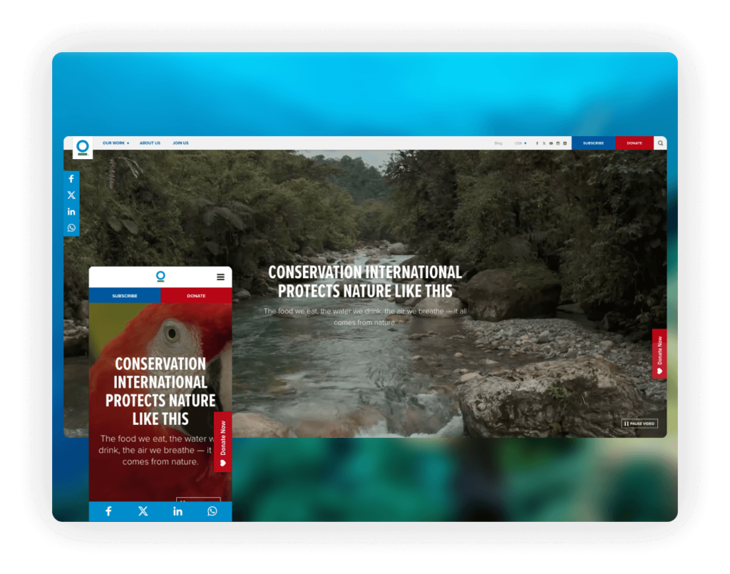
Conservation International’s website captivates from the first glance with a beautiful video banner that immerses visitors in the organization’s mission to protect nature. This dynamic introduction sets the tone for the entire site, emphasizing the urgency and global scale of their work.
Highlights: The website emphasizes social media sharing options, encouraging visitors to spread the word about conservation efforts, thus extending the reach of their message. Calls to action are clear and strategically color-coded: red for donating and blue for subscribing, which simplifies user decisions and guides them towards engagement. The navigation is straightforward, allowing easy access to essential information without overwhelming visitors. Additionally, the site employs One Trust for its cookie policy management, ensuring compliance and transparency in how visitor data is handled, enhancing trust and security for all users.
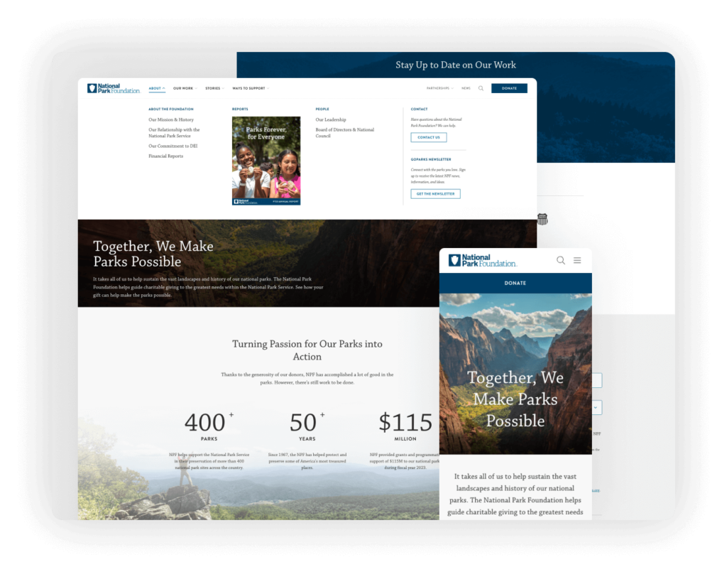
The National Park Foundation website features a beautifully integrated design where the menu seamlessly converges with the banner image, creating a visually stunning first impression that enhances the overall aesthetic of the site. This integration allows the navigation elements to blend naturally with the page visuals, providing a cohesive user experience.
Highlights: The use of a mega menu is particularly effective, incorporating images that not only draw attention but also make the navigation experience more intuitive and engaging. The homepage also strategically showcases the Foundation’s partners, highlighting the collaborative efforts that support the parks. Additionally, the leadership section is excellently designed to showcase the people behind the organization, offering a personal touch that helps build trust and connection with visitors.
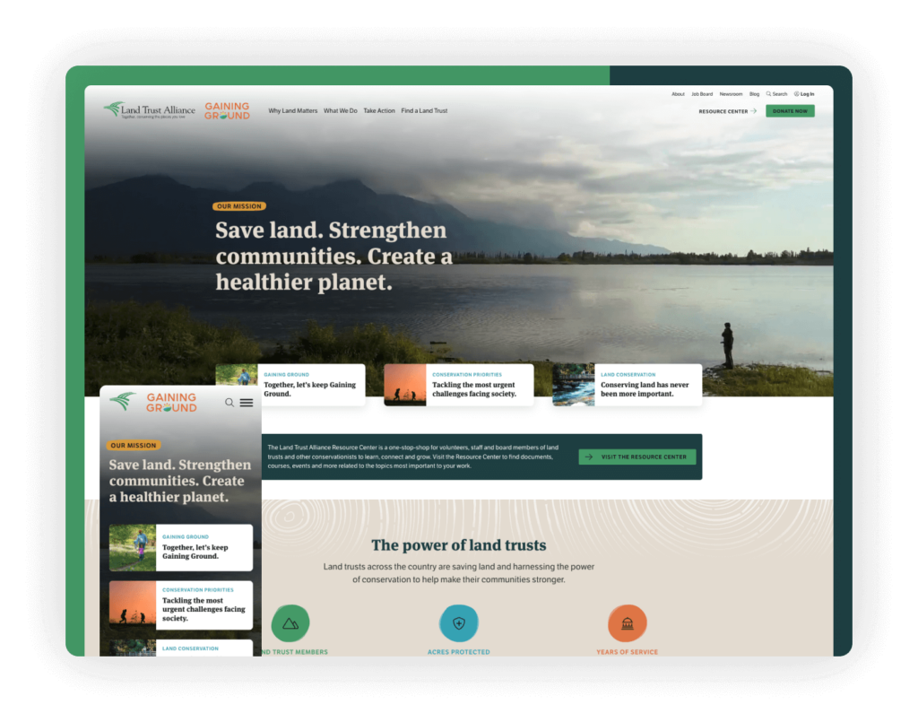
The Land Trust Alliance website excels in adaptability, providing a seamless user experience across various devices. Its responsive design adjusts modules and elements dynamically, ensuring that content is displayed optimally whether on desktop, tablet, or mobile. This approach prioritizes accessibility and user engagement, no matter the device used to access the site.
Highlights: A standout feature is the wide, full-screen video banner that serves as a background behind the site’s navigation. This design choice not only enhances the aesthetic appeal but also immerses visitors in the visual narrative of land conservation. The integration of video with navigation elements creates a dynamic and inviting user experience that effectively communicates the mission and impact of the Land Trust Alliance, encouraging deeper interaction and engagement from site visitors.
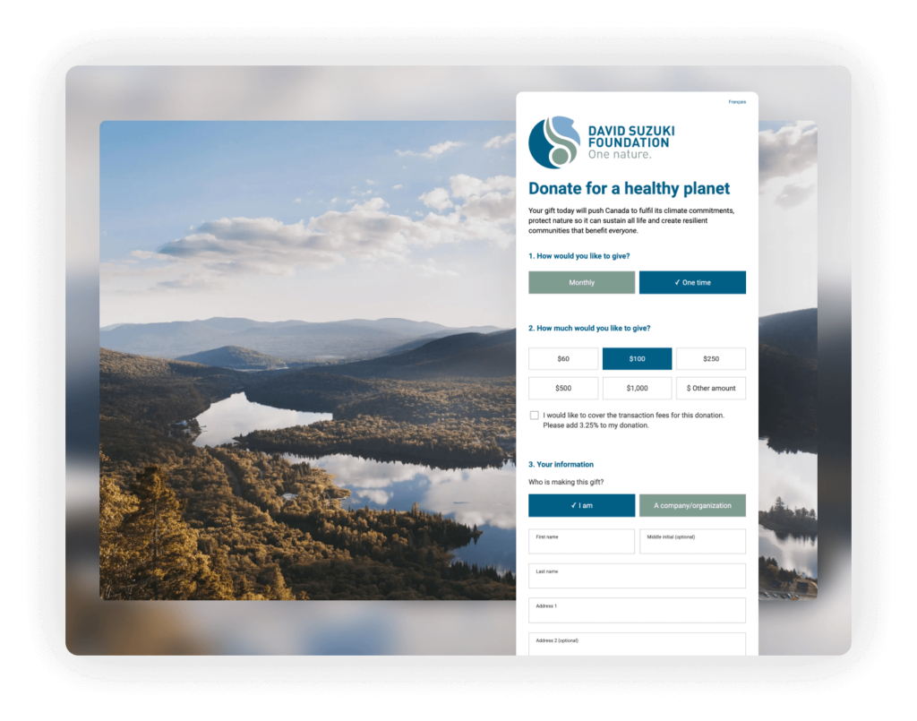
Designed by Briteweb and built on WordPress, the David Suzuki Foundation website showcases a distinctive and visually engaging online presence. One of the notable design elements is the unique, image-only menu, which not only simplifies the interface but also enhances the visual impact of the site, making navigation both intuitive and aesthetically pleasing.
Highlights: The donation page of the website is particularly well-executed, featuring a fixed image that remains in view as users scroll through the donation process. This design choice focuses the user’s attention and reduces distractions, creating a more immersive and streamlined giving experience.
Government/Political Advocacy/Social Justice
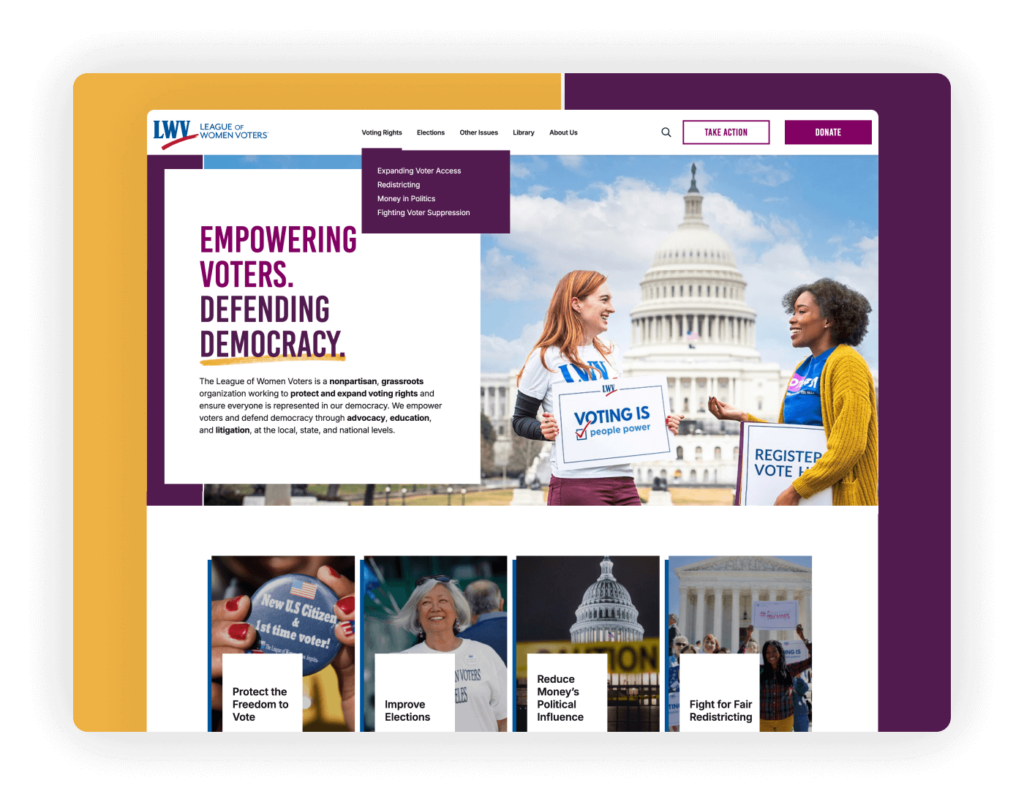
The League of Women Voters’ website stands out with its bold brand representation, where the vibrant and perfectly combined color scheme complements the organization’s mission to empower voters and defend democracy. The engaging image on the banner captures the essence of their advocacy work, drawing visitors in from the moment they land on the page.
Highlights: The site features a sticky menu that remains visible as users scroll, providing constant access to navigation and clear calls to action, including key engagement options like “Donate” and “Take Action.”
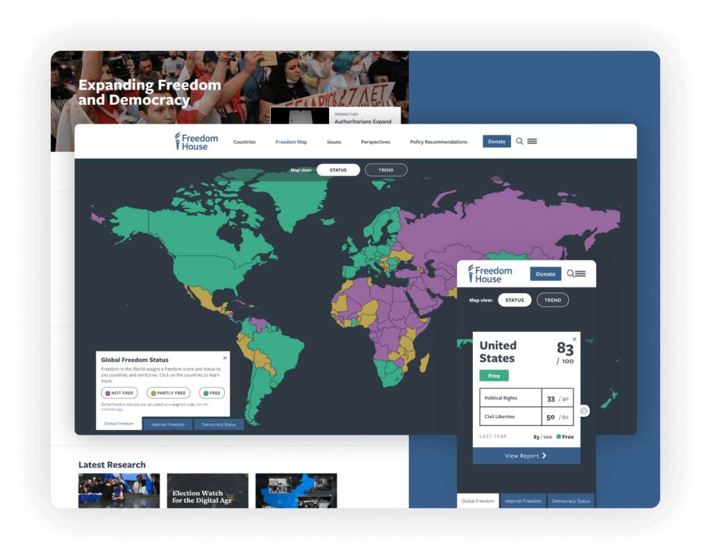
Freedom House’s website adeptly manages the complexity of its extensive content through a streamlined navigation system, incorporating a hamburger menu that tidily consolidates links and resources. This approach simplifies user interaction, making it easy to navigate the site’s vast repository of information on global freedoms and human rights without overwhelming the visitor.
Highlights: A standout feature of the website is its interactive map, which serves as a central tool for visitors to explore the state of freedom around the world. This map is not only a powerful visual tool but also an exceptional example of integrating user interface design to enhance user experience.
World Resources Institute (WRI)
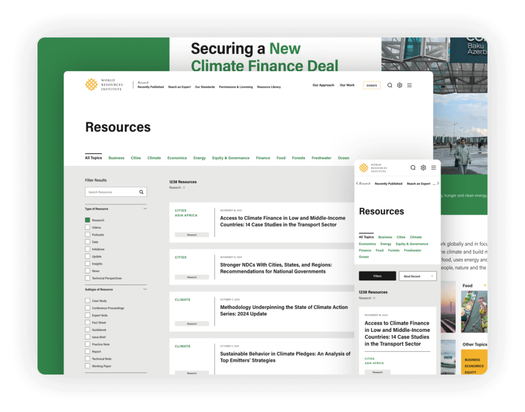
The WRI website features a unique and thoughtful design approach to its homepage banner, effectively utilizing half the screen for a compelling image that draws in visitors. The remaining half cleverly displays essential content including hero text and the main menu, which overlays the image without obscuring its impact. This layout not only maximizes visual engagement but also ensures that critical information and navigation tools are immediately accessible.
Highlights: A particularly innovative feature of the site is its “filter by topic” function, a tool not commonly found on similar sites. This feature allows users to tailor the content they view, from data and resources to news articles, according to specific topics of interest. This functionality enhances the user experience by simplifying access to relevant information and enabling visitors to more deeply engage with the content that matters most to them.
Colorado Evaluation and Action Lab (Colorado Lab)
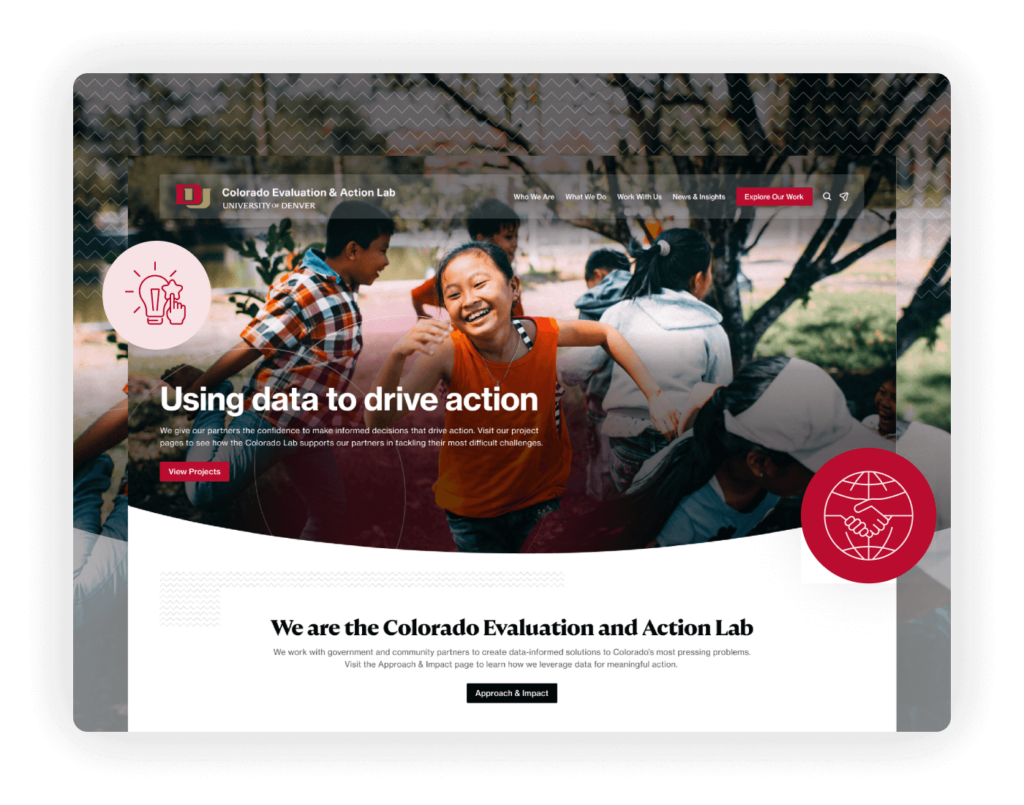
The Colorado Lab website exemplifies an educational style that combines elegance and functionality. The design keeps the user interface sleek and accessible, fostering a sense of trust and professionalism that reflects the organization’s scholarly and data-driven approach to public policy and social research.
Highlights: One notable design element is the transformation of the site’s menu and navigation system into a sticky menu format. As users scroll down the page, the navigation bar remains at the top of the screen, ensuring that essential links are always accessible, regardless of where users find themselves on the site. This feature not only improves usability but also enhances the overall user experience by providing continuity and ease of navigation.
Healthcare
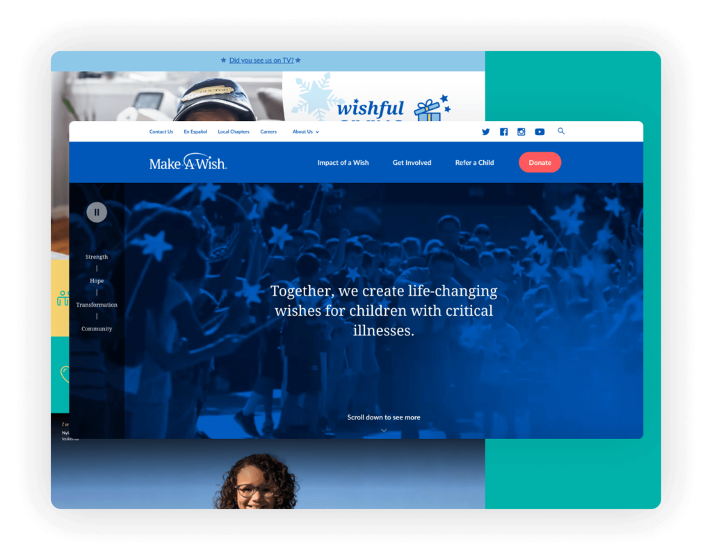
Make-A-Wish America’s website is skillfully designed with functionality and aesthetic appeal in mind. The homepage features a prominent “Donate Now” button, ensuring that the call to action is clear and accessible, facilitating immediate engagement from visitors. The navigation is straightforward, emphasizing simplicity and cleanliness, which enhances the user experience by making it easy to explore the site’s rich content.
Highlights: The impact section of the website is particularly striking, combining colorful illustrations and large, easily readable numbers that effectively communicate the significant achievements of the organization. Additionally, the “Donate Now” button includes a creative animated representation of the Make-A-Wish logo, which not only captures attention but also enhances the appeal of contributing to the cause. This thoughtful design element adds a dynamic touch to the donation process, making it more engaging and inviting for users looking to support the organization’s mission.
Children’s Organ Transplant Association (COTA)
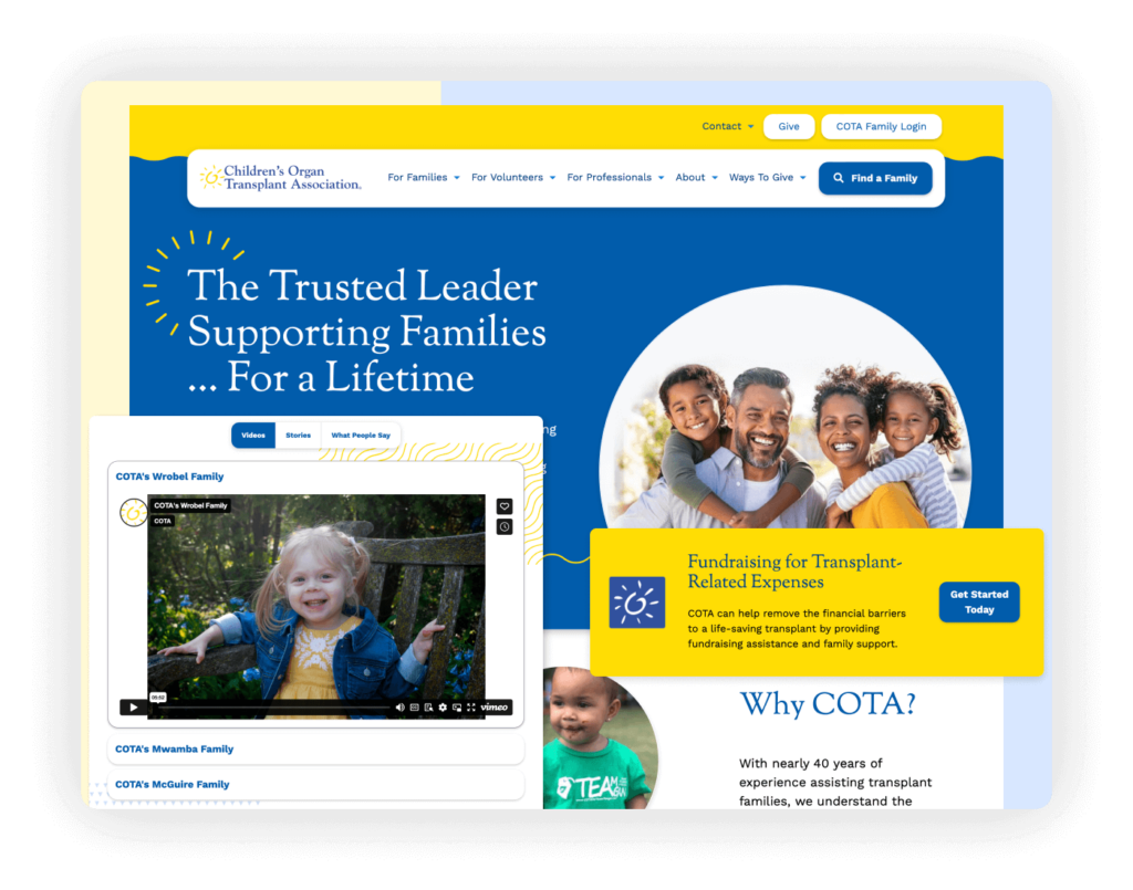
COTA’s website is highly effective in its fundraising approach, with a design that prioritizes accessibility and the strategic use of colors that resonate with its mission. The color palette is not only visually pleasing but also functional, helping to guide visitors through different sections and calls to action seamlessly.
Highlights: From a user experience perspective, the website excels in readability. The layout is clean and organized, allowing for easy navigation and quick comprehension of the information presented. This clarity is crucial for helping visitors understand COTA’s mission, the importance of organ transplantation, and how they can contribute or benefit from the organization’s services.
Personal Genetics Education Project (pgEd)
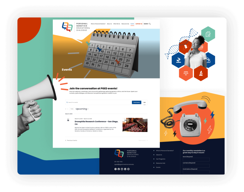
pgEd’s website masterfully represents its brand throughout the design, capturing the essence of their mission to advance personal genetics education. The aesthetic blends a creative and thoughtful mix of color with black and white photography, establishing a visually appealing contrast that draws attention while remaining elegant and informative.
Highlights: A standout feature on the homepage is the innovative display of upcoming events. This section is strategically placed to keep visitors informed of pgEd’s active engagement in community education and outreach. The layout and presentation of this section not only enhance the website’s functionality but also contribute to its dynamic and interactive feel, encouraging users to explore further and participate in pgEd’s educational initiatives.
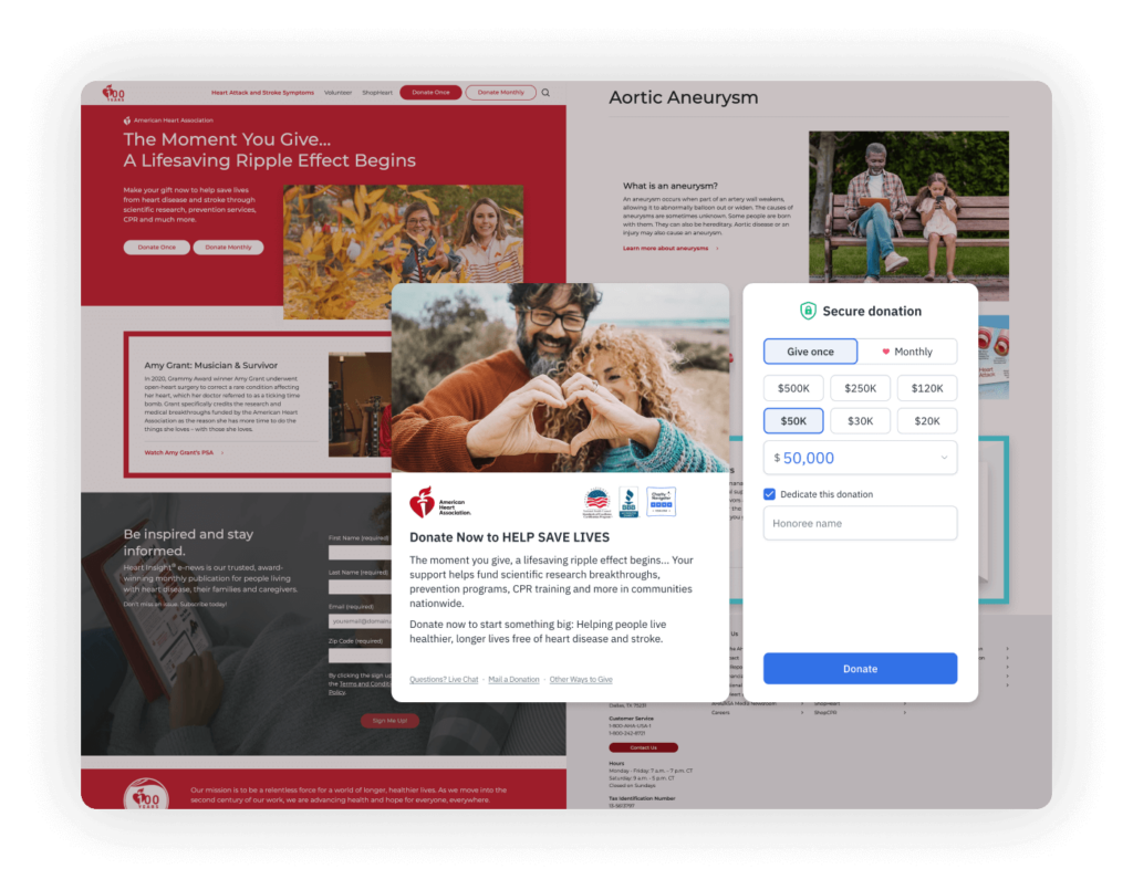
The American Heart Association’s website excels in providing a user-friendly donation experience, utilizing Fundraise Up to streamline and enhance the process. This platform is known for its effective, engaging interface that simplifies the donation procedure, making it seamless for users to contribute.
Highlights: Despite being content-rich, the website maintains a well-balanced layout that organizes information in an accessible and digestible manner. The strategic use of space and well-thought-out design ensure that users can easily navigate through the extensive resources, health advice, and research updates without feeling overwhelmed.
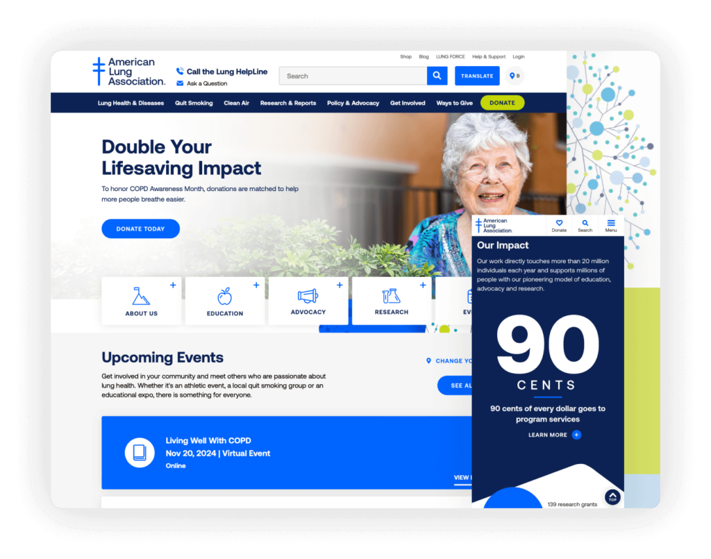
The American Lung Association’s website effectively utilizes large numbers and bold statistics to quickly communicate key information about lung health and the impact of their work. This visual emphasis on data helps convey the urgency of their mission and the tangible results of their initiatives.
Highlights: The website features a prominently displayed “Upcoming Events” section on the homepage, which is not only informative but also encourages community involvement and awareness. The design’s responsiveness across mobile devices is exemplary, ensuring that content is accessible and engaging regardless of how users access the site. Additionally, the use of contrasting colors throughout the website enhances readability and visual appeal, making it easy for visitors to navigate the site and absorb important information.
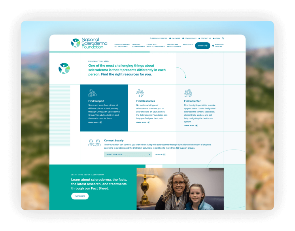
The Scleroderma Foundation’s website effectively manages its extensive content through a well-organized navigation system, ensuring that a vast array of resources is accessible and digestible for its audience. The design embodies the appropriate look and feel of a healthcare website, with a professional and reassuring aesthetic that communicates trust and credibility.
Highlights: The website supports multilingual content, making it accessible to a broader audience and demonstrating the Foundation’s commitment to inclusivity and global outreach. Built on WordPress, the site benefits from flexible and robust content management capabilities, allowing for easy updates and maintenance. This ensures that users always have access to the latest information and resources, crucial for a health-related nonprofit.
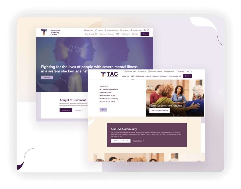
The Advocacy Center’s website, enhanced by Elevation, features an exceptionally well-crafted logo that effectively embodies the organization’s mission and ethos. The site’s color palette is striking, using bold and vibrant colors that grab attention while also making navigation intuitive.
Highlights: The website incorporates a beautifully designed mega menu that not only enhances the visual appeal but significantly improves the user experience by organizing a large amount of content in an accessible and aesthetically pleasing manner. This design choice facilitates easy exploration of the site’s resources, making information readily available to visitors. The combination of a thoughtful layout, striking design elements, and a user-friendly interface makes TAC’s website a standout platform that effectively communicates its advocacy messages and engages its audience.
Housing
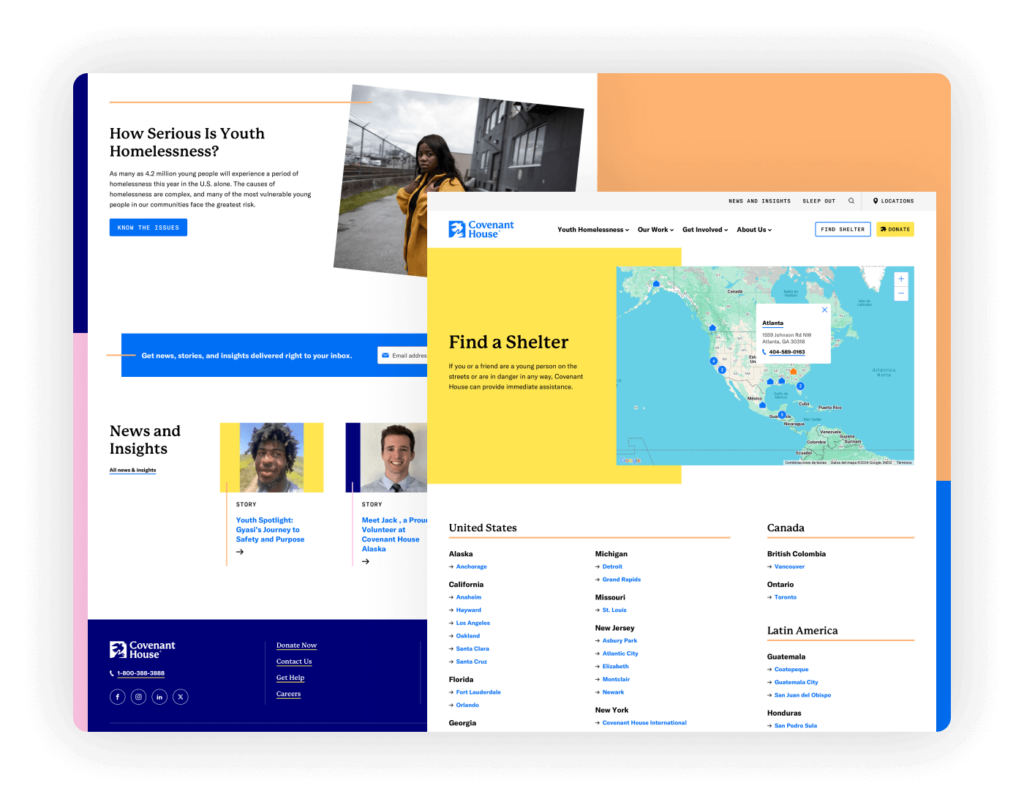
This nonprofit website is meticulously designed to clearly present multiple calls to action, each crafted to engage visitors in various ways that support the organization’s mission. This approach allows users to easily navigate their options, whether they’re inclined to donate, find a shelter, or find more information. The site’s use of a video banner effectively captures the essence and urgency of Covenant House’s work, drawing users into the narrative and encouraging deeper interaction.
Highlights: One of the most valuable features is the interactive “Find a Shelter” map, which is crucial for youths seeking immediate help. This tool demonstrates the organization’s broad reach and readiness to assist, making the support they offer readily accessible.
Habitat for Humanity of Lake County
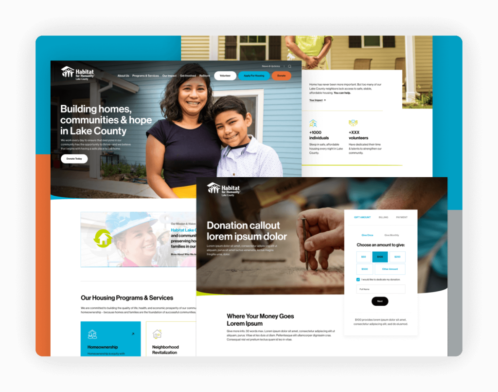
The Habitat for Humanity of Lake County website skillfully uses its homepage banner to communicate the organization’s mission. The banner features an evocative image that visually represents Habitat’s commitment to building homes and communities, immediately grounding visitors in the impactful work being done. The navigation is seamlessly integrated into the banner, providing a modern look that incorporates various calls to action, making it easy for users to navigate and engage with the site’s content.
Highlights: The site’s loading design adds an element of visual interest and professionalism, enhancing the user experience right from the start. The donation page is particularly well-executed, including all the necessary elements to build trust among potential donors.
LGBTQIA+
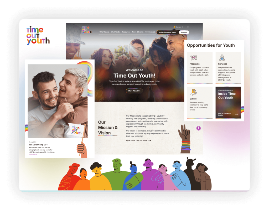
Crafted by Elevation, the Time Out Youth website showcases a standout example of brand representation tailored to an LGBTQ+ youth organization. Built on WordPress, the platform offers flexibility and ease of updating content, crucial for maintaining engagement and relevance. Elevation’s design beautifully encapsulates the organization’s identity through vibrant colors and dynamic visuals that resonate with its young audience.
Highlights: The website features a custom-designed logo that aligns seamlessly with the organization’s mission and community focus. The background, illustrations, and images are expertly matched, creating a cohesive and inviting online environment. This design coherence extends throughout the site, ensuring that every element contributes to a unified brand experience that supports Time Out Youth’s objectives of inclusion and support for LGBTQ+ youth.
Reconciling Ministries Network
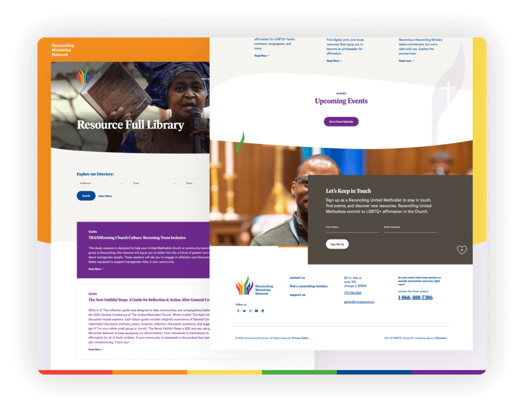
The Reconciling Ministries Network website stands out with its colorful and inclusive design that effectively represents its mission to advocate for LGBTQ+ rights within the religious community. The site’s accessibility features are top-notch, ensuring that all visitors, regardless of ability, can navigate and interact with the content seamlessly.
Highlights: The resource library section is exceptionally well-designed, featuring an engaging layout that makes it simple for users to locate and access a wide range of materials and resources. This ease of use is crucial for fostering education and engagement among the site’s visitors. Additionally, the email signup is smartly integrated on the homepage, paired with a compelling image that enhances visual appeal and draws attention to the signup form.
Bonus Resources: 7 Key Tools to Jumpstart Your Nonprofit’s Website Strategy
Creating a nonprofit website that resonates with your audience requires a thoughtful, strategic approach. From a strong design foundation to accessible features, the following six elements are essential for a nonprofit website that effectively serves its purpose.
1. RFP Template: Simplify the Hiring Process
What it is: A Request for Proposal (RFP) template tailored for nonprofits looking to hire a web design team.
Why it’s important: A well-crafted RFP clearly outlines your project’s goals, timeline, and budget, making it easier to find the right partner. This ensures that you attract agencies that are a good fit for your organization and can deliver on your expectations.
How to use it: Customize the template to reflect your project’s specific needs and share it with agencies you’re considering. A clear RFP prevents miscommunication and streamlines the selection process.
Learn more about creating a nonprofit website RFP, or get started
right away by downloading our template!
2. Best Nonprofit Web Design Agencies: Get Expert Help
What it is: A curated list of web design agencies that specialize in nonprofit websites.
Why it’s important: Working with a design agency that understands the specific needs of nonprofits can save you time and energy. These agencies are experts in creating mission-driven sites that boost engagement and drive donations, all while keeping budget constraints in mind.
How to use it: Review and reach out to agencies that align with your vision and budget. Having professionals guide the process can make the experience smoother and ensure your website is effective from the start.
Visit the top nonprofit web design agencies
3. Moodboard: Define Your Visual Identity
What it is: A moodboard is a collection of images, colors, fonts, and other visual elements that capture the tone and style of your brand.
Why it’s important: Before you dive into design, it’s essential to clarify the look and feel of your website. A moodboard helps you organize your ideas and visually communicate your nonprofit’s identity to your web designer. It also ensures consistency across your digital presence.
How to use it: Create a moodboard that includes your brand colors, inspiring photos, typography, and design elements. Use it as a reference throughout your website build to keep everyone aligned.
Download a our nonprofit website moodboard template or explore tools like Canva or Adobe Spark to create your own moodboard.
4.How to Drive Immediate Traffic to Your Website: Google Ads Grants
What it is: A focused strategy to leverage Google Ads Grants for increasing traffic to your nonprofit’s website.
Why it’s important: After launching or redesigning your site, it’s crucial to attract visitors quickly. Utilizing Google Ads Grants can help your organization reach potential donors and supporters effectively.
How to use it: Apply for Google Ads Grants, which provides eligible nonprofits with free advertising on Google. Create targeted ad campaigns that align with your mission, focusing on relevant keywords and engaging ad copy to drive immediate traffic to your website.
Access your guide to leveraging Google Ads Grants for your nonprofit’s website.
5. Accessibility Guidelines: Make Your Site Inclusive
What it is: A step-by-step guide to implementing accessibility features based on the Web Content Accessibility Guidelines (WCAG).
Why it’s important: Ensuring that your website is accessible means that everyone, including people with disabilities, can navigate and engage with your content. Following accessibility standards also protects you from legal risks and demonstrates your commitment to inclusivity.
How to use it: Check your site against the provided guidelines to ensure all users have equal access to your content. Focus on elements like alt text for images, keyboard navigation, and color contrast.
Download the website accessibility checklist.
6. Content Planning Worksheet: Organize Your Message
What it is: A worksheet that helps you map out all the content for your website, from homepage messaging to blog posts and donor pages.
Why it’s important: Content drives engagement. This worksheet helps you strategically plan what goes where on your site, ensuring that every page aligns with your mission and goals. A well-organized content plan ensures that visitors find the information they need and are inspired to take action.
How to use it: Use the worksheet to plan content for each section of your website. Be clear on your calls to action, messaging tone, and any donor engagement strategies.
Download your content planning worksheet.
7. SEO Checklist: Optimize for Search Engines
What it is: A comprehensive checklist designed to help you optimize your site for search engines, ensuring better rankings and more organic traffic.
Why it’s important: Search engine optimization (SEO) is critical to making sure your nonprofit is discoverable online. An optimized site helps you attract more visitors organically, whether they’re searching for your cause or looking for ways to get involved.
How to use it: Follow the checklist to ensure your content, meta tags, images, and site structure are fully optimized for search engines. Implementing these tips will drive more traffic and help your site reach a wider audience.
Download your SEO checklist for nonprofits.
With these seven tools, you’ll have everything you need to build a strong, strategic foundation for your nonprofit’s website. Whether you’re gathering ideas, hiring a team, or planning content, these resources will save you time and help you create a site that amplifies your mission.
