Attract More Donors With a Seamless Donation Page Experience
Picture this: A potential donor discovers your organization and feels moved by your cause. They arrive at your donation page ready to contribute but encounter a confusing, slow, or poorly designed page. Chances are, they’ll abandon their effort. It’s not an ideal scenario, but sadly, it happens.
A poor user experience can be a serious donation killer –– in a study of nonprofit websites, it was discovered that 47% of donation abandonment cases were due to usability problems relating to page and site design, including unintuitive information architecture, cluttered pages, and confusing workflow. The good news is that you can prevent this problem by creating a more user-friendly donation page for your visitors.
Why User Experience Matters
A seamless donation experience isn’t just nice to have—it’s a must for maximizing contributions. Creating a better user experience can increase conversion rates by up to 400%. By removing barriers and creating a page that resonates emotionally, you can increase giving rates and build stronger relationships with your supporters.
In this guide, we’ll walk through the key elements of an effective donation page, explore best practices for design and functionality, and share tips to enhance donor engagement.
Understanding the Key Elements of a Donation Page
To set up a donation page that works, focus on these essential elements:
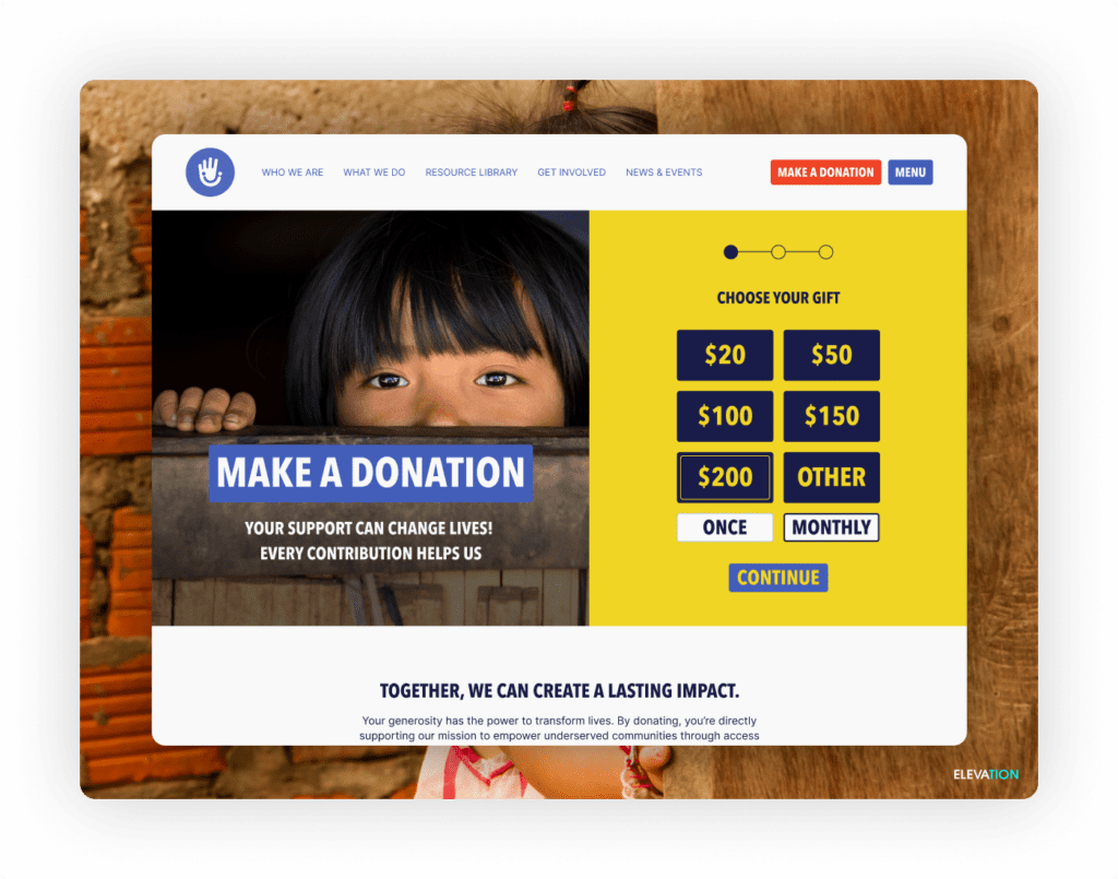
- Clear and Compelling Call-to-Action (CTA): Your visitors should understand exactly what to do, so ensure your CTA leaves zero room for doubt. Use actionable language like “Support Our Mission,” “Donate Now,” or “Give Hope Today” on a clickable button that takes them to the next step. Place your CTA prominently at the top and bottom of the page so it’s immediately visible and accessible.
- Minimalist Design: When it comes to designing a donation page for a nonprofit, less is more. A clutter-free layout keeps the focus on the giving process. Use ample white space, concise text, and easy-to-read fonts to ensure donors aren’t distracted or overwhelmed.
- Multiple Payment Options: Not everyone uses the same payment methods. Providing multiple options—credit card, PayPal, bank transfers, digital wallets—makes giving accessible to a broader audience.

Best Practices For Design and Functionality
Your donation page’s design and functionality go hand in hand. Here’s how to optimize both:
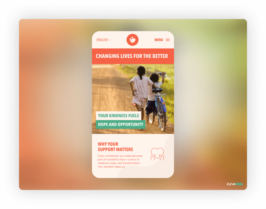
- Mobile Optimization and Responsive Design. 57% of nonprofit website traffic came from mobile devices. If your fundraising page isn’t mobile-friendly, you risk tanking your first impression with visitors and possibly losing a significant chunk of potential contributions. Ensure your page is responsive, loads quickly, and offers a smooth experience across all devices.
- Suggested Donation Amounts. Many donors may be unsure about how much to give. Pre-set donation amounts, such as $25, $50, or $100, can provide helpful guidance to donors. You can even add helpful benchmarks like “$20 feeds two shelter pets for a week” or “$50 funds holiday gifts for a child in need” so donors can understand the direct impact of their contributions. Include a custom amount field for those who want to give more.
- Secure and Trustworthy Checkout Process. Donors need to feel confident that their personal and financial information is safe. Use a secure HTTPS connection, display trust badges, and work with reliable payment processors to reassure your donors. The smoother and safer your checkout process, the more likely donors are to complete their transaction.
Enhancing Donor Engagement
Once you’ve nailed the basics, it’s time to focus on creating an emotional connection. Appealing to your audience’s humanity is critical for encouraging donations.
- Storytelling and Visuals. A picture is worth a thousand words, and images can be one of the most evocative motivators for change. Use visual storytelling to share the impact of your work. For instance, you might feature a short video of a beneficiary sharing their story or a before-and-after photo illustrating how your organization changed lives. Keep your visuals authentic and aligned with your message.
- Donor Testimonials and Impact Statements. Testimonials from past donors or beneficiaries build trust and credibility. Highlight testimonials from previous donors, beneficiaries, and volunteers that illustrate how contributions are making a difference. Seeing others give and the tangible results of those gifts motivates new donors to join in.
- Recurring Donation Option. One-time donations are great, but recurring donations create steady, reliable contributions for your organization. Make it easy for donors to set up monthly or yearly donations on your donations page, and emphasize how sustained giving amplifies their impact.
Test, Optimize, Iterate
Your donation page isn’t set in stone –– it’s an ongoing project. Even the best-designed pages can benefit from continuous improvement. Use tools like A/B testing to determine what resonates and what falls flat. Monitor your page’s performance using metrics like bounce rates, conversion rates, and average donation amounts. Experiment with elements like CTA wording, colors, or donation amounts to see what’s working and where you can make adjustments.
Build a Donation Page That Inspires Action
Your donation page is a gateway to meaningful change. Clarity, functionality and emotional resonance are the key ingredients for attracting support for your nonprofit. By combining intentional design, engaging storytelling, and seamless functionality, you can create a page that not only drives contributions but also deepens connections with your donors.
Start implementing these tips today, and watch as your optimized donation page drives contributions and connects you with lifelong supporters.


