Who is at the forefront of digital marketing for nonprofits? Our list of some of today’s leading organizations explores what makes their nonprofit marketing plans so effective. Whether you need to increase your organization’s visibility online, seek inspiration for your nonprofit advertising, or are looking for fresh marketing ideas for nonprofits, check out the work of these NGOs.
The first few examples reference the current COVID-19 crisis, but the nonprofit marketing strategy behind them is timeless. For related resources, you might also want to look at our growing Nonprofit COVID-19 Resource List, get tips for optimizing your Google Grant management, or receive advice from Julia Campbell in her free webinar on social media strategy.
We hope you enjoy learning from these organizations that are doing fantastic work and paving the way for nonprofit digital marketing.
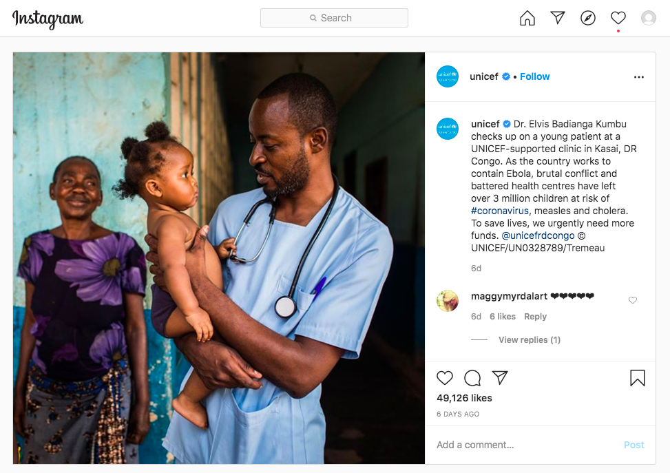
1. UNICEF — Lesson: Name individuals
Unicef’s work around the world is extensive and far-reaching, but the organization is expert at highlighting the local and personal impact of its initiatives through Instagram posts like this one, about a local doctor and his patient at a clinic in DR Congo.
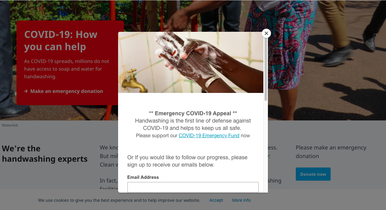
2. Wateraid — Lesson: Make your homepage mission-critical
“One in six healthcare facilities worldwide have no handwashing facilities at all.”
Now more than ever, the above statistic is striking. Wateraid is doing an exemplary job of making the connection clear between their mission and the current crisis. They’ve also taken the necessary steps to ensure their messaging is heard. By adding a popup and modifying the homepage banner, their appeal conveys the urgency appropriate to the situation.
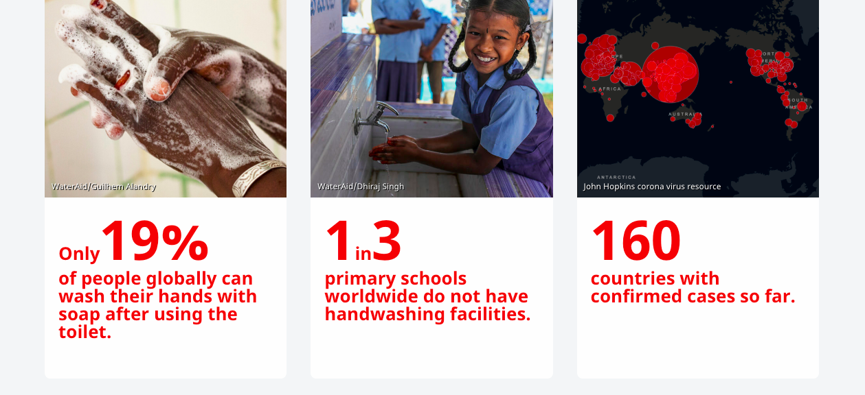
As you scroll down, they’ve highlighted more statistics and added supporting images for better impact:
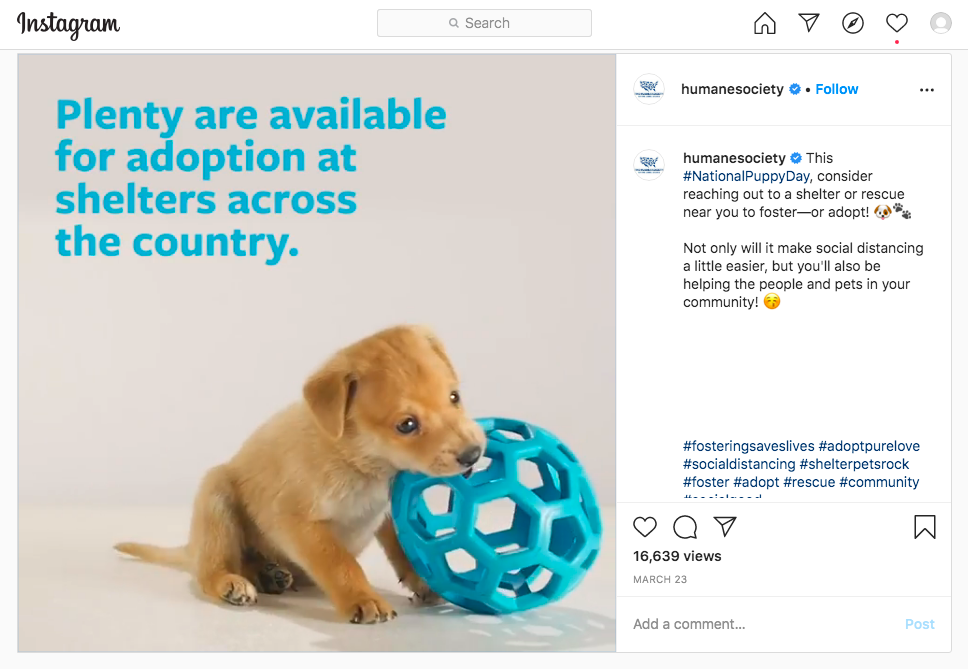
3. Humane Society — Lesson: Puppies and babies
With 4,024 likes and another 16,639 views, it’s hard to go wrong with a cute video of puppies. In fact, the verdict is pretty much in that if you can use the image of a child or dog to tell your story, you should. This post does more than appeal to altruism though. In the current crisis, the Human Society is giving people a way to help out that also makes their own experience of sheltering at home less difficult.
4. Greenpeace — Lesson: Mobilize around breaking news
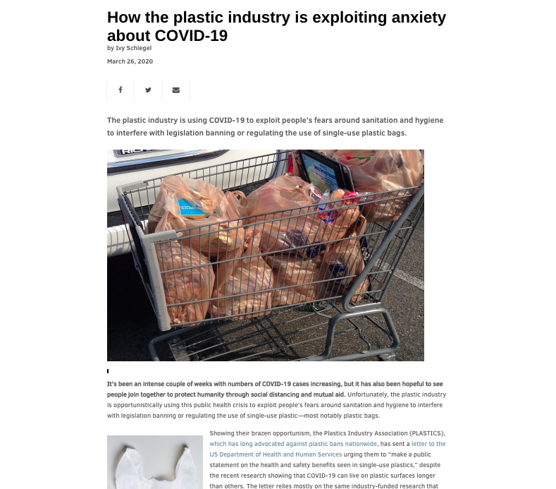
Expert at keeping its digital community informed about their numerous campaigns, Greenpeace highlights breaking news on their website. There is always information relevant to the current news cycle, like this piece about the plastic industry and the COVID-19 pandemic. Articles like this mobilize their base at key moments.
5. Plastic Pollution Coalition — Lesson: Pack visual punch
The organization’s sleek homepage opens with a punch of powerful messaging as the site loads. Once the site is fully up, a video of plastic trash washing up on the shoreline brings the quote to life. To visualize the transformation, try interacting with the below animation:
The organization showcases a second masterful use of video on its homepage. As you scroll down, Jeff Bridges narrates the short film “Open your Eyes.” Don’t miss the logo for Plastic Pollution Coalition in the upper lefthand corner—it communicates their mission with emoji-worthy clarity and succinctness!
6. Global Fund for Women — Lesson: Inspire first, then agitate
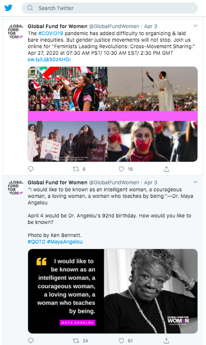
The Global Fund for Women shares their work toward gender justice with imagery that is powerful and educational on Twitter. By mixing inspirational posts with campaign information, their messaging is made more compelling than it would be if it consisted of calls-to-action alone.
7. Room to Read — Lesson: Donation UX
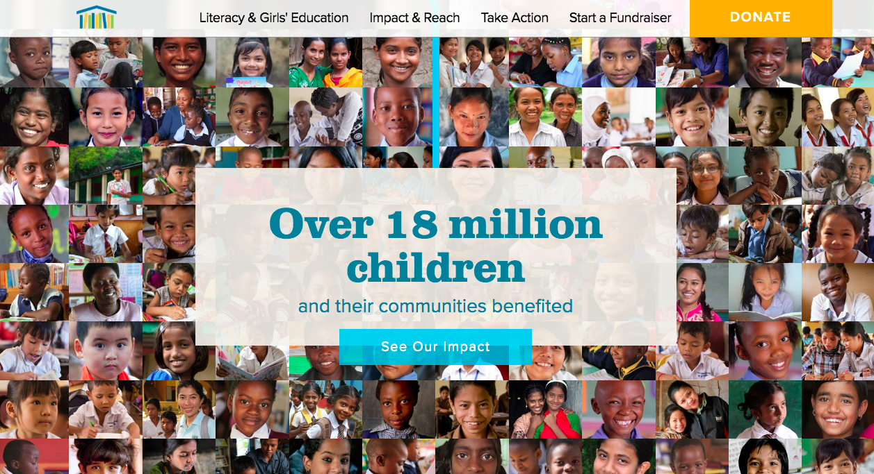
Focusing on literacy and gender equality in low-income communities, this NGO’s brilliant website educates and tells users a story as they scroll down the home page. From individual testimonials and compelling statistics it takes site visitors to a photo collage that makes tangible the magnitude of their impact.
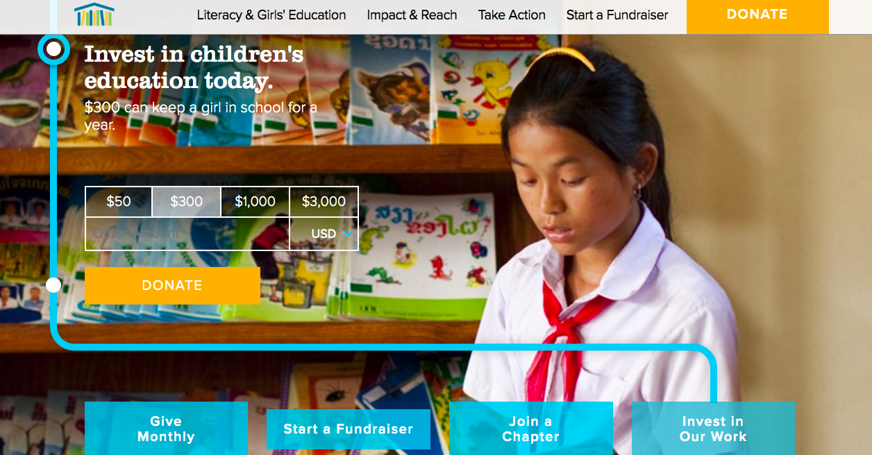
Continuing down the homepage, the site’s userflow takes visitors to a donation appeal. This masterful donation UX does everything right with a minimalist design that ties the suggested giving amount to a milestone and focuses on the impact of the donation rather than on gathering contact information.
8. Pencils of Promise — Lesson: Master peer-to-peer fundraising
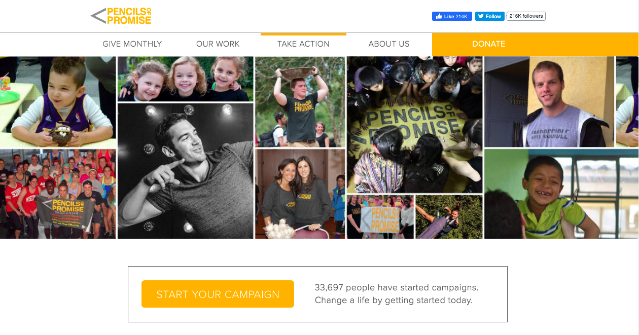
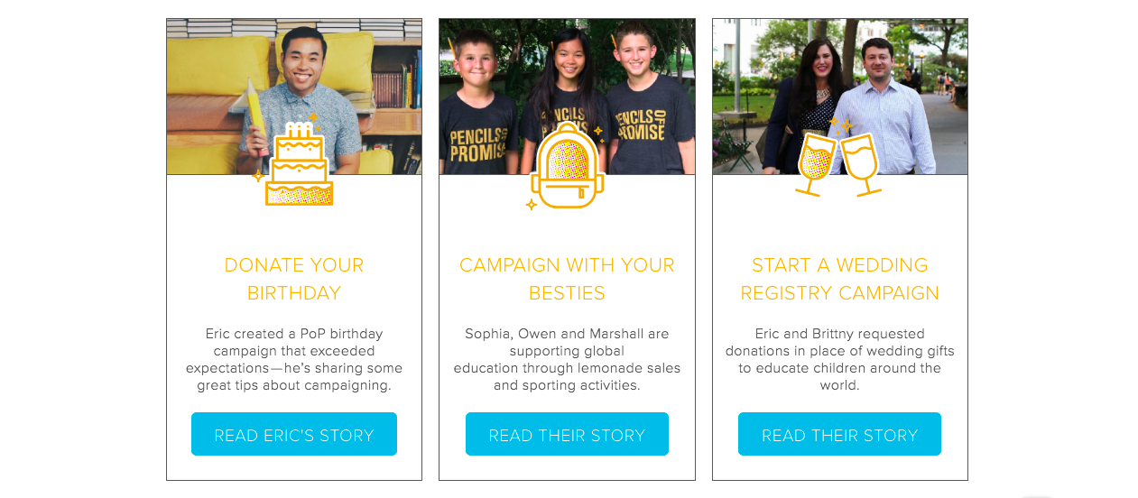
Pencils of Promise boasts a clear marketing strategy that is evident on their website, Facebook and Instagram accounts. They also have all of the tools supporters need to launch their own peer-to-peer fundraising page in just minutes through the Pencils of Promise website. By making it incredibly simple for supporters to start their own campaigns, this is an exemplary use of online community to inspire new donors and raise more money towards quality education for all children.
9. truth — Lesson: Product fundraising can educate
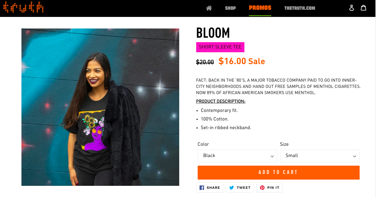
With a history of award-winning nonprofit campaigns like #BigTobaccoBeLike, truth has been recognized for creatively engaging its community in the fight to end cigarette smoking. However, they’re also one to follow when it comes to product fundraising. Their digital marketing strategy includes an online store with beautifully-designed gear to purchase in support of the cause. By brilliantly including a fact that supports their mission in each product description, the store visitor is even more motivated to show support with a purchase. For even more product fundraising advice, check out Kerri Moore’s guest post on 6 Top Notch Fundraising Ideas.
10. National Geographic Society — Lesson: Balance the global with the individual
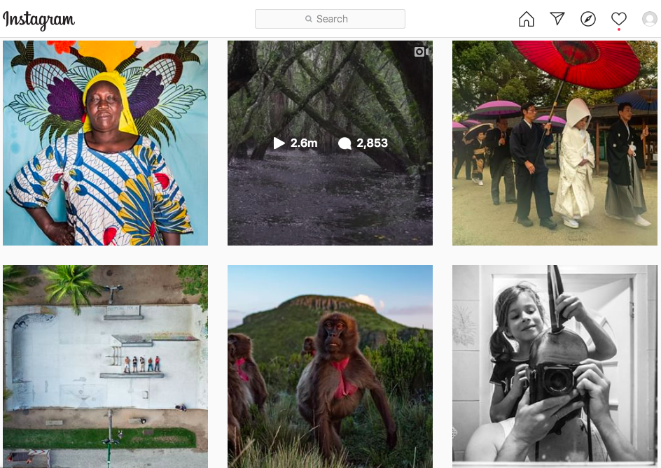
At 133 million followers on their Instagram account, clearly National Geographic is doing something right. A household name for decades, National Geographic shares the wonders of the world through its magazines, websites, and social media. Their high-quality photographic images are a joy to peruse, and demonstrate masterfully storytelling through a perfect balance of images that represent enduring and broad-reaching issues on the one hand, and images that represent the individual and the quirky on the other.
11. WWF — Lesson: Remember to look back
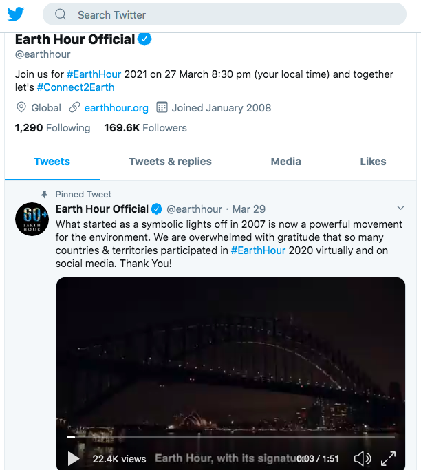
World Wild Fund for Nature’s annual Earth Hour campaign has become a gold standard in the nonprofit marketing strategy world, and the NGO promotes it seamlessly on its various platforms. WWF inspires continued participation by helping their supports feel a sense of accomplishment through a video montage that looks back at what the event looked like in prior years.
12. Charity:water — Lesson: Professional photography pays off
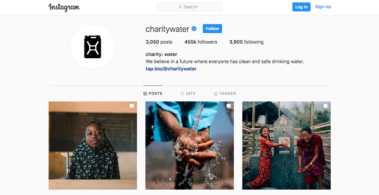
Charity: water is a nonprofit Instagram heavy-hitter, with stunning photography that tells stories about the importance of access to clean water. As much as you’re able, invest in high-quality photos and professionals to capture the most human and most telling moments of your work. Good photography gets right to the heart of the story and speaks volumes to viewers.
Need campaign assets or guidance around digital strategy? Our team of specialists are here to support your nonprofit marketing with services ranging from email templates, graphic design, copywriting, and web development to Google Grant management, SEO for nonprofits, and more.

