If you’re like most nonprofits perusing the web for various tips on how to improve your website, then you’ve probably read a blog or two on Call to Actions (CTAs). A nonprofit’s Call to Action is arguably the most important element of its website. A great CTA should transform visitors into donors, and should be the rallying point for getting users excited about a cause. Shorter than a mission statement, but equally important, a CTA should be inspiring, a continuation of the foundation of your nonprofit put into a short sound bite and user-friendly button.
A seemingly easy task to some, but daunting for others, a CTA must be designed and executed with impeccable precision. It’s the most imperative element of a website and can yield major results for engagement, donations, fundraising, and awareness of your cause.
If you’re ready to begin designing or need a revamp strategy, read through our checklist to ensure that your CTA is reaching its full potential.
1. Make it clickable.
If your aim is to guide viewers to click on the CTA, then you must provide them with the visual hints to do so. Strategic contouring and shading will make the CTA look like a button you would click on in real life. Furthermore, simple graphic design is vital. A CTA is not an image, not a gif, and most certainly not an elaborate graphic design. Rather, it’s the most simple and important part of a website, so cut out the distractions and keep it clean.
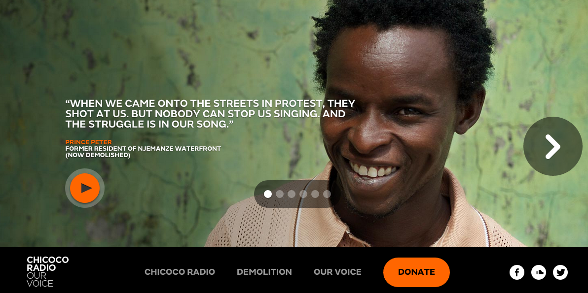
Chicoco Radio has a great button-like CTA.
2. Use actionable text.
Verbiage is everything when it comes to great CTAs. There are a myriad of different action-compelling verbs to choose from that will effectively communicate your message depending on what their purpose is and how you want users to interact with the site. Are you encouraging users to donate, learn more, take action, or offer their support? CTAs tend to be no more than 3 words, so choose your language wisely.
Additionally, it’s important to consider time-sensitivity. Is your cause urgent? Is there a specific timeline? Including the more fine-print details in areas surrounding the CTA will guide and motivate your viewers to decide whether or not they want to take action and when.
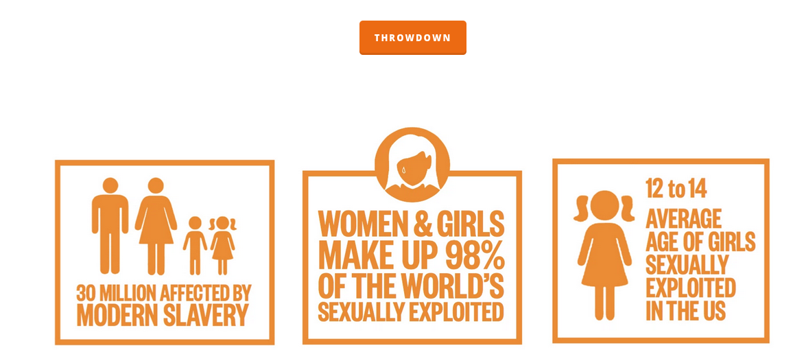
Not For Sale uses exceptionally powerful wording in their CTA that is both concise, efficient, unique, and action-compelling.
3. Utilize a contrasting color palette.
Another strategy to draw further attention to the CTA is through color. Instead of using the same color scheme that matches the website and brand, tech gurus alike agree that the best way to make the CTA really stand out is by using a contrasting color. Various elements of the CTA should match the overall look & feel of the website, but color is an area where you can make a clear distinction between the CTA and the rest of the site.
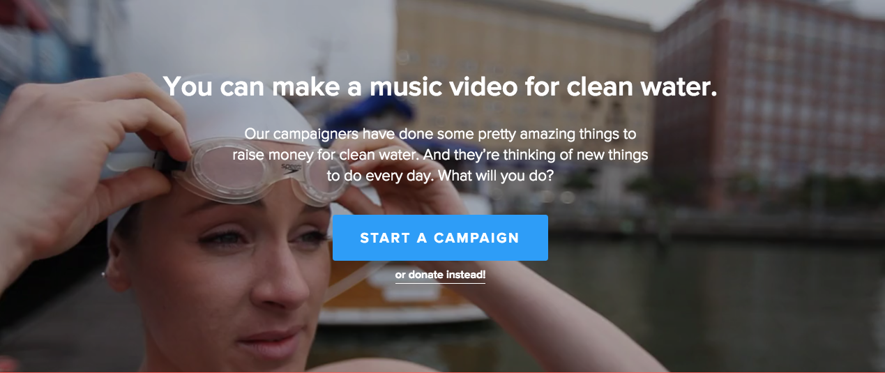
Amongst charity:water’s many strengths, their CTA is also excellent. They’ve used a contrasting color allowing the CTA to stand out.
4. Set your priorities.
It’s tempting to want to give your viewers a platter of CTAs to choose from. Between the “learn more”, “take action”, and “donate now” buttons, it’s hard to prioritize one above the rest. However, using too many CTAs could hurt your nonprofit rather than supporting it. An overload of CTAs could deter visitors from supporting your organization. Creating one, unique CTA will improve the chances of visitors interacting and engaging with your site.
If you are insistent on using more than one CTA, it is encouraged to prioritize 1 above the others. Use a different color or place it separately on the page to emphasize its importance.
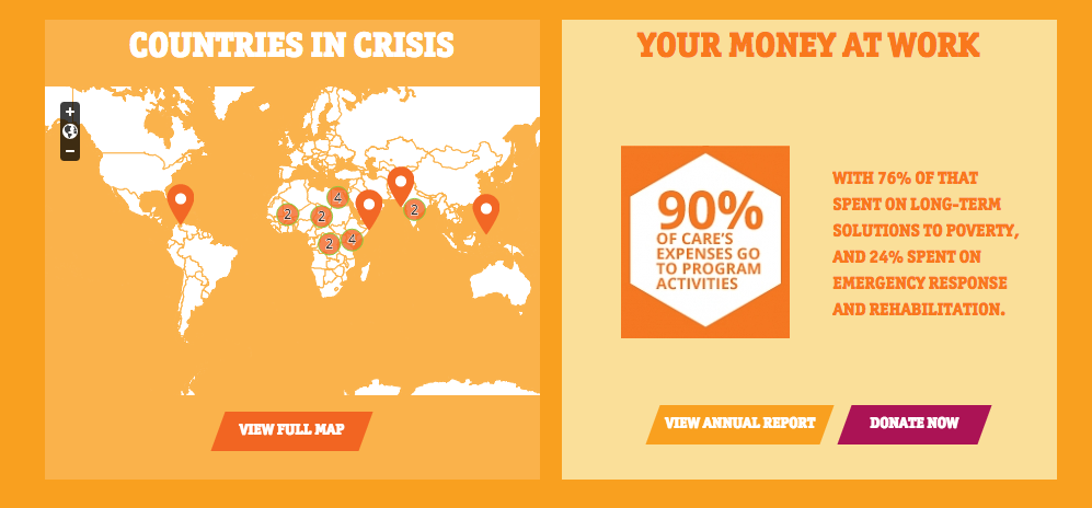
Care incorporates 3 CTAs on their home page, however, they’ve made the “Donate” CTA stand out against the others thanks to a contrast in colors.
5. Place it strategically.
Once you’ve completed the design, decided on a color palette, and chosen its text, you are ready to put the CTA to use. From top to bottom, using strategic color choice, and a logical progression of text, users should be able to follow a path, and somewhere located on this path should be the CTA. Generally, CTAs located at the top of a page get more clicks and conversions, whereas those placed at the bottom have a higher amount of leads. The CTA placement should be aligned with the goals of your nonprofit’s website in order to fully maximize its use.
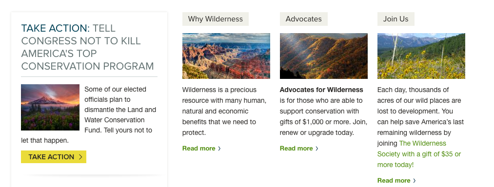
The Wilderness Society masters strategic placement by using colors, imagery, and text to organize the page. Starting from the left, there is the primary CTA – Take Action – and then secondary CTAs are on the right.
6. Take advantage of whitespace.
Setting the right backdrop can also positively or negatively affect the impact of a CTA. Many successful nonprofit CTAs utilize the power of whitespace, an undervalued yet extremely efficient strategy that helps organizes the various elements of a web page. Whitespace doesn’t directly translate to white-space, but instead refers to the “blank” space of a website. The space in between graphics or bits of text. It can be white or it can be another color. In the most simple definition, it’s the space in between. Placing a CTA amidst a backdrop of whitespace will guide the user’s eye to that specific element.
ONE incorporates actual white-space in order to highlight their CTAs setting them apart from the rest of the home page.
Ready to get started?
There is no end-all-be-all to the perfect Call to Action. Every nonprofit employs a different set of techniques unique to their website in order to make their CTA(s) stand out. The important take-away is that for every great Call to Action, there was a thoroughly planned strategy.
If you have any suggestions, leave a comment! We look forward to your feedback!

