As part of the different changes and improvements that WordPress has incorporated since it launched its 5.0 version in December of 2018, the Content Management System (CMS) has replaced the Classic content editor with a brand new Block Editor, also known as Gutenberg.
This new block editor is completely different from what we had been used to, as it allows editors to create content in a more sophisticated way by implementing new features such as using a system of blocks to easily compose and edit content, provide new options on how to organize the content layout for your post or page, and on a more technical level, plugin and theme developers can create personalized block options. But, before we go into more detail about the new editor, let’s first cover some basic information about Gutenberg and how it works.
What is Gutenberg?
Gutenberg is the name given to WordPress’ new content editor. It is named after Johannes Gutenberg, who introduced printing to Europe with the mechanical movable-type printing press. It is designed to make content writing, editing, and publishing easier, especially for beginners.
According to Matias Ventura, team lead for Gutenberg, this new content editor “is an attempt to improve how users interact with their content in a fundamentally visual way, while at the same time giving developers tools to create more fulfilling experiences for the people they are helping.” Awesome, right?
How does it work?
As mentioned before, Gutenberg works as a block editor. It replaces the Classic editor’s single edit field with “blocks”. These blocks allow building more sophisticated page designs and layouts, something that wasn’t possible with the Classic editor. But, what is a block?
A block can be almost anything, and that is part of the reason why this new editor is more user-friendly than the classic editor. Some of the most common (and even cool!) block options are:
- Video embeds
- Tables
- Quotes
- Widgets
Each block is treated as a component and works individually, but can also be grouped together. Users can also easily combine different types of blocks, for example, 2 text blocks, 1 image block. This allows editors to have more flexibility, creativity, and control over their work.
Blocks were also created to serve as a replacement for older content types, such as shortcodes and widgets. This way, users can implement new elements such as videos, forms, social media embeds, and more without the need for a shortcode or widget, which was the case with the Classic Editor.
What if I am not ready for this new editor?
We understand that some users might not feel comfortable yet with Gutenberg, so if you want to continue using the Classic editor even after updating to WordPress 5.0 you can do so in 2 ways:
- You can activate the official Classic Editor plugin, just install it like any other plugin. Once it is installed, you will be able to use the Classic Editor the same way you did before the new update.
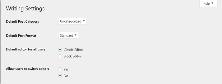
- Setting up the default content editor on Settings > Writing. This change allows you to choose what editor you want for all users on your site to have. It is temporary and you can also choose if users can switch editors, which is great if you have a team working on the site.
What about accessibility?
As a web design agency focused on nonprofits, we understand how important it is to have an accessible website. So does WordPress. As a CMS, they are aware of the different questions and concerns in regards to accessibility that have been brought up due to the release of Gutenberg.
Because of this, they have included various features related to accessibility in this new editor with the goal of making it easier for different audiences. Some of these features are:
- Block Navigation
- Keyboard Shortcuts
- High Contrast Mode
- Helping the User Create Accessible Content
What shortcuts are included in Gutenberg?
As we get more advanced and familiar with Gutenberg block editor, here are some helpful shortcuts that will be definitely helpful.
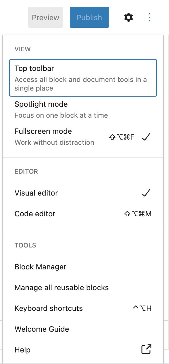
- Options: Represented by an ellipsis or “three dots” in vertical, once selected it will open a menu with different features to choose from in regards to the type of view the user wants while working on the page (top toolbar, spotlight, or fullscreen), the type of editor (visual or code), and the tools such as block manager, keyword shortcuts, and help.
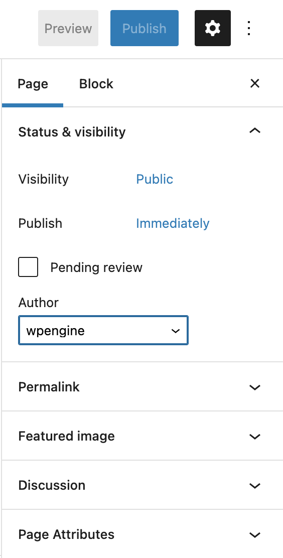
- Settings: Represented by the gear icon, it gives the user two tabs that offer a preview of both the page/document settings and the settings specific to the block that is being worked on.
- Page settings: Includes information about the page’s status and visibility, permalink, and featured image, among other things.
- Block settings: Includes information about the individual block that is currently being used.
- Preview and Publish: These two buttons give you a live preview of the page/post as well as the option to publish/update it.
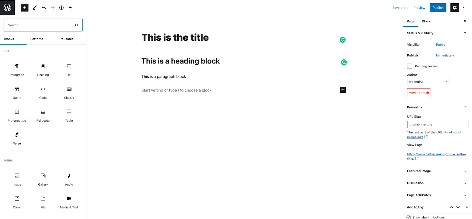
- The Plus “+’ sign: Whether it is on the top left corner or within the space where the user is working, this option lets you add new blocks.
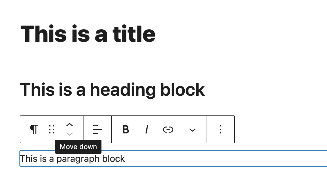
- Individual block settings: If you highlight a specific block, you will be able to see different options such as these arrows which allow to move blocks up or down, drag the blocks across the page, among other options.
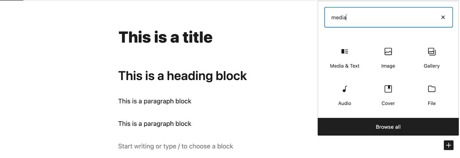
- New Blocks: By using the slash (/), a dropdown will show with a list of available blocks, having the most recent ones first. You can also type the name of the block too. Ex: /image
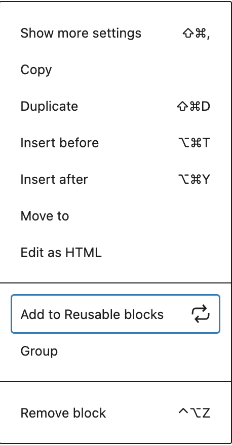
- Reusable Blocks: If you really liked working with a specific block, you can make it reusable and use it in other pages or posts.
Then, to use this block, select it from the available blocks. It can also be edited, however, these changes will affect the block on every page or post where it is being included.
Creating a page or post with Gutenberg
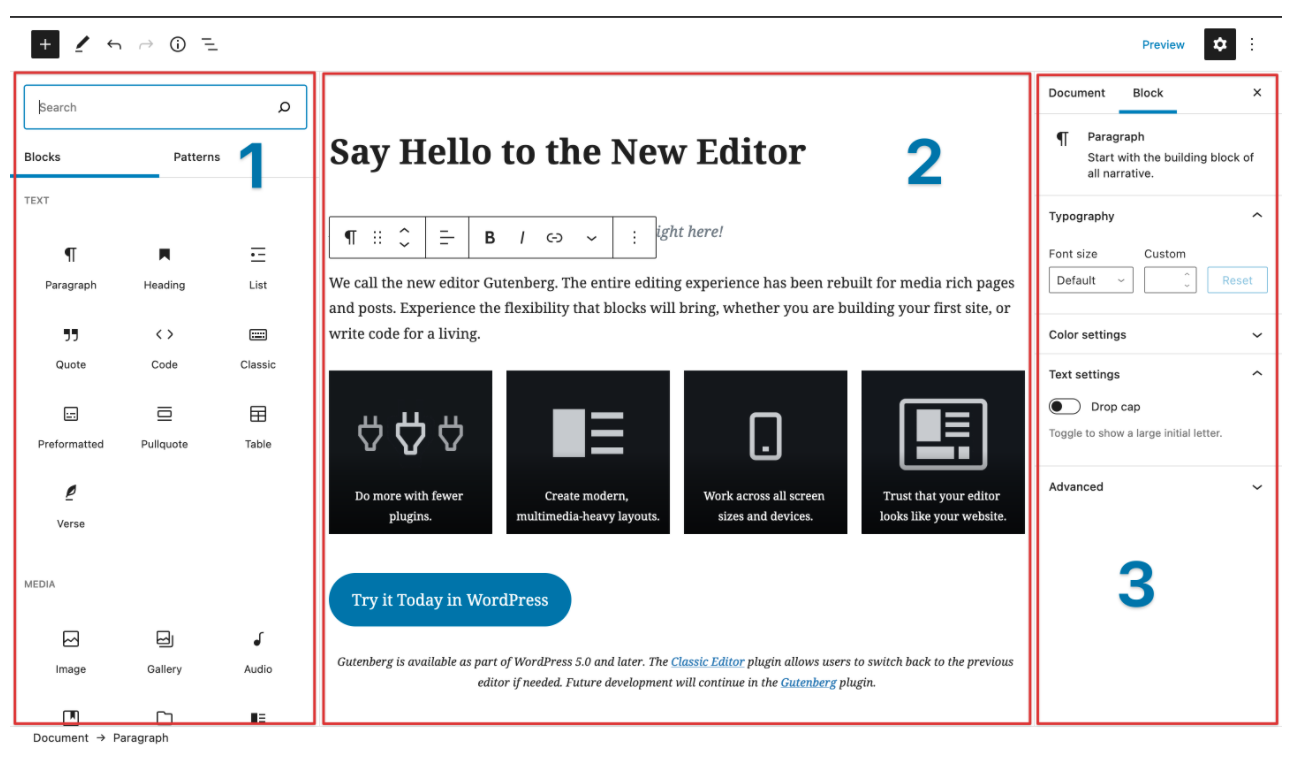
Now that we have learned more about the Gutenberg block editor, how to switch to the Classic editor if you’re not ready yet, and some helpful tips in regards to shortcuts, it is time to learn how to create a page or post and not give up in the process. Before we get started, let’s first familiarize ourselves with how the Gutenberg interface looks like:
From left to right: Block inserter, Block editor content area, Settings Sidebar
Let’s get started with something simple, such as a blog post or a simple lading page with media (image or embedded social media):
- Start writing and adding the text in the editor content area. You can also copy it from Google Docs or Microsoft Word, and it will automatically be converted into blocks.
- After you have added the text, it is time to add the non-text blocks such as images, social media or video embeds and more. Just click on the + sign on the top left of the page or within the editor content area.
- You can upload the media from your computer or select it from your WordPress media library.
- Once you have added the media, you can change the media layout and other settings such as image size, width and height.
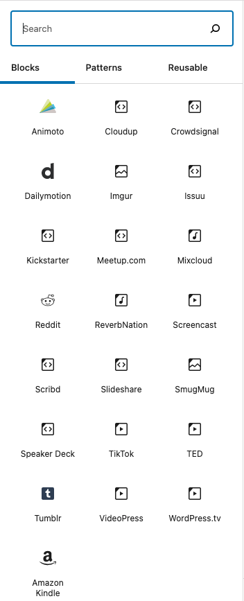
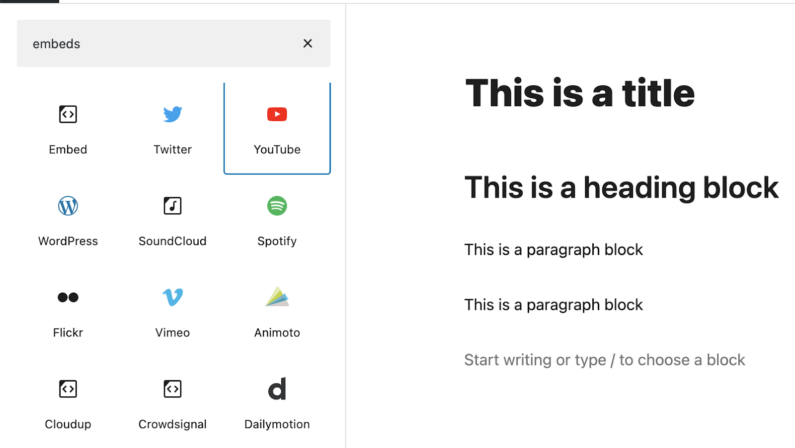
- If you want to add or embed a video, you can do the same as step 2 but with Embeds. All you need to do is include a URL.
- You can also use other not very common but still helpful blocks to make your content for interesting and appealing such as quotes, tables and columns.
- Last but not least, don’t forget to click Preview to see how it looks on the frontend (how users will see it) and when you are ready, click Publish.
Now that we have a better idea of how Gutenberg works and looks, let’s get started building flawless pages and posts! If you have any feedback about Gutenberg and how it has worked for you, or if you would like to learn more about our services and how we can help, please feel free to reach out.

