Social media is so embedded in our lives that part of experiencing something is documenting it digitally on our Instagram profiles. Whether you are for or against this proliferation of technology, you must admit, Instagram is one of the goliaths. With over 800 million active users in September of 2017, this number is only projected to grow. And although the company is owned by Facebook, a fact which is often overlooked, it has managed to escape from the recent scandal unscathed.
What does this mean for the modern nonprofit? Visual storytelling is one of the most effective means of relaying your mission and engaging new supporters and so Instagram is a natural path for doing so. But to insta productively, you want your profile to reflect your organization’s brand. Branding an Instagram can be tricky business, but with a little bit of planning, a few edits and maybe even a few selfies (to test of course) you’ll be Instagramming like a Kardashian.
BONUS stick around until the end of the post for some Instagram best practices!
Photography 101
Before we dive into Instagram, we thought a basic photo tips run down was in order because let’s be real, you have to be working with some nice photos.
There are some basic photo-quality indicators: blurriness (there shouldn’t be any), brightness (can you see the details of the photo) and making sure your thumb isn’t in the frame (it’s okay, I’ve done it too).
A somewhat intuitive but equally important aspect of your photographs is the use of natural light. First, don’t snap a shot when light is coming from straight behind your subject as it will be dark and frankly sad. Think about the time of day you’re taking your photographs and the tone of the light during that specific time. For example, sunset renders light orange and soft colors while the height of the day around noon will be much harsher making it difficult to shoot. Don’t shy away from cloudy days because light is actually dispersed better making it easier for a novice to snap an awesome shot. Finally, if you are inside, try and photograph close to natural light sources like windows, skylights or open doors.
If you aren’t well-versed in photography, using the rule of thirds is an easy way to compose a well-balanced shot. The principle being that you divide your photo into a grid of 9 parts and line up your subject matter at different intersection points. Luckily, smart phones now have grid features that you can turn on making it super easy. Not every great picture follows this rule but this will make things easier if you don’t have an eye for photography.
A little goes a long way when it comes to photo editing and a nuanced touch always yields the best results. When editing your photos stick to small changes in areas such as contrast, brightness and saturation but, again, keep it light.
Brand It, Baby
Like any aspect of branding, you have to go in with a game plan. So first, ask yourself “What is the purpose of my nonprofit’s Instagram?” For many it is the chance to relay your nonprofit’s mission through visual storytelling mechanisms and to engage your followers enough to get them to research you more.
After your have decided what the purpose of your Instagram is, brainstorm about four themes that you want your Instagram to center around. These themes will be translated into the content that you post.
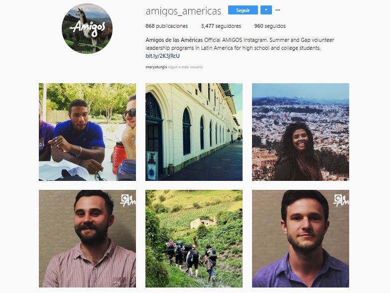
For example, check out the Instagram of Amigos de las Americas. This organization organizes gap year and summer abroad programs for high school and college students from the United States in Latin America.
There are 3 clear themes they use on their Instagram: program participants up close, program participants in action and Latin America program locations. As you scroll through their Instagram, you see different variations of these same themes creating unity throughout the profile. It’s okay if every now and then you break from tradition and post something different, but keep it within theme whenever possible.
After you have chosen your themes you will move into the more stylistic side of branding. This aspect of your Instagram should reflect the brand your nonprofit already has to ensure coherence across digital platforms.
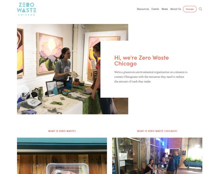
A nonprofit who is owning this concept is Zero Waste Chicago. The Chicago-based org is striving to connect Chicagoans with the resources they need to reduce their waste. Above is a view of their website homepage. Their branding is clear: simple, clean and bright.
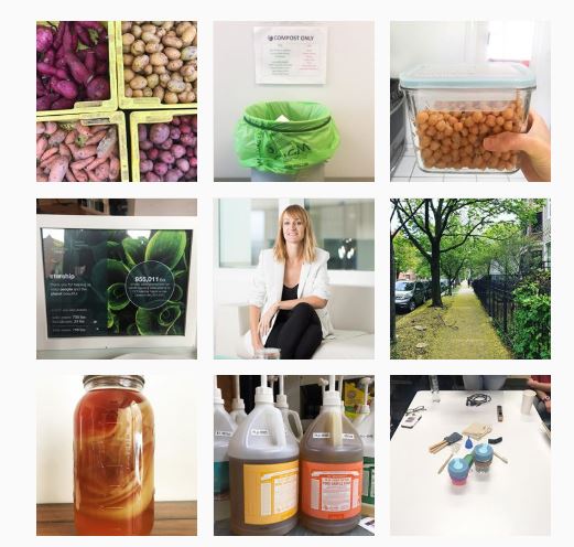
Zero Waste Chicago’s branding is consistent from their website to their Instagram. The same emphasis on white space and cool color tone is apparent on their profile.
Like Zero Waste Chicago you want to take a look at your brand colors and overall feel to build your Instagram aesthetic. Play with the tone (warm or cold), the contrast and the filter of some test photographs. When you find a combination that reflects your brand and looks great, save the settings. Consistency is key. Each of your photos should utilize the same filter combination to create a unified look.
Above is the Instagram of Ethical Writers, a group of writers and creatives who aim to improve the world with the work that they do. All of the photos on their Instagram profile are high contrast black and white images and they never stray. This creates a visually pleasing and well-branded profile.
As you post, you always want to be thinking about the first 6-9 photos that appear on your profile. These are the ones that people will see before they start scrolling so you want them to pack a punch. This means that your photos should always be playing off one another creating a web of content that performs as a whole.
We have to reference the master on this one because Anderson .Paak just does it so well. Each of his photos connects to its surrounding ones creating a piece of digital art that entices his audience. .Paak has a team of graphic designers paid to make his profile the way it is so we can’t expect ours to turn out exactly the same. That being said, thinking about the interaction of those first few photos will tell a story to your followers and make them click to learn more.
For a more accessible version of connectedness is the Instagram profile of Flours In Your Hair, the account of Becca Rea-Holloway, a baker located in Washington DC. Rea-Holloway does a wonderful job of balancing her photos. The colors in her Instagrams always play off of one another and she keeps in interesting by posting different aspects of the baking and cooking process. The repetition of circles also contributes to the feeling of connectedness making it enjoyable scroll through. Shape repetition is a great way to create a balanced profile that allows for continuity even as your image content changes.
Best Practices
Don’t leave us just yet, there are few tips we want to leave you with to make sure your profile is killer.
1. Always use your nonprofit’s logo as your account image so that everyone knows the account is really you.
2. Allow white space to let your profile breathe and not become overly heavy. Use hashtags and tag influencers or other related companies to increase your audience.
3. Utilize your Insta-captions to redirect followers or browsers to your Instagram bio and then your home or other specific landing page.
4. Leverage your other social media accounts to get people to your Instagram profile.
If you have any questions or want to chat with us about your Instagram, please reach out! We would love to give advice. Happy Instagramming, techies!


