You work so hard to find new donors. You write appeals, you send emails, you schedule social posts, you build your lists, you do all the right things to find and inspire . But are your potential donors turned off by your lackluster online donation form?
It’s a real possibility. One of the most powerful things I’ve learned during my time at Qgiv is that donors will not make a donation if your donation form isn’t optimized. If your donation form is too long, too complicated, or too boring, they won’t make a gift.
Luckily, there’s a ton of research out there about how to build a great online donation form. We’ll break down each element of a good form here — read on to find out how you can turn your online donation form into the best form ever.
FULL DISCLOSURE: Since I work for Qgiv, I built this form for my (non-existent) nonprofit in a few minutes using Qgiv’s content management system. Regardless of the fundraising platform you use, you should use these elements on any donation form!
STEP 1: Your Online Donation Form Should Reflect Your Brand
People become donors because they’ve emotionally connected to your mission. That emotional connection is reinforced by your stories, your photos, your branding, and the overall feel you cultivate on your website. But lots of donation forms don’t match their site’s branding. That severs the emotional connection that inspired your donor to give.
Here’s a (large) picture of my donation form.
My nonprofit uses a simple palette of green, white, black, and grey, so I made sure I used those colors on my form. I also made sure to use images that drive home the mission of the community garden, and the language on the form all revolves around our volunteers and the families they help.
When you’re building your form, stick to the color palette, images, and writing style that you use on the rest of your site. You’ll keep donors inspired to give throughout the donation process (even the boring parts!) and make them feel close to your organization.
STEP 2: INCLUDE SUGGESTED DONATION AMOUNTS & DESCRIPTIONS
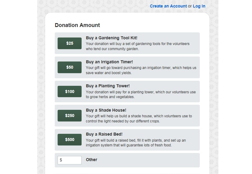
At Qgiv, we noticed that donors tend to make larger gifts if you include suggested donation amounts. The idea is that a donor can get a feel for what other people are donating before they decide how much to give. In this case, I’ve started my suggested amounts at $25 and gone up from there. Donors who came to your form intending to make a $20 gift may opt to make a $25 gift instead, just because it’s included as a suggested amount.
When you include suggested amounts on your form, make sure you also give donors the option to give a custom amount. Suggested amounts are useful, but you don’t want to miss out on a donation because someone wanted to give you a different amount and didn’t have that option.
We’ve also noticed that including descriptions of your suggested amounts affects how many donors finish making a gift and their gift amount. Giving donors an idea of how their gift will make a tangible impact on your mission.
STEP 3: CONSIDER ADDING RESTRICTIONS
Nonprofit fundraisers often have a love-hate relationships with restrictions. On one hand, donors love being able to direct how you use their gift. Restricting their gift assures them that their money will go to a cause they love. On the other hand, nonprofits need non-restricted donations to fill in gaps in other campaigns or programs. If you’re going to include restrictions on your page, make sure donors can give where the need is greatest. It’s really helpful!
Restrictions can also be tricky because giving donors too many options negatively impacts whether or not they complete their gift. If you are going to include restrictions on your form, offer a handful of options. Many more than that will negatively affect your donor’s experience.
If you’re worried about having too many restrictions on your form, consider building individual forms for major campaigns or programs. In this case, I built a form especially for my organization’s community garden program so it wouldn’t clutter up my primary donation form.
STEP 4: ALLOW RECURRING DONATIONS
Recurring donors are every nonprofit fundraiser’s dream. They’re loyal donors who are committed to your cause, and it’s a relief to have a steam of consistent revenue. One of the biggest reasons nonprofits don’t get recurring donors is because they often don’t give donors the option of making a recurring gift.
Let donors support you regularly! You can offer recurring options in a subtle way that doesn’t overwhelm donors; in this case, I’ve included a few options donors can choose from. I’ve also defaulted to a one-time donation so donors don’t feel pressured or coerced into making a recurring gift.
If a donor does opt to make a recurring gift, the donation form will ask them to choose start and end dates for their recurring donation. At the end of the transaction, it will also ask them if they want to set up an account so they can manage their donation. It’s important that these options don’t appear if a donor makes a one-time gift!
STEP 5: OPTIMIZE THE REQUIRED FIELDS
Filling out the required fields on your donation form will probably never be a donor’s favorite part of their donation experience. But there are things you can do to make it as easy as possible.
The most important thing you can do with your donation form’s fields is to keep them short. The longer the donation form is, the less likely a donor is to complete their gift.
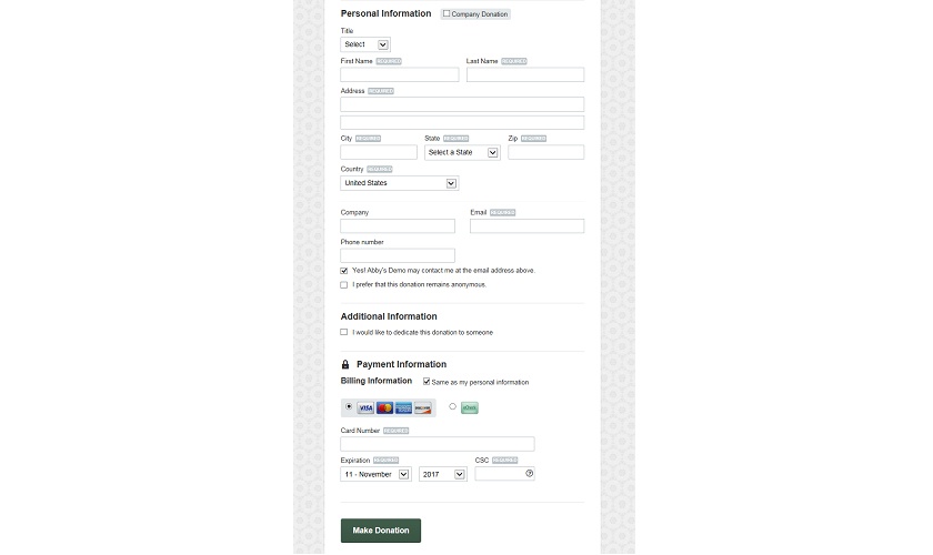
Some things you have to collect. You have to know their personal information and payment information. But you can limit the amount of time they have to spend typing by letting them check a box to use the same information for the personal and billing sections.
It’s important to add as few additional fields as possible. I’ve chosen to let donors stay anonymous and to let them opt into future emails from my nonprofit. Other than that, the only other field I’ve added is the option to dedicate their donation to someone. That’s it!
You want to know as much as possible about your donors. But don’t ask them on your donation form! Keep your fields to a minimum and get donor information through other channels. Since you’ll want to build an ongoing relationship with your donors anyway, consider collecting minimal information an opportunity to communicate with them again.
STEP 6: EMBRACE THE PRESENCE OF SECURITY SEALS
Let’s be super honest: the security seals on your donation form aren’t pretty. But they are reassuring. People are more leery than ever about putting their personal information on the Internet, and that includes your donors. At Qgiv, we regularly see donor conversion rates (the ratio of people who land on your donation page vs. the number of people who actually complete a donation) drop if the security seals are covered up. Leave them visible — your donors will appreciate it!
STEP 7: SET THE STAGE FOR FUTURE RELATIONSHIPS
Your donors don’t support you because you’re a cool charity. They support you because they’re passionate about your mission and the people you help. You can add (minimal!) content to your donation form to reinforce that shared passion and to set the stage for future engagements.
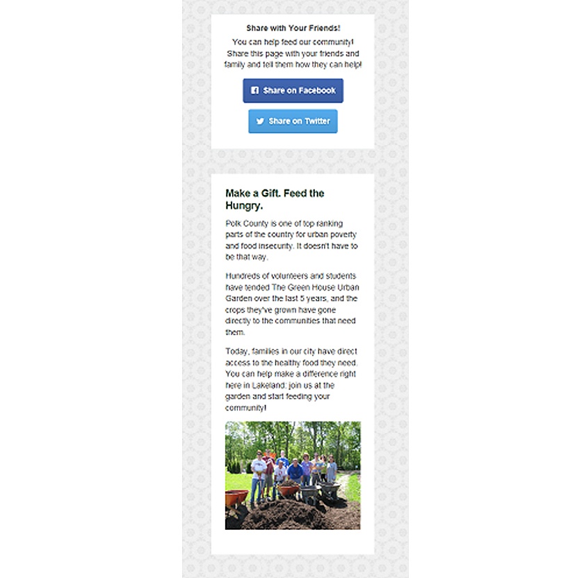
Always include a way for someone to share your donation form to social media. If someone lands on your form and can’t make a donation, they might be inspired to share it with someone who can make a donation.
There’s also a widget on the side of the form that explains a little about the nonprofit’s volunteers and the huge impact they’re making on the families in our city. Making volunteers the focus of this content emphasizes that donors can connect with a community of like-minded people who love the same cause they do. The photo of volunteers in the garden drives home the underlying message that our charity is a group of people helping another group of people instead of being a faceless organization that just collects money.
Building a great donation page can have a huge, positive impact on your fundraising. It will inspire donors, keep them engaged, and connect them to your organization. It also sets the stage for really great donor retention methods and future opportunities to get them excited about your cause.
Creating your donation form doesn’t have to be intimidating. Keep your brand on the page. Consider the donor’s experience as they use your form. And remember that your purpose on this page is to connect donors to a mission they care about.
If you want to give your donation form a quick check-up, here’s a link to a neat donation form check-up checklist. It’ll help you get an idea of where to start!


