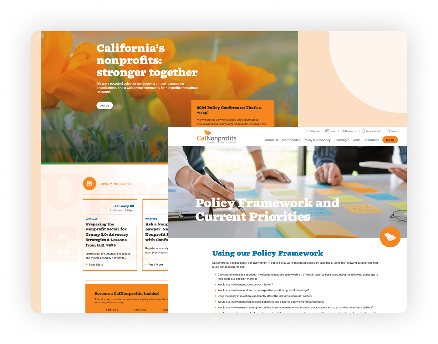
In the business world, image is everything. The largest brand names in the world rely heavily on their brand images in order to market to their consumers. Logos tell a story about a company or organization that can influence people long before they step foot in a store or visit their website. Large corporations spend millions of dollars in order to create their brand, calculating responses and analyzing results. Even if your team doesn’t have the resources to research the best options to represent your cause, you can use these simple rules about color selection to help make your decision.
Warm Colors
Red is the color of passion and can be an aggressive because of the strong response it can invoke in those who see it, sometimes causing a physical response. Sometimes it is popular in the food industry and health care organizations because of its connection with blood. Some notable brands that use red are: Coca-Cola, Target, Netflix, Frito Lays, Exxon.
Yellow is known as the happiest color of them all because its reminds people of things like the sun. Using yellow shows optimism, hope and clarity in the brand. Some notable brands that use yellow are: McDonalds, Sprint, Best Buy, IKEA, YellowPages.
Orange is a great combination of the brightness yellow and the boldness of red and makes for a great show of vitality. Brands that use orange are often seen as creative and fun with a confidence that makes people want to see what they do next. Excitement can be created using this color, but may not come off a professional or be a good choice for groups with that kind of focus. Some notable brands that use orange are: FireFox, Nickelodeon, Fanta, Payless Shoes.
Black is many times used to convey a classic and serious look and a lot of times gives a sense of expensiveness. Sophistication can be very important for profit generating businesses but for nonprofits this could be too strong of an image. Obviously black might be used for outlining in text or in combination with other colors, but as a main color it would be risky. Some notable brands that use black are: Chanel, Adidas, BBC, Givenchy.
Cool Colors
Purple has been used as a sign of royalty for centuries and can also be seen as sophisticated. It does have a mysterious aspect to it because it has a rich combination of the warm reds and cold blues. Purple can really inspire creativity as well much like orange, but for this reason is complex and can be tricky to use well. Some notable brands that use purple are: Yahoo, Taco Bell, Big Brothers Big Sisters, Hallmark.
Blue is one of the strongest colors that can be used in marketing because it known as the dependable and strong color. Economically speaking it makes people feel comfortable because it is commonly used to express financially stable and tied to its inherent connection with the sea and sky. Some notable brands that use blue are: AT&T, Dell, Facebook, American Express.
Green is almost always seen as fresh and energetic associating with nature, but also a dark side with money and greed. Different shades of green can have very different impact, with darker shades relating to more serious money-related activities and lighter greens giving more youthful vibe. Some notable brands that use green are: BP, Whole Foods, Animal Planet, Walmart.
Brown is simple and strong and through its connection to dirt and the earth can be seen as dull and uninteresting. Besides be used in food brands that produce brown foods, most companies or organizations don’t want to use brown because it is not very eye-catching. Some notable brands that use brown are: UPS, M&M’s, Hershey’s, Louis Vuitton.
White is clean and pure like doctors and brides at a wedding. For that reason the healthcare industry and its supporters like using white to solidify their imagery, as well as the tech industry. White is used in almost all logos and brands as a way of contrasting colors and making their main color choices pop. Some notable brands that use white are: Apple, Lexus, Wikipedia, WWF.
Choose wisely
Branding your nonprofit or powering through a rebranding mission can be a very tough process and one that once completed needs to be followed. Choosing the right colors to enhance your image and psychologically connect the public’s personal experiences is essential to creating an identity. Picking the wrong colors can destroy perception, and even if you want to change your mind later on, a color change might no longer be an option. Try different combinations and shades until everyone feels comfortable, because once you pick, it will define your nonprofit for years to come. Need a little more help? Check out this helpful color wheel resource from our friends at Canva!


