It’s officially a new year and you are trying to organize and set goals for the year. Your nonprofit’s website is your biggest asset and you want it to be done right. Make this year the year of the website, with these tips to help you get started.
First, start by answering the age old question:
Why Should Your Nonprofit Redesign Its site?
There are a lot of signals that your site is due for an upgrade. One tell-tale sign is that your nonprofit’s site isn’t mobile-friendly. You don’t have a lot of time to impress your potential donor, volunteer or new supporters and they aren’t going to be interested if they can’t see your website on their phone. An obvious sign of a problem is if your menu doesn’t collapse. More than half the world’s population uses a smart phone and if your website doesn’t reflect that statistic then it’s time to reboot. Other indications that it’s time for change include poor user experience (UX), a high bounce rate, or an overall outdated design.
It’s an Investment Not an Expense
Your nonprofit website is your best employee. It works nights and weekends so that you don’t have to. It establishes your credibility and expands your reach by presenting potential donors, volunteers, board members and the general public with information about who you are and what you do. It is also the nucleus for your online presence. It acts as the hub for social media and press attention. If your website is linked by local media in an online article but looks questionable, then you are missing out on a great opportunity to expand your community of supporters.
Next, let’s talk logistics and getting it done right. When approaching the design process it’s important to first brainstorm internally before taking your search to a third-party:
Content and Users
What Content Does Your Nonprofit Have? 
One of the most important things we can tell you is that content drives design. Without great content, your nonprofit’s website would be an empty shell.
There is a misconception that all website content is written. While there is always a written component to nonprofit websites, other forms of content can drive design. Maybe your nonprofit is extremely visually driven and you have a treasure chest of high-quality images and videos to act as your centerpiece. Whatever your chosen medium of content is, assess it for quality. It is better to have less high-quality content than a lot of poor content.
Who Is Your User?
User experience should dictate every aspect of your site. Approach your new site through the lens of your user. How old are they? Why are they visiting your site? What information do they need in order to remain on your site? Are you trying to attract more millennial donors? You should be thinking about these kinds of questions and have answers to at least some of them before you approach a third party for development.
Design
What Do You Want?
You don’t have to be a designer or a developer to assess your nonprofit’s needs! To make sure that you go with the right web design, you need to first know what’s missing and what your needs are.
Start by listing the features you need. Do you need a home page with social media integration? What about a secure donations page? How many content or informational pages do you need? Using your user groups (hint) is essential. Imagine what they need when listing out your design and development features.
Then start doing research. Make lists of nonprofit sites that you like and dislike and features they have that you are interested in for your own. Remember, however, that large nonprofits with massive budgets are going to be able to afford about a million and a half interior pages that are outside a standard budget. This isn’t to say that your nonprofit won’t be able to have an awesome website, but just keep this in mind as you look at other websites! Also, research current trends and styles to ensure that your site will be modern and generate traffic and interest.
The Nitty Gritty
Paying for Your Nonprofit’s Website 
Here comes the part everyone hates, the bill. There are many different ways your nonprofit can raise money to pay for its website. From crowdfunding and soliciting donations, to your board and event fundraising, there are a lot of possibilities. If you are interested in learning about more options, check out our downloadable “How to Fund your Nonprofit Website” guide.
We also understand how challenging it can be to find grant money to fund websites, which is why we’ve compiled a list of over 60 web and tech grants for nonprofits.
Timeframe and Search
Set realistic goals concerning what your nonprofit can accomplish in what period of time. We suggest setting SMART goals for your nonprofit to make sure you stay on track and focused.
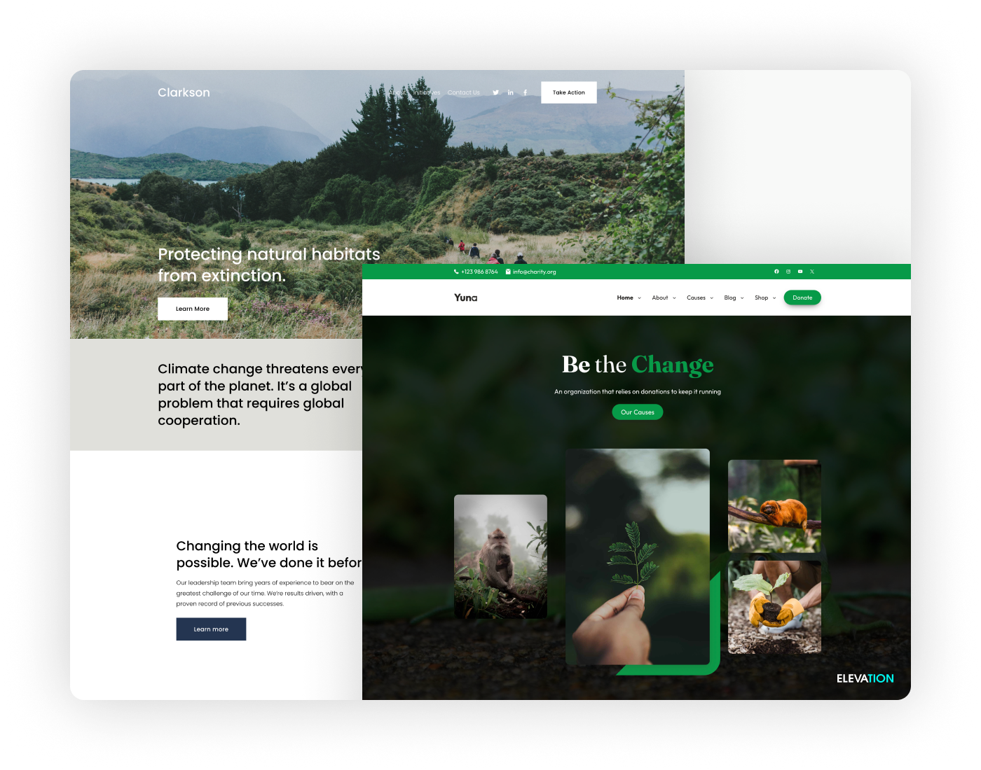
There are a number of great options out there when it comes to nonprofit web design. Do your research to compare pricing and quality while keeping your individual needs in mind. We also invite you to visit our portfolio to check out some of the sites we have designed for nonprofits across the United States.
We look forward to seeing all of the amazing new nonprofit websites that go live this year!
This article updates a post originally published in 2018.


