Just like for-profit businesses, nonprofits need a strong brand identity in order to help create trust and increase visibility about their cause. In addition your brand is a part of any of the visual content produced by your organization like brochure creating for your awesome programs!
In this post, I will talk about some important elements that you can include in your nonprofit brand style guide. Writing down and defining these different aspects of your brand strategy will help create unity and coherence for your organization.
So why is a strong brand presence important? Think about the people who land on your nonprofit’s website or who see your organization’s merchandise. Does it make an impact? Is it memorable? Would your branding communicate the message of “awesome nonprofit,” “strong vision” or “my money will make a difference by giving to them”?
There’s actually some science behind brand recognition. Business consultant Chris Malone and Social Psychologist Susan Fiske have been studying the obsession with brand loyalty over the years. They discovered that people perceive brands the same way they perceive other people. “These perceptions drive their loyalty, or disdain, toward a product or provider.”
The best types of donors, volunteers, and supporters are those who are loyal. It’s your job to help them be loyal by creating a great and powerful brand image so that they will be drawn into your cause. If someone loves your brand, they will talk about it. They will donate to it. They will buy your merchandise. They will spread the word. Just like they do for the other brands they love.
So how do you get started to create a powerful brand image? First you will need a brand style guide to create unity and coherence for your organization. This could include many components, but here I will list the 5 most important to get you started.
Brand Characteristics
First and foremost, you brand style guide should keep who you are as an organization at the core. Describe who you are, what you do, what your goals are, and the qualities you value. You could also include your nonprofit’s personality and brand tone in this section. Three essential elements to include are:
Your Mission
Mission statements are at the direct center of nonprofits. Including your mission statement in your brand style guide will help others understand why your organization exists.
Your Vision
Your vision statement describes the clear and inspirational long-term desired change resulting from an organization or program’s work.
Your Values
Your core values should not only reflect what your organization stands for, but they should also provide vision and purpose to your nonprofit.
Logo
The next section you should include in your brand style guide is your nonprofit logo. This section is to ensure that people use your logo appropriately when working with your brand. First, make sure you provide a high resolution version of your logo, both with and without a background. Tell people what they can and cannot do with your logo. Make sure that everybody knows what the rules are for posting. If you don’t want your logo used in certain contexts, be sure to make that clear.
Primary Logo
This is where you should display your primary logo, or the first logo that you want to be used when someone is showcasing your organization. This could be your logo icon, wordmark, or both depending on how your primary logo looks. Make sure you specify whether it needs to be horizontally or vertically placed, as well as giving the different color options available.
Secondary Logo
Your secondary logo is your second option for how you want others to display your logo. For example, if your primary logo is horizontal, maybe your secondary will be vertical. Be sure to include the same details that you do for your primary logo, including different color options.
Size
Be sure to display (in real terms) the minimum size that you allow your nonprofit logo to be produced in order so that it remains identifiable and legible.
Space
In this section, you can specify the “safe area” of your logo, or how much white space you require to be maintained around it without any imagery or graphics.
Misuse
Include guidelines for misuse of your logo, such as incorrect colors, fonts, sizes, distortions, etc.
Color Palettes
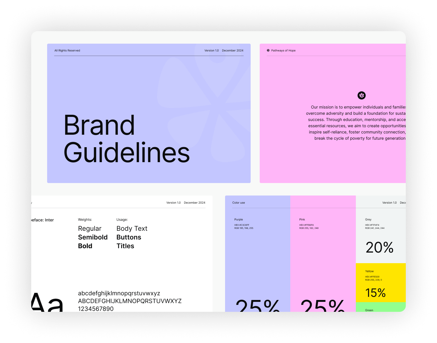
It is essential that your nonprofit display your color palettes so that the proper colors are used in third-party communications and publicity. It will also create unity and ensure coherence for your brand.
Primary
Different colors can invoke different feelings, so think about that when picking your palette. These colors are the primary colors you want to use to represent your brand. Be sure to specify the exact shade of each color!
Secondary
Secondary colors are other colors that you allow to be used when creating media or marketing information about your organization. For example, if you want to create a call-to-action, use a different font color, etc., check out the secondary palette for color ideas.
Typography
In this section, include your font(s) that goes with your brand’s personality and conveys your information in the most appropriate way. Remember that sometimes logos are typographic (represented solely by a name), which means it’s even more important that you choose a font that creates consistency with your brand.
Primary
These will be the fonts that you choose for primary materials such as body copy content, headlines, storytelling, etc. Be sure to include which fonts of the font family are allowed (italics, bold, etc.) as well as the minimum size font you want used.
Secondary
Your secondary fonts are any extra fonts you allow to be used to represent your brand, perhaps for subheaders, factoids, or addresses.
Photography
By pinpointing your nonprofit’s photographic style, you can begin to identify the types of images that you want to represent your brand. Are they formal or informal in composition? Are they primarily of children, adults, animals, or the environment? If they include people, what kinds of emotions should they express? What kind of setting should they be in? These are some of the questions you ask yourself before creating your nonprofit’s photographic approach. Also don’t forget to include examples of your photography. This, of course, is the best way for others to get the feel for your imagery!
Of course, there are many other elements you could add to your nonprofit brand style guide such as your organization’s story, design elements, illustrations, photo overlays, social media style, and more. We hope this list gives you a good idea of the importance of brand guidelines and some simple elements you can include in your guide to get started!
And don’t forget to check out some of our favorite great Nonprofit Brand Style Guides below:


