If your organization isn’t accepting donations online, it is definitely time to get the digital fundraising train rolling. The term “payment processing system” sounds super official and scary but we promise you, it’s just a fancy for name for “accepts payment online”. We nerds at Elevation want to give you a little breakdown about what your online donation could look like using some fun combos of PayPal, Stripe and Authorize.Net. Buckle up, everyone, it’s going to get a little bumpy but stay seated because there’s a free downloadable guide included. Off we go!
The Donation Button Home Page Situation
Before we even touch on the three systems, we wanted to briefly discuss donate button best practices. Your donate button should call attention to itself, it should be big and bold so that website visitors can’t miss it.
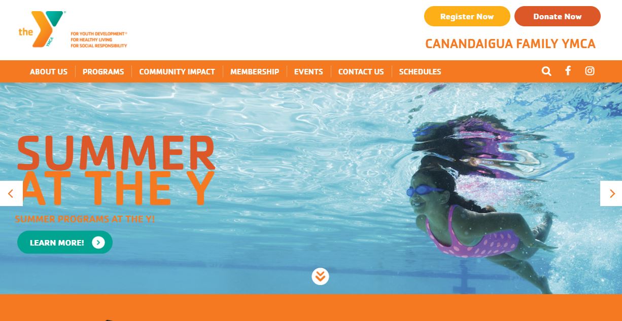
Check out the Canandaigua Family YMCA’s button. It stands out while still remaining in brand and the banner remains visible as you scroll down. All of these are donation button best practices and if you have more questions about aesthetics check out our piece on making online donation easy.
After your user has clicked on the donate button they will be taken to the donation page. This page is built with a separate system and there a ton of donation page best practices which we have broken down for you in a separate article you can check out here.
Now this is the point where payment processing comes into play.
PayPal: The Old Classic
User experience professionals are now recommending that donation systems keep users in the site and not linking out to 3rd party systems to create a seamless transaction for the user and we totally agree, accept when it comes to PayPal.
PayPal has been in the donation game for quite some time and because of this its name carries quite a bit of weight. This means that some of your new donors might feel more comfortable donating through PayPal. Or maybe it’s just because all of their payment information is saved there and it’s just easier for them. Whatever the reason may be having a PayPal donate button as a part of your donation process can be an asset.
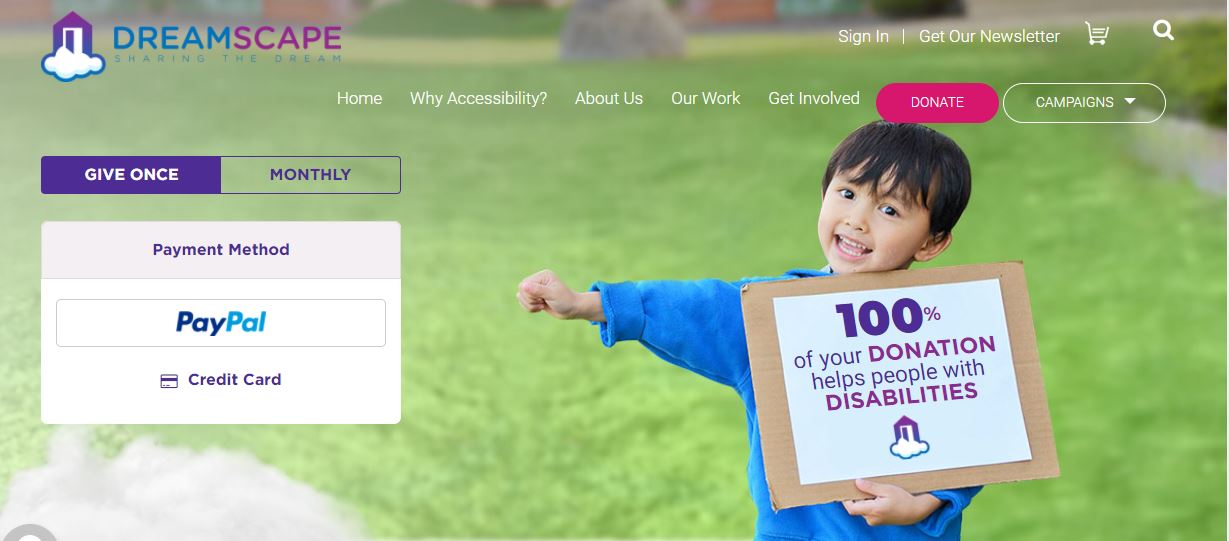
Dreamscape Foundation, an organization that works to increase accessibility via technology for those living with a disability, gives users the option to remain on-site and donate with credit card and an option via PayPal. If the user chooses to remain that’s where the next system comes into play.
Authorize.Net vs Stripe
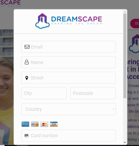
There are few different systems you can choose for systems that process on your site. We like both Authorize.Net and Stripe. Both allow for what you see below with Dreamscape’s payment information form, an on-page experience.

It’s important to point out that these are only the payment processing systems, they are not form creators. Meaning the form displayed above was not created with the same program!
Concluding Thoughts
So there you have it! Using these three systems you can set up a great donation experience for your site users. Now as promised, we have included a downloadable guide that will include:
- Pricing breakdowns of each
- Information about foreign transaction and other fees
- Additional information about each processing system
Download the guide below!
If you have any questions about donation processing systems or otherwise please reach out to us at Elevation. We would love to hear from you and chat about your nonprofit’s website!


