There is a general consensus that nonprofits tend to lag when it comes to creating optimized, user-friendly, cyber-secure, and transparent donation forms. And rightfully so. Nonprofits tend to push donor experience to the back-burner without realizing how optimizing their online donation form could positively impact their fundraising goals.
In 2013 alone, online giving grew 13.5%. Following that, in 2014, it grew another 8.9%. Additionally, Network for Good claims that branded donation forms yield 6x more donations than generic giving pages.
Using an outdated online donation form can leave significant donations on the table. These nonprofits organizations are taking the time to fully optimize their online fundraising efforts. Keep reading to see what you can learn for your fundraising strategy from 13 of the best online donation forms.
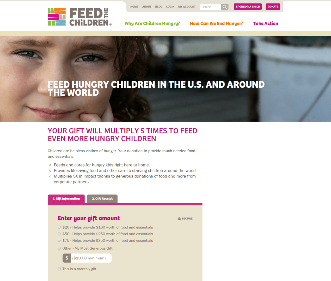
1. Feed the Children
- Balanced text versus image ratio
- Clear description of where the money will be allocated
- Limited fields for donors to complete
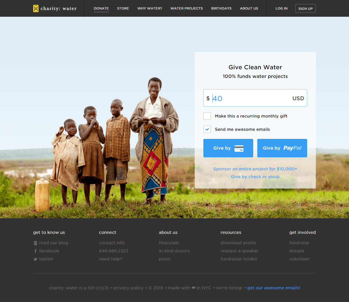
2. charity:water
- Limited number of fields donors are required to complete
- Responsive across all screen sizes
- Great use of compelling imagery, strategic use of whitespace to organize the page, and limited text
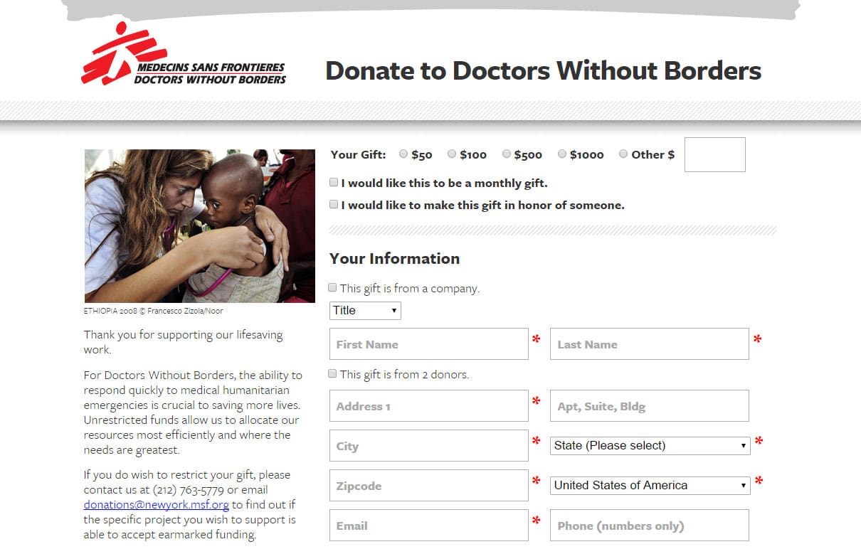
3. Doctors Without Borders
- Provides donors with donation amounts
- Gives the option of donating monthly or in honor of someone
- User-friendly donation process with limited links to access
4. Sidelines*
-
User-friendly icons suggesting donation amounts
-
Customized donation page that matches the look & feel, and brand of the nonprofit website and organization
-
Concise and informative text describing where the donated amount will go
*Designed by Elevation

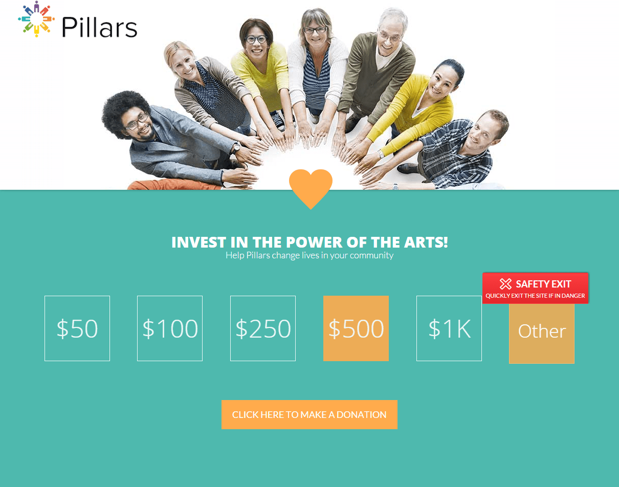
5. Pillars*
- Easy scroll experience with user-friendly icons depicting various donation amounts
- Limited text with compelling images
- Provides alternative ways to support Pillars – allows the donor to feel as if they aren’t just another credit card, but that in any amount/way their support is valued.
*Designed by Elevation
6. Project Cure
- CTAs located through the page with varying actions (donate, give, learn, etc)
- Low amount of links to access before arriving at the donations page
- Donation amounts, monthly option, and gift designation offered in a clear, and efficient manner

7. (RED)
- (RED) utilizes 2 well-designed donations pages for its donors. While normally, it’s advised to require the fewest link/page clicks to be able to donate, for (RED), the 2-page system works in their favor. The first page is a quick description of the cause accompanied by a short video from an international celebrity, while the 2nd page is the actual donation page.
- User-friendly donate icons are placed strategically throughout the site with varying CTAs (learn, act, donate, etc)
- Donations page(s) are branded and display insightful infographics (not featured) of where donations will be allocated

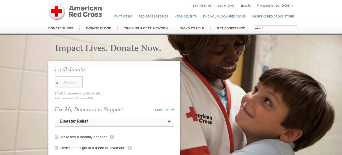
8. American Red Cross
- Limited required fields for donors to complete
- Donation icons on all pages of the website
- Specific to the Red Cross, as a donor, you can customize the cause you wish to support and 3-4 options are usually displayed. Red Cross has by far the most user-customized donation process.
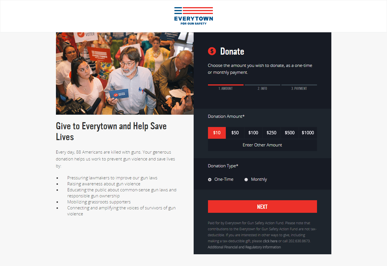
9. Everytown
- 2-column page that organizes and prioritizes the page accordingly; mission statement to the left and donations to the right.
- Limited fields required to donate. Everytown, along with a few others mentioned in this blog have a 2-page donation system; first donors choose their preferred donation amount, and after clicking “next” they enter in the required personal information. A personal preference, but I enjoy this process flow. It separates the process into 2 steps and doesn’t visually overwhelm.
10. Piedmont*
-
Limited required fields for donors to complete
-
Detailed list of where donations will be allocated
-
Option to set up recurring donations on a monthly basis
*Designed by Elevation
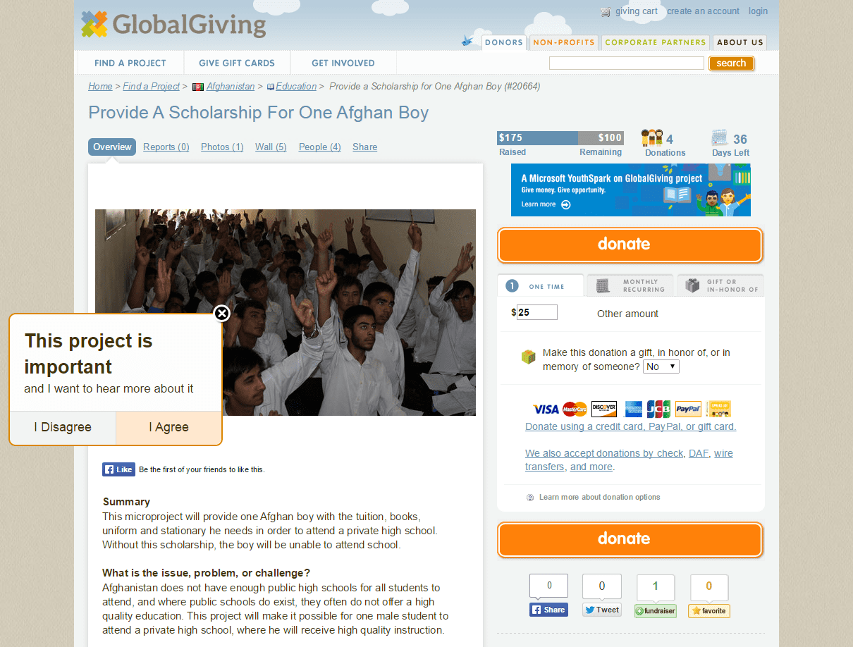
11. Global Giving
- At first glance, the Global Giving site and donation page may seem overwhelming. However, this site is perfect for donors looking for a nonprofit/cause to support but that want to compare/choose what or who they would like to donate to.
- Brief summary, basic information, state of the current situation provided
- Donation amounts, amount raised, how many days left in the campaign, and number of donors already contributing are provided on the donation page.
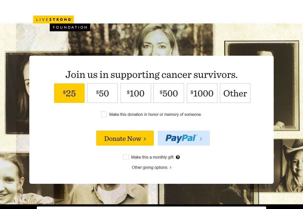
12. Livestrong
- Donation amounts provided for donors to choose from
- Branded donation page that matches the layout, color scheme of the entire site and organization
- Further down the page they include an infographic showing the current and continuing impact of donations (not included here)
13. Action Against Hunger
- Pop-up donation forms effectively turn every page on your website into a potential donation page
- Contextual giving experience capitalizes on donors’ motivation and momentum at the moment they’re most inspired
- Action Against Hunger’s switch to pop-up donation forms had a huge impact on their fundraising metrics:
- 78.4% increase in total conversion rate
- 23.3% increase in one-time gift value and 65.8% increase in monthly gift value
- 88.2% increase in one-time gift conversion rate
Listed above are only 13 of many well-designed online donation forms. If you see a big difference between your own nonprofit’s donation form and the ones above, it may be time to re-boost and update your website. Contact our team this week to start improving your nonprofits online fundraising strategy!